Have you always want to learn how to draw a person, but didn’t know where to start? This article will show you everything you need to know to draw people well.
How to Draw People Worksheets
How to Start
The temptation for many people when they are drawing people is to first make the eyes, or nose, or something that is relatively small.
But this is a mistake.
When drawing people, you always want to start with the biggest ideas first, and then work your way to the smaller ideas.
And the biggest idea you need to capture first, before even THINKING about drawing eyes, is the overall proportion of your figure. How tall compared to how wide is your figure?
Artists often indicate the height of the figure by marking the bottom of the feet and the top of the head.
For the width, artist sometimes use what is called a “Proportion Box”. It is a box that represents the height and width of the person.
Once you have determined the height and width of your figure, you can get a little more specific with the shape. To do this, use a technique called an envelope.
An envelope contains a small number of straight lines that incapsulate the overall shape of the person you are trying to draw.
Envelopes are advantageous because they help you find the bigggest overall shape before getting distracted by details.
The envelope also helps you start to organize how one major point, say the elbow, relates to another major point like the head.
Look at the image below, and notice how this relatively simple envelope shape helps describe the entire person that is being drawn.
Major Anatomical Landmarks
When learning how to draw people, it is important that you know how to identify important anatomical landmarks. This takes both knowledge and practice.
Our Yay! People Worksheets help students learn how to identify important anatomical landmarks and practice finding them in a variety of poses.
Key landmarks to learn include the greater trochanter, symphysis pubis, sternal notch, and acromian processes.
It is important that you not only know what these landmarks are, but how to find them on the human figure. Students often mistake the greater trochanter for the hip, for example. That is why it is important to practice finding key landmarks over and over again so that you can internalize them.
(Need help learning anatomical landmarks? Our Yay! People Worksheets include dozens of examples to help you learn and practice how to find key landmarks on the human figure.)
Learn key landmarks when drawing figures.
Refine Your Drawing of a Person
Once you have your major proportions and shape set, and your key anatomical landmarks identified, you can start to refine your drawing.
Again, it is best to always work from the biggest ideas to the smallest. The shapes of the arms and legs, for example, are much bigger than an eyelash. Be mindful of what is physically the next biggest idea when learning how to draw a person and it will help you.
Next Steps for Drawing People
By starting with a proportion box and envelope and then working to smaller ideas such as the individual arms and legs, you are well on your way to drawing believable people.
It can be challenging to learn how to draw people, which is why the School of Atelier Arts created these extensive worksheets to help people learn. ANYONE can make believable people that has access to good knowledge and quality practice, and that is what these people drawing worksheets provide.
Once you master drawing people, you might want to learn more about portraits in order to bring your drawing of people to the next level. Check out our articles on portraiture:
When starting out, having the right oil paint materials list is essential for creating successful artwork. So many students purchase inferior or unhelpful materials, sabotaging themselves and their artwork before they even start.
Unlike watercolor, tempera, or acrylics, oil paints offer unparalleled richness, depth, and flexibility to the painter. Unfortunately, many people are confused by the materials needed for oil painting and avoid it altogether, causing them to miss out on a rewarding art form that has lasted millennia.
Despite popular beliefs, good oil painting materials are not that expensive if you are judicious in your paint selections and take good care of your materials.
In this article, you will discover our vetted oil paint materials list with brief descriptions about why you need each item and how to use them. We’ll go over how to select oil paints, the best palettes, and why a filbert brush is your best friend.
The Department of Aesthetics Blog is reader supported. When you purchase through the links on our site, we may earn affiliate revenue. Please note that SAA is not responsible for your studio safety, and that you should make sure to research how to safely use all studio materials.
Oil Paint
Oil paint is made from pigment mixed most commonly with either linseed, safflower, or walnut oil. The oil creates a binder that adheres the pigment to your painting surface.
Acrylic paint uses plastic as a binder, and watercolor usually uses gum arabic as a binder. The pigments between all these different kinds of paint are actually the same. If you buy cadmium red watercolor, cadmium red oil paint, and cadmium red acrylic paint, it is the same pigment being used. What is different is the binder.
As someone who is increasingly concerned about microplastics in our environment, I avoid using acrylic paints and acrylic primed painting surfaces which use plastic as a binder.
There is a reason oil paint has been around for thousands of years. It is useful, long lasting, easy to work with, and creates beautiful results. Welcome to the world of oil painting!
Please note that I do not advocate for any particular brand. As long as you choose professional grade paint there are many wonderful options. I have linked my current favorites.
Student Grade vs. Professional Grade Oil Paint
This difference between student grade paint and professional grade paint comes down to the binder (and fillers) used for these paints.
Pigment can be very densely packed within a paint, which creates a rich paint with high coloring power. Professional grade paints tend to have the highest pigment density available for that pigment.
Or, paint manufacturers can add a filler to spread out the expensive pigment a bit. This allows them to get more paint for less costly pigment.
Although the cheaper student paints are attractive to financially struggling students, I find it is rarely worth it to cut costs on paint.
When you learn how to paint using atelier methods, you are not using so very much paint every day. Even if you paint 6 hours a day in an atelier, it is unlikely that you will go through all your new tubes of paint within 6 months.
So although it is more of an up front expense to purchase professional grade paints, if you are painting like an atelier artist and not a modern artist covering 6 foot tall canvasses, the small amounts of paint you are using justifies the higher quality paint cost.
For this reason, all recommended paints found here are professional grade paints.
Types of Pigments
Paint is made from many different kinds of pigments. The pigments themselves have different properties that oil painting students should be aware of.
Earth Pigments: Some pigments used in paints are simply refined dirt. Raw Sienna was originally a yellowish dirt from the town of Sienna. Yellow Ochre, Burnt Sienna, Terra Verte, etc. are all versions of refined dirt mixed with oil.
Heavy Metal Pigments: Some pigments use heavy metals. Examples include cadmiums and lead whites. These pigments should be handled with care to make sure you never accidentally ingest them. Again, it is not being oil paint that requires careful handling, it is the pigment itself which can be purchased in many forms of paint.
Organic Pigments: Some black paints that are made from soot or burning animal bones. Carmine red uses crushed cochineal insects as its pigment, but sadly it is fugitive and the color diminishes with exposure to light.
Synthetic Pigments: These are modern pigments that have incredible lightfast properties and were often developed by the car manufacturing and makeup industries. They tend to have very intense color strength and resistance to dimming over time. Examples include paint colors with the word “quinacridone” in them.
Recommended BASIC Oil Paint Materials List
The School of Atelier Arts believes in simplicity and approachability in all of our painting classes. That is why we keep our palette recommendations simple. We want our students to produce the greatest artwork with the least amount of confusion. We have found that these pigments give students great results. Remember, you do not need 100 paints. You need a handful of paints that will get you where you want to go in your painting journey.
Want direct coaching on how to use this simple palette to create beautiful artwork? Join our online atelier, Ateliyay! Painting Bootcamp. For the fraction of the cost of other ateliers, you can learn online at your own pace with our incredible instructors and flexible schedules.
Old Master Oil Paint Materials List
This is a tricky palette to narrow down as there are many variations of it that artists used throughout history. This is one example of a minimalist Old Master Palette using just 4 colors, and often referred to as a “Zorn Palette” due to this artist’s persistent (but not exclusive) use of it. I’ve included the more historic pigments in this list, but almost any red, yellow, white, and black can be used to make up a “Zorn Palette”.
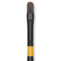
Brushes come in many shapes, sizes, materials, and crucially, quality. Through more than a decade of teaching, I have found one type of brush superior to all the rest for beginner students.
The Versatile Filbert
At School of Atelier Arts (SAA), we emphasize using synthetic filbert brushes because they combine the best of flat and round brushes. They allow for both broad strokes and fine details, making them the most versatile option for classical and contemporary painting. Their soft edges both blend smoothly and can make sharp lines depending on the angle of the brush, making them perfect for using just 1-3 brushes for an entire painting. We like to keep things direct and simple at SAA.
Brush Recommendations
The Rosemary Brush Company makes outstanding quality brushes which are each made by hand. I especially like their synthetic Ivory Series. Due to their exceptional quality, they are a little pricer than other options and are best to invest in once you have some oil painting experience.
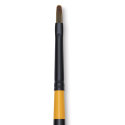
My favorite brushes to recommend to students are the Utrecht Synthetic Filbert Brushes. This is what I encourage students in our online painting classes to purchase for their first oil painting materials setup:
Palettes are an essential tool for the classically trained painter. Here are the different options available and our recommendation to add to your oil paint materials list.
Palette Options
Wooden Palette – Traditional and great for mixing, but requires prepping the palette carefully with layers of linseed oil. I love the romanticism of a good wood palette. More importantly, I think this is the best palette for students as they can hold their palette up close to their canvas when mixing colors.
Glass Palette – Some students really love using a glass palette due to its larger size and the ability to set the glass on a table in front of you. (You do not want to hold a glass palette! HEAVY!) However, as an experienced atelier instructor, I dislike that their color mixing is done so far away from their canvas. I feel this is a disadvantage for seeing color as a beginner.
Disposable Paper Palette – Convenient for quick setups and cleanups but lacks durability, and frankly, is a huge pain in the rear. It moves, tears, and makes mixing colors annoying. A wood palette is much easier to clean than most people realize. You can simply scrape off the paint with a palette knife and wipe it with a paper towel. That’s it. Don’t be afraid.
Keep It Simple: Avoiding Unnecessary Oil Painting Mediums
It’s tempting to use mediums like liquin, turpentine, and alkyds, but at SAA, we advocate for keeping things as simple as possible. The less you have to think about that is not actually painting the better.
Also, I believe in letting oil paint act and behave like oil paint. It is not watercolor, you do not need to thin it as if it were. It is not acrylic, so stop adding dryers to your paint to make it act like acrylics. It is oil paint. Let it be oil paint.
Instead, use paint straight from the tube, occasionally adjusting with a small amount of refined linseed oil if the paint out of the tube is excessively thick. Overuse of solvents or mediums can create a nasty smell, introduce unknown chemical elements into your studio, and can create unknown safety hazards as many secret painting mediums have unknown substances in them. Keep it simple, and let the oil paint do its oil paint thing. It is, after all, oil paint.
Painting Medium Recommendations
Gamsol is a popular solvent in oil painting circles because it is formulated to evaporate at a lower rate than other additives. If you insist on having an additive to your paint, this is the one I recommend over all others and you will find it on our oil painting materials list.
I encourage students to only use this to thin paint when drawing on a canvas. That’s it. Even then, I am starting to transition students to drawing directly with pure paint instead of thinning it. The more stinky extras you eliminate from your painting practice the better.
Linseed oil may also be added in very small amounts to thin especially thick paint.
Make sure you only use refined linseed oil, not commercial grade linseed oil. It is important that all impurities are removed from your linseed oil to ensure it does not darken your painting over time.
Palette Knives
There are good palette knives and bad palette knives. You can tell simply by holding one and bending the blade.
A good palette knife offers flexibility. It’s blade is thin yet durable. A bad palette knife is brittle and breaks under pressure. It might also be very thick and unwieldy.
Please do not use those dumb plastic palette knives, they are a nightmare for serious painting.
If you are a school teacher looking to put a class set together, invest in a smaller number of good quality palette knives for students to share instead of the worthless plastic ones that do not do their job well at all.
I have found that a single palette knife is sufficient for most purposes, especially beginner painters learning to use one for the first time. If you have many palette knives, there is a tendency to lose them. If you have one palette knife, you keep track of it.
Palette Knife Recommendation
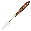
I like this size 5 smallish trowel-shaped palette knife from Blick.
Ah canvasses, canvasses. So many to choose from. But all canvasses are NOT created equal my friends.
Cotton Canvas
Cotton canvasses were not widely used by artists until the 1800’s when mass manufacturing made the material more broadly available.
As a canvas choice, cotton is often cheaper than linen. But it is also often much more course than many linens. Low resolution surfaces tend to be very difficult for students to learn on. I have witnessed many student projects fail simply because they could not control their paint on such a highly textured surface.
Students are tempted to use cotton canvasses when learning how to oil paint due to its lower cost, but this comes at its own price. This is because each support you practice painting on teaches you something about material handling for that support. When you switch to a different type of canvas later, you have to relearn your paint handling skills.
This is why I encourage students to use professional grade paints and canvasses as early as possible in their learning journeys. The cost difference is not so astronomical, but the benefits of learning on materials you intend to use for the longevity of your career has incalculable benefits.
Linen Canvas
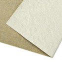
Linen canvas is the preferred surface used by most easely painters for the longest period of time. There are probably good reasons the Old Masters had for that.
My reasons for recommending linen canvasses is that we have evidence in museums that it upholds reasonably well over long periods of time. It is a natural substance that we know for sure does not interact adversely with any of the pigments that were used historically. Its finer threads and subsequently tighter weave create a smoother painting surface which is especially desirable for students learning how to paint.
Although linen tends to be more expensive than cotton, there are economical options that work quite well for student work.
Canvas Board
Canvas board is a cheaper alternative than stretching canvas or purchasing pre-stretched canvas. It is also sturdier to work with than taping loose canvas to a board. I recommend this option for beginner oil painting students.
Centurian oil paint board
Other Supports
In addition to canvas, some other support options include wood and metal. I do not use these supports in my own painting practice, and therefore will not offer recommendations on these materials.
Oil vs. Acrylic vs. Primed Canvas
Now that you have selected a canvas, you need to consider the primer. This is what rests between the cotton/linen/other support and your painting on top of it.
I am generally against using materials that we do not have long term information on. As plastics (and therefore acrylics) were not made widely available to artists until the second half of the last century, I do not trust that we know what their true longevity may or may not be.
We do have a substantial track record that oil primed linen will last centuries when treated properly. Therefore this is the only type of primed canvas I recommend to my students.
Unprimed Canvas: Do not do this to yourself. Especially if you are a beginner. There is no reason to learn an entire new oil painting skillset that is required to prime a raw canvas well. Why mess with rabbit skin glue, weeks of drying time and sanding, etc. when there are really wonderfully primed canvass options readily available? This is art materials geekery territory. If you want to learn how to paint, do that first then circle back to this.
Canvas Weaves & Gesso Layers
Canvasses come in a variety of weave densities. Oil Primed Portrait Linen is generally considered the smoothest painting surface with tightly woven fibers. To my knowledge there is no standard for measuring weave in painting canvas, but most producers of painting linen will list in their descriptions how smooth or rough a surface is.
The smoothness of a painting surface is also determined by how many layers of gesso are applied to it. The more layers, the smoother the surface.
Pre-Stretched vs. Hand Stretched Canvasses
For beginner students, I recommend using canvas board or pre-stretched canvasses. Please don’t distract yourself from the very difficult task of learning how to paint by going on unnecessary side quests like stretching canvas. Learn how to stretch canvas once you have a solid set of painting skills under your belt.
Some students dislike how loosely pre-stretched canvas tends to sit on the frame. The little “keys” on the back of the canvas can be inserted on the back side to tighten the canvas.
Loose Canvas
Students often overlook the usefulness of loose canvas. You can cut it easily to any size you need. It is less expensive than stretched canvas. If you paint something you especially love, you can matt it under glass like a drawing, or have it dry mounted to foam core at a frame shop and frame it the same as any other painting.
Canvas Boards
Canvas boards are not often included in oil painting materials lists, but I think that is a mistake. Canvas boards are economical, offer a firm support for framing, and are easier to store than fully stretched canvases. I find them to be a very good compromise for students between the time, energy and expense of stretched canvas and the less professional looking loose canvas.
For beginners, Centurion makes affordable oil primed linen with a smooth surface. They also make the most acceptable versions of pre-stretched canvasses I have tried.
Sometimes students find the surface of Centurian canvas too smooth, in which case I recommend Clausens. Clausens is my favorite oil primed linen for professional work. It has a wonderful weight to it and stretches well on bars. It comes in rolls and must be stretched by hand onto stretcher bars for professional paintings. It is fine to cut up into small pieces for studies as well. Although pricey, it will last a very long time.
Next on our oil painting materials list is easels. You don’t need 15 easels. You need one maneuverable easel that accommodates the majority of the work you will ever make in your career.
There are big expensive H-Frame easels, and smaller pack-and-play plein air easels. Table easels. All the easels.
However, I try to convince my students to keep their setups as simple as possible. Learning how to paint is already challenging. Pondering an infinite number of easel options is a distraction.
Easel Recommendation
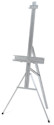
The easel I most recommend to students AND my professional peers is the Testrite Aluminum Easel. It is metal and durable, It’s easy to fix. It collapses quite small. It’s not terribly heavy. I can easily take it with me plein air painting (although not for extended plein air painting hikes, more the type of park and paint). Yet, it is sturdy enough for my clumsy self to stumble into it without knocking it over in my studio. It also has a small footprint ideal for tight studio spaces. And it is one of the more affordable options on the market. If you are especially tall, they make an extension that I recommend getting as well.
This is the cheater’s way of not having to wash brushes. Wipe off excess paint with paper towels after your painting session. Then, simply submerge the brush end of brushes in oil to keep them from drying out. It helps to slightly elevate one end of the dish at an angle by placing a roll of tape under one side.
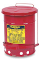
This is a good safety measure to have in your studio. Rags soaked in oil can spontaneously combust. Always use oil in minimum amounts and never leave an oil soaked rag lying around. Please note SAA is not responsible for studio safety.
Complete Oil Painting Materials List (With Links!)
By choosing high-quality materials, and avoiding unnecessary additions to your studio practice, you set yourself up for success in your artistic journey. Here are our complete list of oil painting materials recommendations.
Creating a stunning painting composition isn’t just about the rule of thirds or following mathematical formulas. In fact, those rules aren’t very helpful, and can even harm your compositions, if you don’t understand the big underlying concepts of pictorial design.
A well-balanced composition draws viewers in, directs their eye through the piece, helps to tell a visual story, and makes the overall artwork much more compelling.
Yet, many artists struggle with composition. They tend to bumble about placing things on their canvasses awkwardly, and inevitably end up with paintings that feel like something is always “off”.
If this sounds familiar, you’re not alone. I’ve been teaching students realistic drawing and painting skills for more than a decade, and composition continues to be the most difficult aspect of painting for students to grasp.
Fortunately, mastering composition is possible with guidance from a knowledgeable atelier-trained instructor. So, let me be your guide today through the world of pictorial composition and let’s discover what good painting composition is, what it isn’t, and how to practice your composition skills effectively and elevate your art.
Creating a strong composition is the foundation of compelling artwork. Whether you’re drawing a portrait, designing an outdoor plein air painting, or even arranging abstract forms, understanding composition helps guide the viewer’s eye and enhance visual impact.
The following key composition techniques offer a structured approach to building complex and visually engaging artworks. By practicing these methods, artists can develop a deeper understanding of how visual elements work together to create harmonious compositions. Mastering these principles allows for greater artistic confidence and the ability to communicate ideas more effectively – and intentionally – through art.
Sweeps & S-Curves
Sweeps and S-curves are powerful compositional tools that create movement and unity within a piece. By learning to recognize how flowing these implied curves lead the viewer’s eye through a composition, you can make your painting feel dynamic and cohesive.
Learn how to harness the natural elegance of curves to create rhythm and harmony in your artwork. Whether used subtly in a portrait, or prominently in a landscape, sweeps and S-curves are a useful tool for achieving a visually engaging composition.
Big Shapes & Spots
One of the most effective ways to simplify composition is by focusing on the big ideas, such as big shapes and spots. These concepts help students to identify dominant forms that establish structure and balance within an artwork.
By organizing a composition around major shapes before diving into details, artists can create a solid compositional foundation that delivers clarity for the viewer. Learning to place key shapes and focal spots strategically helps create compelling visual hierarchies, guiding the viewer’s attention carefully through the piece.
Designing with Edges & Silhouettes
Edges and silhouettes play a crucial role in how we read the big ideas of a composition. Edges and silhouettes can work to your benefit, or detriment if you are not careful.
If you want something to read cleanly and clearly, strong contrasts of light on dark or dark on light create clear edges.
If you want your subject to read calmly and mysteriously, low contrasts of light on dark or dark on light create subtlety and nuance in a painting composition.
Carefully placed edges and silhouettes create visual statements. By studying how two different colors meet (Softly? Harshly?), students can gain mastery and use edges and silhouettes to control the visual feeling of their compositions.
Linear Ideas in Painting Compositions
Understanding the power of lines in composition is fundamental to creating visually engaging artwork.
Sometimes the more subtle applications of this concept are difficult for students to see at first. Identifying and utilizing diagonal, vertical, horizontal, and converging lines in a composition creates visually effective structures in paintings.
Lines not only guide the viewer’s eye, but also establish guidelines for placing other elements in the composition.
Designing your painting composition around lines also contributes to the mood of your painting. Diagonal lines create energy and movement, verticals evoke strength and stability, while horizontals hint at calmness.
Color and value are essential compositional tools that impact the overall feel and readability of an artwork. Students need to learn how to recognize and apply dominant color schemes and value structures to strengthen their compositions.
By understanding how a picture can be light, medium, or dark, artists can control the mood of their painting compositions.
By practicing identifying the overall color of a picture, students can manipulate their hues to evoke specific feelings from their viewing audience.
Mastering seeing a picture holistically, including its overall value and hue, allows artists to control the emotional and visual impact of their compositions with confidence.
Painting Composition: Putting It All Together
Mastering composition involves the ability to integrate multiple elements seamlessly. That’s why our popular Yay! Composition Worksheets have students practice each element individually, and then combine them together. By practicing the ideas presented in this article, artists can create compositions that are visually captivating.
Deliberate composition training ensures that students can apply their knowledge in real-world artistic scenarios, leading to more confident and effective artwork.
Why Artists Love our Yay! Composition Worksheets for Learning Painting Composition
Artists and educators alike have seen immediate improvements in their work using our popular worksheets. Here’s what some have said:
“My students were always intimidated to try and draw realistically. With the help of the School of Atelier Arts resources, I now know how to help them experience success with their drawings every time! Their confidence is through the roof!” — Nina Dirienzo, High School Art Teacher
“I am extremely thankful for these resources because they offer skill-based lessons that give my students a strong foundation for their artworks.” — Kelsea Fischer, Elementary Art Teacher
What’s Included in the Yay! Composition Worksheets?
When you purchase the Yay! Composition Worksheets, you get:
50+ digital worksheets that guide you through the composition process step by step.
A Spanish translation for educators teaching bilingual students.
A structured approach that makes learning composition easy and practical.
These worksheets are designed for artists of all skill levels, whether you’re a beginner struggling with composition or an experienced artist looking to refine your skills.
If you’ve been struggling with composition, it’s time to stop guessing and start mastering it. The Yay! Composition Worksheets provide a clear, repeatable method that works every time. No more frustration. No more uncertainty. Just strong, confident compositions in every painting you create.
Get instant access to your digital worksheets: ➡️ BUY NOW
30-Day Money-Back Guarantee – If you don’t love the worksheets, we’ll give you a full refund. Simply write to help@schoolofatelierarts.com with your refund request, no questions asked.
When starting out, having the right oil paint materials list is essential for creating successful artwork. So many students purchase inferior or unhelpful materials, sabotaging themselves and their artwork before they even start. Skip directly to the Oil Paint Materials List, or continue reading for contextual information about the materials. Introduction to Oil Painting Materials […]
Creating a stunning painting composition isn’t just about the rule of thirds or following mathematical formulas. In fact, those rules aren’t very helpful, and can even harm your compositions, if you don’t understand the big underlying concepts of pictorial design. A well-balanced composition draws viewers in, directs their eye through the piece, helps to tell […]
Realistic portrait drawing is one of the most rewarding yet challenging skills an artist can develop. Whether you are a beginner struggling with basic proportions, or an experienced artist looking to refine your technique, this article will help you to draw better realistic portraits. Capturing a likeness requires a solid understanding of structure, feature placement, […]
Black is an essential color in any oil painter’s palette, yet not all black oil paints are the same. Different black oil paints offer different drying times and mixing behaviors that can greatly impact your painting. In this guide, we’ll explore the most common black oil paints, including Ivory Black, Lamp Black, Mars Black, and […]
White is the most used color in oil painting, but not all white oil paints are created equal. Artists often struggle to choose the right white for their work, as different types have varying properties that affect color mixing, drying time, and durability. In this guide, we’ll explore the most common white oil paints and […]
Check out these articles featuring the School of Atelier Arts. Redfin This article draws on SAA Director Mandy Theis’ knowledge of setting up a studio. By intentionally controlling light the way we teach in our online Ateliyay! Painting Bootcamp, any content creator can have a more conducive place to work.
Realistic portrait drawing is one of the most rewarding yet challenging skills an artist can develop. Whether you are a beginner struggling with basic proportions, or an experienced artist looking to refine your technique, this article will help you to draw better realistic portraits.
Capturing a likeness requires a solid understanding of structure, feature placement, and head proportions.
And it also means ignoring silly rules that are often taken as inalterable truths. (Eyes halfway on the head anyone? Rarely is this true unless you are sitting eye height with your subject and facing straight on.)
Portrait drawing by SAA Director Mandy Theis.
Many aspiring portrait artists find themselves frustrated when their drawings don’t resemble their subject, or feel “off” in ways they can’t quite pinpoint. This frustration is common because portrait drawing requires not just artistic inspiration, but also technical knowledge and deliberate practice. Without a clear process, mistakes like incorrect feature placement, wonky proportions, and awkward stiffness in the final portrait are inevitable.
But there’s good news: realistic portrait drawing is a teachable skill, and with the right approach, anyone can master it. You heard me. REALISTIC PORTRAIT DRAWING IS A LEARNED SKILL.
The reason many people believe they cannot draw well is because they have previously tried and it didn’t work out so well. But very few people have access to teachers that have portrait drawing skills. The problem wasn’t you. The problem is that you didn’t have access to someone with the skillset you wished to learn.
Lucky for you, I can teach you EXACTLY how to make realistic portraits. You can see my own portrait work on my Instagram @mandyfineartist https://www.instagram.com/mandyfineartist.
I am also a licensed art teacher. So not only do I know how to create realistic portraits, I know how to teach you efficiently how to make them too.
(In fact, helping people learn realistic portraiture is exactly why I created the Yay! Portraits Worksheets. These worksheets help artists overcome the most common struggles and make lifelike, accurate portraits with confidence.)
In this guide, we’ll explore the major challenges artists face when drawing portraits, the essential principles that lead to realistic results, and how structured practice can accelerate your portraiture drawing skills.
Why Realistic Portrait Drawing Feels So Difficult
Many artists, even those skilled in other areas, find portrait drawing uniquely challenging. That’s because the human face is deeply ingrained in our psyche—we are naturally wired to recognize faces and notice even the slightest inaccuracies. When something is off, we can sense it instantly, even if we don’t know exactly what went wrong.
Here are the most common reasons for portrait drawings fails:
1. Overall Head Proportions Are Inaccurate
The human head has a giant mass at the back of the skull that is bigger than the face portion of the head. But students often ignore this mass, essentially cutting off the entire back of the head which is still visible in a front facing portrait. Without understanding that this mass exists, and relating it to the proportions of the face, it’s easy to make the skull too wide, the forehead too small, or the chin too long. One of the most frequent mistakes beginners make is not correctly measuring the height-to-width ratio of the head, which results in absurdly placed features.
You can practice finding the mass of the back of the head with our Yay! Portrait Worksheets, like the sample worksheet below.
2. Feature Placement Destroys the Likeness
One of the biggest mistakes artists make is focusing too much on individual details—like a beautifully drawn eye or a well-rendered nose—without first ensuring that all features are placed correctly in relation to one another. LIKENESS IN A PORTRAIT COMES FROM THE FEATURES BEING THE CORRECT DISTANCE FROM EACH OTHER. Even if you perfectly render each feature, if their placement is off by just a little bit, the portrait won’t look like the subject.
For example:
Eyes that are even slightly too high or too far apart will make a face look like somebody else.
A nose that’s just a fraction too low can make the subject look older than they really are.
A misplaced mouth can completely change the expression, making the portrait feel “wrong.”
Misaligned features make the head feel like it is turning in different directions within the same portrait.
This is why getting feature placement right from the start is essential for capturing a likeness.
If your drawing looks “off,” chances are it’s a feature placement issue, not a rendering issue. Even slight misplacements can destroy a likeness, so it’s crucial to observe and measure distances between features carefully.
While placement “rules” about the eyes being halfway on the head can help establish general structure, be wary of the many dubious rules batted about in drawing books about the heights, widths, and general locations of individual facial features.
Some people have wide-set eyes, others have narrow noses, and lips come in countless shapes and sizes. This is what makes each face unique. Instead of following rigid formulas, artists must train their eyes to observe these variations and adjust their drawings accordingly. Capturing these subtle differences is what truly brings a portrait to life.
In fact, all of these so-called “rules” are mostly nonsense. They represent an idealized version of a human face—one that almost no real person actually matches exactly. If you try to force every face into these proportions, you’ll end up with generic portraits that fail to capture the unique individual qualities of your subject.
Instead, use the ideal figure as a reference point to analyze how your subject deviates from the idealized version. Is their nose slightly shorter? Are their eyes wider apart? Does their chin extend lower than the “right” proportions suggest? Recognizing and emphasizing these differences is what makes a portrait look like the actual person rather than just another generic face.
Getting the relationship of features to each other right is one of the hardest things for students to learn. It takes a lot of practice to get it right. It also helps to have a system, like what I teach in the online Ateliyay! Painting Bootcamp, to get it right.
I also teach this system for feature relationships in our Yay! Portrait Worksheets like the one you see below.
3. The Angle and Gesture of the Head Are Incorrect
A common reason portraits feel “off” is that the tilt or angle of the head hasn’t been properly established. Even a small mistake in the tilt of the brow line, nose, or mouth can create an unnatural or distorted look. The head is rarely perfectly straight-on, so artists must learn to accurately depict head angles to create believable portraits.
Our Yay! Portraits Worksheets help train artists to identify and accurately draw these head directions.
Want to to be better at realistic portrait drawing? You need a structured approach.
The key to improving portrait drawing is not just more practice—but the right kind of practice. Instead of drawing the same way as always, while making the same mistakes over and over, artists need a step-by-step process that teaches them how to analyze, construct, and refine portraits that actually look like the person they are trying to draw.
That’s where the Yay! Portraits Worksheets come in. These worksheets provide a systematic approach to portrait drawing, covering essential techniques that eliminate guesswork. By following guided exercises, artists can build their skills faster and with greater accuracy.
1️⃣ Mastering Overall Head Proportions – Learn the rules of facial symmetry, spacing, and the skull’s structure to ensure every portrait starts with a solid foundation. 2️⃣ Getting Feature Placement Right – Follow a structured method to correctly position eyes, nose, mouth, and ears to ensure accuracy and likeness. 3️⃣ Understanding Head Angles – Learn how to construct heads at different angles so portraits feel natural and not awkward or stiff. 4️⃣ Focused Practice – Each worksheet targets specific problem areas, so you improve efficiently without getting overwhelmed.
Unlike simply copying a reference photo, these worksheets teach you how to “see” like an atelier-trained artist.
Start Drawing Realistic Portraits Today!
If you’re tired of struggling with portraits that don’t quite look right, you don’t have to keep guessing. With the Yay! Portraits Worksheets, you’ll get the exact step-by-step guidance you need to start drawing realistic, lifelike portraits right away.
Your best portraits are just a few practice sessions away.
Want more?
If you are ready to take you and your art seriously, the best way to learn how to draw is under an atelier-trained artist. That is what our online Ateliyay! Painting Bootcamp gives you. You will get to practice your portraiture under the guidance of a true expert. Learn more about our online Ateliyay! Painting Bootcamp here.
Black is an essential color in any oil painter’s palette, yet not all black oil paints are the same. Different black oil paints offer different drying times and mixing behaviors that can greatly impact your painting.
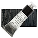
In this guide, we’ll explore the most common black oil paints, including Ivory Black, Lamp Black, Mars Black, and Bone Black, and discuss their characteristics to help you choose the right one for your individual painting goals.
The Department of Aesthetics Blog is reader supported. When you purchase through the links on our site, we may earn affiliate revenue. Please note that SAA is not responsible for your studio safety, and that you should make sure to research how to safely use all pigments.
Ivory Black
Ivory Black is one of the most commonly used blacks in oil painting. Traditionally made by charring ivory or animal bones, modern Ivory Black is a carbon-based pigment that is deep and semi-transparent. It has a slower drying time compared to other blacks, making it ideal for slower painters and those who are fond of blending.
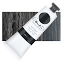
Lamp Black is one of the deepest and most intense blacks available. Made from soot collected from burning oils or resins, it is highly opaque. It provides strong coverage and works well for high contrast areas and areas that need deep, dramatic blacks.
Mars Black is a synthetic iron oxide-based black known for its opacity and fast drying time. It is the most opaque of all black oil paints, making it excellent for strong coverage and crisp edges. Because of its quicker drying properties, it is a great choice for artists who want to build layers efficiently without extended drying times.
Bone Black is similar to Ivory Black, as it is also derived from charred bones. However, it tends to be thicker. Bone Black is semi-transparent and has a lower tinting strength than Mars or Lamp Black, making it useful for nuanced color work. Artists seeking a traditional, historical black with more subtle handling properties often prefer Bone Black.
For strong opacity and fast drying: Mars Black is the best option for bold applications and efficiency.
For historical accuracy and nuanced work: Bone Black provides a classic, versatile black with soft handling properties.
For slow painters, Ivory Black is your friend.
Each black has its own distinct character, and the right choice depends on your painting style and needs. By understanding the properties of different black oil paints, you can make informed decisions to enhance your artistic expression.
Which black do you prefer in your work? Let us know in the comments!
White is the most used color in oil painting, but not all white oil paints are created equal. Artists often struggle to choose the right white for their work, as different types have varying properties that affect color mixing, drying time, and durability.
In this guide, we’ll explore the most common white oil paints and their characteristics, including Flake White, Lead White, Stack White, Titanium White, Crimnitz White, Permalba White, and why Zinc White has fallen out of favor.
The Department of Aesthetics Blog is reader supported. When you purchase through the links on our site, we may earn affiliate revenue. Please note that SAA is not responsible for your studio safety, and that you should make sure to research how to safely use all pigments.
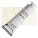
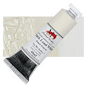
Flake White is a traditional oil paint usually made from lead carbonate and linseed oil. It is known for its fast drying time, slightly warm tone, and excellent durability. Because of its lead content, Flake White forms a strong, flexible paint film that resists cracking over time. Many classical painters favored it for its ability to create luminous color mixes without overpowering other pigments. However, its toxicity has led to limited availability and a decline in use.
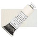
Lead White is another name for Flake White, but sometimes refers to whites made using a different preparation method. It shares the same properties, offering strength, flexibility, and a fast drying time. Despite its exceptional performance, modern artists must handle it with caution due to lead’s toxicity. Some manufacturers produce alternatives that mimic its effects while being less hazardous.
Lead White Replacement
For artists seeking a safer alternative to traditional Lead White, several modern replacements are available. Some manufacturers offer lead-free whites that mimic the handling and drying properties of Lead White while eliminating toxicity concerns. These substitutes often blend titanium dioxide with other pigments to achieve a similar warmth and flexibility.
Options like Michael Harding’s Warm White or Rublev Colours’ Lead White Alternatives are formulated to provide durability and a strong paint film without the brittleness of Zinc White. While no replacement perfectly replicates the unique qualities of Lead White, these alternatives allow artists to work safely without compromising performance.
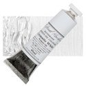
Stack White is a historically significant version of Lead White produced using the “stack process.” In this traditional method, sheets of lead were stacked with layers of manure and vinegar to encourage a slow chemical reaction that resulted in the formation of lead carbonate. This method produced a uniquely textured, slightly warmer white with superior handling properties. Though largely obsolete today, some niche paint makers still recreate it for historical and restoration purposes.
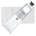
Titanium White is the most common white used by contemporary artists. Made from titanium dioxide, it is the brightest and most opaque white available. It provides strong coverage and a cool tone, making it excellent for mixing and creating high-intensity highlights. However, it can be overpowering in color mixing, and its slow drying time can be a drawback for artists who prefer a faster workflow. Despite this, its non-toxic nature and versatility make it a staple in most studios.
Cremnitz White is another lead-based white, similar to Flake White but with a softer texture and a slightly higher tinting strength. It is often favored by portrait painters for its smooth consistency and warm undertones. Like other lead whites, it is highly durable but comes with toxicity concerns, requiring careful handling and ventilation.
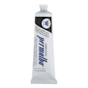
Permalba White is a modern, non-toxic alternative to traditional lead whites. It is a blend of Titanium White and other white pigments, designed to provide high opacity while maintaining a soft, workable consistency. It dries faster than Titanium White alone and is a popular choice among artists looking for a safe, high-quality white with good mixing properties.
Zinc White, or zinc oxide white, was once a popular choice for its transparency and cool tone, making it ideal for subtle glazing and mixing. However, over time, it was discovered that Zinc White produces a brittle paint film that is prone to cracking and delamination, especially when used in thick layers or mixed with other paints. This structural weakness has led many manufacturers and conservators to discourage its use, and it has largely been replaced by alternatives like Titanium White or specially formulated lead-free whites.
Choosing the Right White Oil Paint for Your Purpose
For strong, flexible paint layers: Lead-based whites (Flake White, Lead White, Stack White, Crimnitz White) are the best but require careful handling due to toxicity.
For high opacity and brightness: Titanium White is the best choice, though it can be overpowering in mixtures.
For more transparency and glazing: Lead white is more transparent than other options and tends to become even more transparent over time.
For historical accuracy: Stack White is a great option for period-specific techniques and restoration work.
For a safe, versatile white: Permalba White is a great non-toxic alternative with good mixing properties.
Every artist has their preferred white based on their technique and artistic goals. By understanding the strengths and weaknesses of different white oil paints, you can make informed choices that enhance your painting practice. Which white do you prefer, and why? Let us know in the comments!
When starting out, having the right oil paint materials list is essential for creating successful artwork. So many students purchase inferior or unhelpful materials, sabotaging themselves and their artwork before they even start. Skip directly to the Oil Paint Materials List, or continue reading for contextual information about the materials. Introduction to Oil Painting Materials […]
Creating a stunning painting composition isn’t just about the rule of thirds or following mathematical formulas. In fact, those rules aren’t very helpful, and can even harm your compositions, if you don’t understand the big underlying concepts of pictorial design. A well-balanced composition draws viewers in, directs their eye through the piece, helps to tell […]
Realistic portrait drawing is one of the most rewarding yet challenging skills an artist can develop. Whether you are a beginner struggling with basic proportions, or an experienced artist looking to refine your technique, this article will help you to draw better realistic portraits. Capturing a likeness requires a solid understanding of structure, feature placement, […]
Black is an essential color in any oil painter’s palette, yet not all black oil paints are the same. Different black oil paints offer different drying times and mixing behaviors that can greatly impact your painting. In this guide, we’ll explore the most common black oil paints, including Ivory Black, Lamp Black, Mars Black, and […]
White is the most used color in oil painting, but not all white oil paints are created equal. Artists often struggle to choose the right white for their work, as different types have varying properties that affect color mixing, drying time, and durability. In this guide, we’ll explore the most common white oil paints and […]
Check out these articles featuring the School of Atelier Arts. Redfin This article draws on SAA Director Mandy Theis’ knowledge of setting up a studio. By intentionally controlling light the way we teach in our online Ateliyay! Painting Bootcamp, any content creator can have a more conducive place to work.
Check out these articles featuring the School of Atelier Arts.
Redfin
This article draws on SAA Director Mandy Theis’ knowledge of setting up a studio. By intentionally controlling light the way we teach in our online Ateliyay! Painting Bootcamp, any content creator can have a more conducive place to work.
Are you a fan of audio learning and searching for some new great art podcasts? You’re in luck – here is a collection of art podcasts from a wide range of content creators.
Art School Live
Although technically more of a free online class/video format, this show makes for great listening if you are wanting to learn more about art. The host, Eric Rhoads, is a prolific content producer and creates fantastic art podcasts. Here are several episodes of Art School Live that feature School of Atelier Arts Director Mandy Theis.
In this art podcast, you will discover why there is no such thing as white. Guest Mandy Theis will take you through a process for figuring out how to detect which color your white actually is, and how to use whites well in your painting process.
Learn how to create a small study of a master painting in this art podcast with Mandy Theis. Mandy will teach you how to find the big ideas of a painting, and how to create an effective study.
This art-themed podcast goes into the shadowy subject CIA involvement in the visual arts during the cold war. It is a well-researched podcast with cited sources. And, it is a highly entertaining episode that features atelier-trained painter and educator Mandy Theis.
This a fabulous art podcast hosted by Michael Dargie. The tagline for the podcast is “Think Audaciously. Act Courageously.” In this episode, Michael interviews School of Atelier Arts Director Mandy Theis about atelier-style art education.
This art podcast episode is a delightful romp through arteducationland and covers some of the history of art education, and why learning how to draw and paint realistically requires finding the right teachers.
This is a neuroscience podcast that looks at mental health through many different lenses, including art. In this art podcast episode, discover how to use your art thinking to actually change what and how you see the world.
When starting out, having the right oil paint materials list is essential for creating successful artwork. So many students purchase inferior or unhelpful materials, sabotaging themselves and their artwork before they even start. Skip directly to the Oil Paint Materials List, or continue reading for contextual information about the materials. Introduction to Oil Painting Materials […]
Creating a stunning painting composition isn’t just about the rule of thirds or following mathematical formulas. In fact, those rules aren’t very helpful, and can even harm your compositions, if you don’t understand the big underlying concepts of pictorial design. A well-balanced composition draws viewers in, directs their eye through the piece, helps to tell […]
Realistic portrait drawing is one of the most rewarding yet challenging skills an artist can develop. Whether you are a beginner struggling with basic proportions, or an experienced artist looking to refine your technique, this article will help you to draw better realistic portraits. Capturing a likeness requires a solid understanding of structure, feature placement, […]
Black is an essential color in any oil painter’s palette, yet not all black oil paints are the same. Different black oil paints offer different drying times and mixing behaviors that can greatly impact your painting. In this guide, we’ll explore the most common black oil paints, including Ivory Black, Lamp Black, Mars Black, and […]
White is the most used color in oil painting, but not all white oil paints are created equal. Artists often struggle to choose the right white for their work, as different types have varying properties that affect color mixing, drying time, and durability. In this guide, we’ll explore the most common white oil paints and […]
Check out these articles featuring the School of Atelier Arts. Redfin This article draws on SAA Director Mandy Theis’ knowledge of setting up a studio. By intentionally controlling light the way we teach in our online Ateliyay! Painting Bootcamp, any content creator can have a more conducive place to work.
Color theory can be one of the most confusing yet rewarding aspects of painting, but not with our FREE online color theory class.
If you’ve ever struggled with muddy colors, contradictory color wheels, or mixing the perfect red, you’re not alone!
As a licensed art teacher and atelier-trained artist, I’ve seen firsthand how frustrating color mixing can be. And you know what? It doesn’t have to be so hard.
This FREE color theory training will break it all down, from understanding the power of brown to uncovering the truth about warm and cool colors. (Hint: what you were taught might be wrong!)
Plus, if you stay in the class until the end, there’s a special bonus waiting for you. Let’s dive in and make sense of color once and for all!
My Journey with Color Theory: Before and After Atelier Training
Before I truly understood color theory, I struggled with achieving the technical ability I envisioned having. One of my early paintings, which I was incredibly proud of at the time, had all the hallmarks of an artist struggling with color mixing: the skin tones were muddy, the colors lacked clarity, and I didn’t have a clear goal in mind when I was mixing. While it was the most realistic portrait I had ever created at that point, something about it didn’t feel right—it didn’t match the image in my head.
Everything changed when I studied in an atelier, a traditional art training method that focuses on realism and technical precision. Atelier training isn’t typically found in universities. Instead, art training including color theory classes is passed down from master to student, preserving centuries of artistic knowledge. Through this structured learning process, I finally cracked the code of color theory.
Ready to practice your color theory? Our popular Yay! Color Theory Worksheets will help you practice your newfound color theory knowledge.
The Key to Understanding Color: A Systematic Approach
If you’ve ever mixed red and yellow to make orange, only to find that your orange wasn’t the RIGHT orange, you already know that color mixing isn’t as simple as basic formulas. The secret to mastering color is breaking it down into three fundamental elements:
Value – How light or dark a color is.
Chroma – The intensity or saturation of a color.
Hue – The actual color family (red, blue, yellow, etc.).
By understanding these three elements, you can mix colors with intention and avoid common pitfalls, such as unintentional muddy notes.
Why White and Black Aren’t Really Colors
One of the biggest misconceptions in color theory is that white and black are standalone colors. In reality:
White is not a color but rather an extremely light version of a hue, such as a very light yellow or blue.
Black is not a color but an extremely dark version of a hue, like a deep red or blue. This is why black clothing items sometimes don’t match—one may have a cooler (blue) undertone, while the other has a warmer (red) undertone.
If you’ve ever used a black marker and added water to it, you may have noticed that it separates into different colors. That’s because black is made from pigments of other hues, just in their darkest form.
A common question I receive is, “Why isn’t brown on the color wheel?” The answer? It actually is! Brown is simply a darker, lower-chroma version of orange. Once you understand how to manipulate value and chroma, you’ll see that brown is just a neutralized orange.
While understanding these concepts is an important first step, true mastery comes with practice. Atelier training provides a structured approach to learning and applying color theory. Structured approaches help artists move beyond trial-and-error mixing.
If you’ve ever felt frustrated that your artwork doesn’t match what’s in your head, know that there is a path forward! Through the right training and consistent practice, you can develop the technical color theory skills to fully express your artistic vision without compromise.
Ready to take your color skills to the next level? Keep practicing, keep studying, and most importantly—keep painting!
When starting out, having the right oil paint materials list is essential for creating successful artwork. So many students purchase inferior or unhelpful materials, sabotaging themselves and their artwork before they even start. Skip directly to the Oil Paint Materials List, or continue reading for contextual information about the materials. Introduction to Oil Painting Materials […]
Creating a stunning painting composition isn’t just about the rule of thirds or following mathematical formulas. In fact, those rules aren’t very helpful, and can even harm your compositions, if you don’t understand the big underlying concepts of pictorial design. A well-balanced composition draws viewers in, directs their eye through the piece, helps to tell […]
Realistic portrait drawing is one of the most rewarding yet challenging skills an artist can develop. Whether you are a beginner struggling with basic proportions, or an experienced artist looking to refine your technique, this article will help you to draw better realistic portraits. Capturing a likeness requires a solid understanding of structure, feature placement, […]
Black is an essential color in any oil painter’s palette, yet not all black oil paints are the same. Different black oil paints offer different drying times and mixing behaviors that can greatly impact your painting. In this guide, we’ll explore the most common black oil paints, including Ivory Black, Lamp Black, Mars Black, and […]
White is the most used color in oil painting, but not all white oil paints are created equal. Artists often struggle to choose the right white for their work, as different types have varying properties that affect color mixing, drying time, and durability. In this guide, we’ll explore the most common white oil paints and […]
Check out these articles featuring the School of Atelier Arts. Redfin This article draws on SAA Director Mandy Theis’ knowledge of setting up a studio. By intentionally controlling light the way we teach in our online Ateliyay! Painting Bootcamp, any content creator can have a more conducive place to work.
Drawing Assignments that Teach Your Students About Edges
Edges are the often-neglected but oh-so-important workhorse of drawing. Understanding and applying good edgework in drawings takes students to the next level.
Often, we art teachers spend a lot of time teaching drawing assignments about values – how light and dark to shade things in a drawing.
But JUST AS IMPORTANT is what happens when one value meets another value.
Does the light value meet the dark value abruptly? Or is it a soft transition?
Edgework is actually quite a simple drawing skill to teach, and this free edges drawing assignment will help your students learn how to master the concept.
Drawing Assignments that Teach Texture
Texture is a skill that is always impressive when seen, but often a confusing concept for students.
“Shiny” is perhaps the most impressive texture of all to see in a drawing, and is actually one of the easiest textures to achieve in a short drawing assignment.
In this free drawing lesson, students will discover how to manipulate values to create a drawing of a shiny object.
Looking for more great drawing ideas? Check out these blog posts:
New to atelier training? Curious if atelier training is right for you? This free diagnostic quiz will help you figure out if atelier training is a good next step for you in your artistic career.
Simply answer the questions as honestly as possible. Don’t overthink your answers – this diagnostic quiz will help guide you on whether or not you are ready to pursue atelier training.
Don’t worry – the quiz is completely free and doesn’t even ask for your email address!
It WILL help you determine whether atelier training is a good fit for you and your artistic goals.
Triadic colors can seem pretty straightforward on the surface, but we’re going to take a little bit of a deeper dive to get a better understanding of what triadic colors are and why they are important.
What are Triadic Colors?
Triadic colors are colors that relate to each other on a triangle on a color wheel. So when we’re looking at the color wheel, if I were to draw a triangle between the red the yellow and the blue, the red yellow and blue would be considered triadic colors.
So red, yellow, and blue they make a triangle on the color wheel. Great! We have triadic colors!
But the triangle doesn’t always have to point towards yellow. So for example, if we made a triangle going between the orange, the green, and the purple, these are also triadic colors. They make a triangle on the color wheel, and these colors relate to each other in a triangular way. Therefore they are triadic colors.
Now this is a very simple approach to what a triadic color is, but there are more complicated ways to think about triadic colors.
Let’s go to a color wheel that has a few more colors on it. Before, we went to red, yellow, and blue. But what if we went from a purpley-red to an orange-yellow to a greeny-blue? These would also be triadic colors.
You can basically rotate this triangle any way you want on the color wheel to find triadic colors. Triadic colors can be nearly any three colors. The term “triadic” simply represents the relationship of those colors on the color wheel.
Some people play with this idea of triadic colors by adjusting it a bit. For example, what if your triangle was not a perfect triangle? You can have triangles that are not equilateral. So you can have a skinny triangle and some would say it is still a triadic color.
For those of you color geeks out there, the Fletcher palette uses this concept of unequal triangles to find variable triadic color harmonies.
Fletcher came up with a system where he wanted to make colors match music harmonies. He was really into using triadic colors and he tried to match the colors to the structures of musical chords. So, he divided colors into major and minor keys using triangles and other shapes.
If you really want a thorough understanding of his system, I recommend reading the Fletcher Palette book. For the purposes of this article, I just wanted to give you an example of a way that triadic colors can be taken into a more sophisticated realm.
So to review, we covered what a triadic colors essentially are, and a few ways they can be used by artists to determine color schemes for their work. If you enjoyed this article, make sure to join our wildly popular art newsletter for art tidbits in your inbox every week.
If you truly want to understand colors and how to mix them, you need to learn how to identify the three major elements of color.
Every color that you observe has three elements: value, chroma, and hue.
Value is how light or dark a color is. Lemon yellow is a very light color, for example, and blue jeans are a darker color.
Chroma is how intense the color is. A lemon is very, very yellow. Mustard is also yellow, but not as intense of a yellow as the lemon.
The lemon is more chromatic than the mustard. Mustard is more neutral than the lemon.
Hue is where the color is located on the color wheel. The hue can be red, orange, yellow, green, blue, or purple. The hue of a lemon is yellow. The hue of mustard is also yellow. The hue of blue jeans is blue.
Brown isn’t on the color wheel because brown is actually orange.
What?
You heard me.
Brown is orange.
Now before you panic, let me explain why brown is orange and how to mix brown paint with this knowledge.
The hue of brown is actually orange. This means if you had to assign the color brown to be red, orange, yellow, green, blue or purple, it fits most closely with orange than with any of the other colors.
Some of you might be thinking, “It doesn’t look orange!”
And that is because of the chroma of brown. Brown is an orange, but it is a very neutralized orange. It is not very chromatic.
Think of the earlier example when we compared the intensity of a yellow lemon to the intensity of yellow mustard. The yellow mustard is a more neutral yellow than the yellow of the lemon.
Now think about orange. A very intense orange, like the color of an orange fruit, is highly chromatic.
But if you think of other examples of the color orange, such as a bad spray-on tan, it is still orange but less chromatic than the fruit.
If you neutralize it even more than that, you will get brown.
So, the reason brown is not on the color wheel as a separate color is because it’s already there – orange! The hue of brown is orange.
So now what? How can this help you mix brown paint?
Now that we know the three elements of every color (value, chroma, and hue), and have recognized that brown is in fact a neutralized orange, we are ready to start mixing brown paint.
There are 3 steps to mixing brown paint
Step 1: Make orange paint.
Step 2: Make a neutral paint
Step 3: Add your neutral paint to your orange paint.
Step 4: Adjust the value
Each of these steps requires a little bit more knowledge to execute successfully. Here is what you need to know in order to mix brown paint successfully.
Because brown is a neutralized orange, we need to start by making the color orange. You can do this by adding yellow and red together to make orange.
But it is not quite that simple. Many people think that you need to take equal parts red and equal parts yellow to make orange paint, but that is not quite true.
Different pigments have different strengths. Red is often a much stronger pigment than yellow. So if you want to make orange paint, you need to add quite a bit more yellow than red in order for it to come out orange.
Step 2: Make a neutral paint
Mixing a truly neutral paint is worthy of its own post, but I will put a simplified version of it here.
A neutral color is a color that doesn’t look like any color on the color wheel.
It is like a grey, but it is not a green-grey, or blue-grey, or red-grey, or yellow-grey. It is a grey that doesn’t look like any other color.
You can make this color by mixing together red, yellow, and blue. This mixture is called a chromatic neutral, which sounds contradictory but you do not need to worry about it too much for mixing brown paint.
What you do need to worry about is mixing red, yellow, and blue together until they look like no color.
But be careful! Remember that different colors have different strengths of pigment. You cannot take equal parts of red, yellow, and blue and expect to get a true neutral.
And there is one other pitfall to watch out for! When you mix red, yellow, and blue together, the color will look quite dark. It’s hard to tell if it is truly neutral or not when it is so dark in value.
This is why you also want to add some white paint to your neutral. By lightening the value, it makes it easier to see if your mixture is truly neutral.
It’s important that your mixture is the most non-color (kind of greyish) possible in order to mix brown paint successfully in the next step.
Step 3: Add the neutral paint to the orange paint in order to mix brown paint
So far you should have mixture of orange and one mixture of neutral.
In order to neutralize the orange in order to turn it into brown, we need to add some of the neutral paint to the orange paint.
BUT BE CAREFUL! GO SLOW!
Do not add too much neutral to your orange paint too quickly. Your neutral mixture is going to be stronger than your orange mixture. Therefore, you need to add small amounts of neutral to your orange mixture at a time.
As you slowly add neutral paint to the orange, you will notice that it will start to turn brown.
If you want to mix a brown that still feels pretty orange, like a bad spray-tan, you don’t need to add very much neutral.
If you want to mix brown that is very brown, you will need to add more of your neutral paint to the orange.
Once you have mixed a brown that feels the right amount of brown to you, there is one more step to consider.
Remember that one of the three elements of color is value, or how light or dark your brown paint is.
If the brown you mixed is too light, you can darken it by mixing a neutral that does not have white in it.
Another way to darken the value is to add a little black to it, but be careful about adding too much black because black is actually a very dark blue, red, or purple and it will change your brown into a different color if you ad too much.
If you need to make your brown lighter in value, you can add white to it. But white is often just a very light blue, so if you add too much you will change your brown into a different color.
Mixing brown paint can be a struggle. It is a very finicky color to mix, because if you add too much neutral or not enough, you won’t get the exact color of brown you are looking for.
You also have to balance the value out, often with white or black, which can change the overall color of your brown.
But, if you understand the underlying principles of value, chroma, and hue, and follow these detailed instructions, you will be mixing browns in no time.