Take purple for example. Purple is made up of red and blue, and lies between them on the color wheel. So two different ways to describe purple would be to call it either a warm blue, or a cold red. It can accurately be described both ways.
Green is either a very cold yellow, or a very warm blue. Orange can be described as being either a cold red or a warm yellow.
It also applies to the primary colors (red, yellow & blue). Take yellow, for example. Most lemons are a cooler variation of yellow, whereas mustard tends to be a warmer yellow.The color of lemons is often towards the cool, green side of the color yellow. The color of mustard leans towards the warm, orange side of yellow.
Using “warm” and “cool” to describe colors is simply a way of describing the hue of the color, or where it lands on the red, orange, yellow, green, blue, purple color wheel.
Every country has its own, place-specific palette, but Iceland has some of the most unique colors of them all.
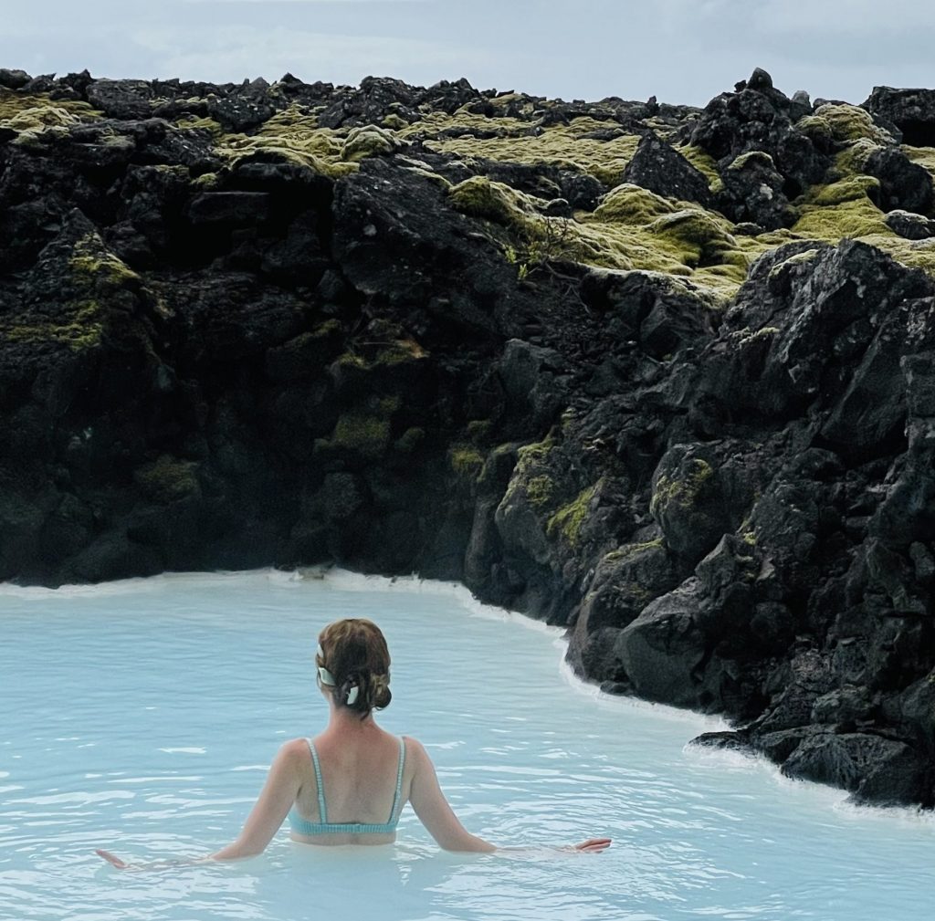
It is constantly a challenge to get the camera to capture colors accurately, which is why I always recommend palette studies if you want to remember the true colors of a place. From direct observation, the colors were both more chromatic and leaned slightly more green than this photograph.
Blue Lagoon Palette
The Blue Lagoon is world-famous for its milky-blue waters. As an artist, I wanted to discover how that milky-blue effect is created. How can the water be both blue and milky?
From a purely visual perspective, the key is to understand its coloring is that the Blue Lagoon is not just one color. It has many colors that are adjacent to each other that together create the visual effects that delight the eye.
The local color of the Blue Lagoon water is a chromatic blue. Its hue is ever so slightly green, and the value of the color is in the middle range – perhaps a 5 or 6 on a 9-step value scale.
But what makes the water seem milky is that there is an additional color that appears directly next to the more chromatic blue. This second color is lighter in value (just like milk is light in value). It is still blue, but it is slightly more neutralized. When placed adjacent to the more chromatic local color of the Blue Lagoon, it makes a milky blue effect.
The dark volcanic rock surrounding the lagoon also enhances the chromatic feeling of the water. By being both dark in value and low in chroma, these rocks create a color foil for the lighter value, chromatic lagoon water.
Are you enjoying these palette studies? Join our newsletter for even more art teacher delights!
Iceland Volcano Palette
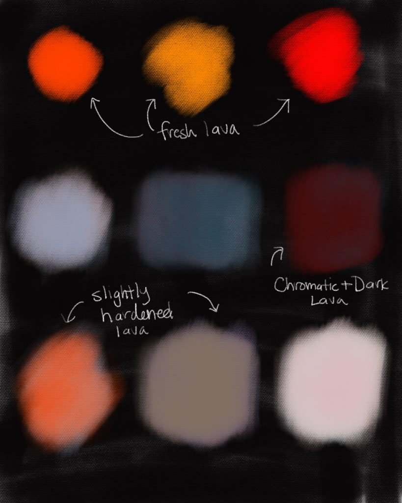
An active volcano in Iceland made for an even more chromatic palette. One of the most wondrous aspects of seeing lava with my own eyes, less than a few feet away from me, was discovering how chromatic a color can truly be. I cannot recollect any other subject I’ve seen coming close to the chromas of lava. No tropical flower, no synthetically dyed fabric, nothing I have viewed with my own eyes was more chromatic than the lava.
What was particular special about the chromas I saw on the volcano were how the colors were both dark in value and simultaneously incredibly chromatic. Often, chroma is sacrificed when making a color darker because black is needed to bring the value down, and black is fairly neutral. Darkening colors often robs them of their intensitites.
But the Icelandic lava was both extraordinarily reddy orange, and yet also dark in value – as dark as values 7 and 8 in some areas – without sacrificing an ounce of the intensity. It was an incredible visual phenomenon to behold.
Sadly, my pigments – even those on my drawing tablet – could not come close to the true intensities I saw in nature. In order to emphasize the intensity of the colors, I placed the color studies on a darker background. (This is an old artists’ trick for helping colors feel more chromatic when the pigment alone cannot do it justice.)
I loved the contrast I saw in Iceland between the cool color notes of the Blue Lagoon and then the deep fiery chromas of its active volcano. Iceland is a striking country with unique colors worth studying all on their own.
Have you ever made a place-based palette before? What was the most surprising color you discovered? Let me know all about it in the comments below.
Scientific progress is not always recognized in art, but it plays a significant role in aesthetic developments.
Cadmiums
The discovery of cadmiums as a use for pigment had an enormous effect on the trajectory of art. Cadmium reds, yellows, oranges, and greens suddenly and drastically altered the range of colors artists had access to in their palettes.
This art knowledge, in turn, changed the way artists painted.
Having brighter and more chromatic colors on their palettes inspired artists to paint subjects that were previously disappointing to attempt, such as brightly colored landscapes, because they could now come closer to painting their subjects with the colors they observed in nature.
Before artists had access to brighter colors, many focused on using the value of the colors – how light or dark they are – to recreate their scenes on canvas.
With an expanded color range, artists could shift colors instead of values to show three dimensional effects. It was an additional tool now available to painters to use when making artwork.
Not only did artists suddenly have access to many bright colors that are useful for landscape painting, but they had access to another invention in short order: the tube of paint.
Traditionally, artists used pigment powder to grind with oil to create their own paints. This process was time consuming and equipment-heavy, which made it largely impractical for transporting. If artists wanted to paint a landscape, this was most often done by creating sketches in charcoal or watercolor on site, and then completing oil paintings of the landscape in a studio interior.
But when tubes were discovered it made a huge impact on painting practice. Now artists could store their paint for very long periods of time. They could also take large or small amounts with them into the field. This change lead to landscape painting being created on site, and it revolutionized the genre.
When painting on site, artists had more opportunities to closely investigate colors, forms, and other aspects of painting without having to rely on sketches and memory. They could take in more information this way, and landscape painting as a genre exploded. What was previously considered a lesser subject of art became an admired one, and a necessary aspect of studying art at the turn of the last century.
Art Knowledge Builds
When cadmiums and tubes for paint were invented to create new colors and store oil paint, it freed up concepts of painting that could not have been explored without them. These discoveries combined allowed painters to travel outside to paint, as they no longer were tied to their studios to grind their pigments, and to paint with colors that better represented the colors they saw in nature.
These scientific discoveries lead to the ability for painters to expand their palettes and paint outside, and an explosion of landscape painting was the result.
These are just some of the many overlooked scientific advancements in art that shape artwork being made even today.
What other scientific advancements happened throughout the history of art-making? Let me know in the comments below.