What is Atelier? Notional Space? Contours?
Fret not my friend, this is your go-to artist dictionary for all those wonky terms people who draw and paint realistically like to throw around. This is an ever expanding project, so check back regularly for the newest definitions!
Atelier: The French word for “studio”. A place where artists learn realistic drawing, painting, and sculpting skills.
Want to start atelier training? Here’s how.
BedBug Line: Also known as a core shadow, it is a line that is slightly darker on the edge of a shadow that is the exact place where a form turns from light towards shadow. This term is rarely defined in other artist dictionaries.
Chroma: The intensity of a color. The opposite of neutral. A very chromatic color is often described as “bright”. A stop sign is a very chromatic red. Bricks are also often red, but not as intense as a stop sign. Bricks are less chromatic than a stop sign.
Learn more about color with our Yay! Color Theory Worksheets
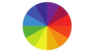
Color Wheel: A circle that shows colors. Some color wheels show just the hue. Some show hue + chroma, or hue + value.
Contour Line: A line that is used to describe the shape of something.
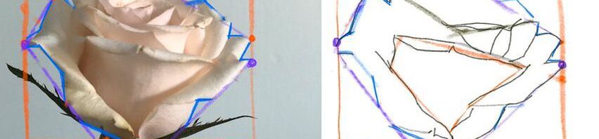
Envelope: A small number of straight lines that represent the overall biggest shape of your subject.

Ferrule: The part of a paintbrush that attaches the bristles to the handle.
Hue: The location of a color on the outermost circle of the color wheel. Red, orange, yellow, green, blue, and purple are all hues. If a blue hue leans green, the hue is a blue-green. Hues are sometimes confused with color intensity. Hues are the most pure form of every color. So a brown color would be described as having an orange hue that has been neutralized.
Learn more about color with our Yay! Color Theory Worksheets
Local Color: The base color of a subject. For example, the base color of an apple might be red, even if it has bright yellow highlights are dark blue shadows. Local color is an important word for any artist dictionary
Neutral: The opposite of “chroma”. Every color has its most intense version, and also a version that is so close to a greyish neutral that it is hard to tell there is any color to it at all. There is a scale from chroma to neutral that every hue has, from most intense to least intense. When colors are less intense, they are described as neutrals. A bright orange fruit would be described as a chromatic orange. A wood floor is still orange in hue but is more neutralized than an orange. Then there is a wall that seems almost grey but has the barest hint of orange to it, which would be described as a very neutralized orange.
Notional Space: The proportions of your subject if you were to imagine a box going around it and touching it on all sides.
Outer Contour: Similar to a contour but describes specifically the outer most shape of a subject.
Want to start atelier training? Join our Ateliyay! Painting Bootcamp today!
Proportion Box: Another term for Notional Space. The proportion box represents the amount of space your subject takes up if you were to imagine a box going around it and touching it on all sides.
Sight-Size: When you draw or paint your subject at the exact same size that you observe it. Learn more here: https://www.studydrawing.com/sight-size
Value Scale: The standard atelier value scale has 9 increments of value from darkest to lightest. 1 represents the lightest and 9 represents the darkest.
Are there words you would like to see added to this dictionary? Let me know in the comments below.
Make sure to join our mailing list for art delights delivered right to your inbox.
Want to start atelier training? Join our Ateliyay! Painting Bootcamp today!
Oil Paint Materials List
When starting out, having the right oil paint materials list is essential for creating successful artwork. So many students purchase inferior or unhelpful materials, sabotaging themselves and their artwork before they even start. Skip directly to the Oil Paint Materials List, or continue reading for contextual information about the materials. Introduction to Oil Painting Materials […]
Painting Composition: The Key to Making Better Art
Creating a stunning painting composition isn’t just about the rule of thirds or following mathematical formulas. In fact, those rules aren’t very helpful, and can even harm your compositions, if you don’t understand the big underlying concepts of pictorial design. A well-balanced composition draws viewers in, directs their eye through the piece, helps to tell […]
Realistic Portrait Drawing
Realistic portrait drawing is one of the most rewarding yet challenging skills an artist can develop. Whether you are a beginner struggling with basic proportions, or an experienced artist looking to refine your technique, this article will help you to draw better realistic portraits. Capturing a likeness requires a solid understanding of structure, feature placement, […]
Guide to Black Oil Paints
Black is an essential color in any oil painter’s palette, yet not all black oil paints are the same. Different black oil paints offer different drying times and mixing behaviors that can greatly impact your painting. In this guide, we’ll explore the most common black oil paints, including Ivory Black, Lamp Black, Mars Black, and […]
Choosing the Right White: A Guide to White Oil Paints
White is the most used color in oil painting, but not all white oil paints are created equal. Artists often struggle to choose the right white for their work, as different types have varying properties that affect color mixing, drying time, and durability. In this guide, we’ll explore the most common white oil paints and […]
Articles Featuring School of Atelier Arts
Check out these articles featuring the School of Atelier Arts. Redfin This article draws on SAA Director Mandy Theis’ knowledge of setting up a studio. By intentionally controlling light the way we teach in our online Ateliyay! Painting Bootcamp, any content creator can have a more conducive place to work. 60 SHARES Share on Facebook […]






Leave a Reply