How to Paint Archives - School of Atelier Arts

Category: How to Paint

These articles focus on teaching you how to paint.

  • Oil Paint Materials List

    Oil Paint Materials List

    When starting out, having the right oil paint materials list is essential for creating successful artwork. So many students purchase inferior or unhelpful materials, sabotaging themselves and their artwork before they even start.

    Skip directly to the Oil Paint Materials List, or continue reading for contextual information about the materials.

    Introduction to Oil Painting Materials

    Unlike watercolor, tempera, or acrylics, oil paints offer unparalleled richness, depth, and flexibility to the painter. Unfortunately, many people are confused by the materials needed for oil painting and avoid it altogether, causing them to miss out on a rewarding art form that has lasted millennia.

    Despite popular beliefs, good oil painting materials are not that expensive if you are judicious in your paint selections and take good care of your materials.

    In this article, you will discover our vetted oil paint materials list with brief descriptions about why you need each item and how to use them. We’ll go over how to select oil paints, the best palettes, and why a filbert brush is your best friend.

    The Department of Aesthetics Blog is reader supported. When you purchase through the links on our site, we may earn affiliate revenue. Please note that SAA is not responsible for your studio safety, and that you should make sure to research how to safely use all studio materials.


    Oil Paint

    Oil paint is made from pigment mixed most commonly with either linseed, safflower, or walnut oil. The oil creates a binder that adheres the pigment to your painting surface.

    Acrylic paint uses plastic as a binder, and watercolor usually uses gum arabic as a binder. The pigments between all these different kinds of paint are actually the same. If you buy cadmium red watercolor, cadmium red oil paint, and cadmium red acrylic paint, it is the same pigment being used. What is different is the binder.

    As someone who is increasingly concerned about microplastics in our environment, I avoid using acrylic paints and acrylic primed painting surfaces which use plastic as a binder.

    There is a reason oil paint has been around for thousands of years. It is useful, long lasting, easy to work with, and creates beautiful results. Welcome to the world of oil painting!

    Please note that I do not advocate for any particular brand. As long as you choose professional grade paint there are many wonderful options. I have linked my current favorites.

    Student Grade vs. Professional Grade Oil Paint

    This difference between student grade paint and professional grade paint comes down to the binder (and fillers) used for these paints.

    Pigment can be very densely packed within a paint, which creates a rich paint with high coloring power. Professional grade paints tend to have the highest pigment density available for that pigment.

    Or, paint manufacturers can add a filler to spread out the expensive pigment a bit. This allows them to get more paint for less costly pigment.

    Although the cheaper student paints are attractive to financially struggling students, I find it is rarely worth it to cut costs on paint.

    When you learn how to paint using atelier methods, you are not using so very much paint every day. Even if you paint 6 hours a day in an atelier, it is unlikely that you will go through all your new tubes of paint within 6 months.

    So although it is more of an up front expense to purchase professional grade paints, if you are painting like an atelier artist and not a modern artist covering 6 foot tall canvasses, the small amounts of paint you are using justifies the higher quality paint cost.

    For this reason, all recommended paints found here are professional grade paints.

    Types of Pigments

    Paint is made from many different kinds of pigments. The pigments themselves have different properties that oil painting students should be aware of.

    Earth Pigments: Some pigments used in paints are simply refined dirt. Raw Sienna was originally a yellowish dirt from the town of Sienna. Yellow Ochre, Burnt Sienna, Terra Verte, etc. are all versions of refined dirt mixed with oil.

    Heavy Metal Pigments: Some pigments use heavy metals. Examples include cadmiums and lead whites. These pigments should be handled with care to make sure you never accidentally ingest them. Again, it is not being oil paint that requires careful handling, it is the pigment itself which can be purchased in many forms of paint.

    Organic Pigments: Some black paints that are made from soot or burning animal bones. Carmine red uses crushed cochineal insects as its pigment, but sadly it is fugitive and the color diminishes with exposure to light.

    Synthetic Pigments: These are modern pigments that have incredible lightfast properties and were often developed by the car manufacturing and makeup industries. They tend to have very intense color strength and resistance to dimming over time. Examples include paint colors with the word “quinacridone” in them.

    The School of Atelier Arts believes in simplicity and approachability in all of our painting classes. That is why we keep our palette recommendations simple. We want our students to produce the greatest artwork with the least amount of confusion. We have found that these pigments give students great results. Remember, you do not need 100 paints. You need a handful of paints that will get you where you want to go in your painting journey.

    1. Titanium White
    2. Cadmium Yellow
    3. Cadmium Red
    4. Ultramarine Blue
    5. Ivory Black

    Want direct coaching on how to use this simple palette to create beautiful artwork? Join our online atelier, Ateliyay! Painting Bootcamp. For the fraction of the cost of other ateliers, you can learn online at your own pace with our incredible instructors and flexible schedules.

    Old Master Oil Paint Materials List

    This is a tricky palette to narrow down as there are many variations of it that artists used throughout history. This is one example of a minimalist Old Master Palette using just 4 colors, and often referred to as a “Zorn Palette” due to this artist’s persistent (but not exclusive) use of it. I’ve included the more historic pigments in this list, but almost any red, yellow, white, and black can be used to make up a “Zorn Palette”.

    1. Lead White
    2. Venetian Red
    3. Bone Black
    4. Yellow Ochre

    Brushes

    Brushes come in many shapes, sizes, materials, and crucially, quality. Through more than a decade of teaching, I have found one type of brush superior to all the rest for beginner students.

    The Versatile Filbert

    At School of Atelier Arts (SAA), we emphasize using synthetic filbert brushes because they combine the best of flat and round brushes. They allow for both broad strokes and fine details, making them the most versatile option for classical and contemporary painting. Their soft edges both blend smoothly and can make sharp lines depending on the angle of the brush, making them perfect for using just 1-3 brushes for an entire painting. We like to keep things direct and simple at SAA.

    Brush Recommendations

    The Rosemary Brush Company makes outstanding quality brushes which are each made by hand. I especially like their synthetic Ivory Series. Due to their exceptional quality, they are a little pricer than other options and are best to invest in once you have some oil painting experience.

    My favorite brushes to recommend to students are the Utrecht Synthetic Filbert Brushes. This is what I encourage students in our online painting classes to purchase for their first oil painting materials setup:

    1. Size 2 – 2 brushes
    2. Size 4 – 1 brush
    3. Size 6 – 1 brush
    4. Size 8 – 1 brush

    Palettes

    Palettes are an essential tool for the classically trained painter. Here are the different options available and our recommendation to add to your oil paint materials list.

    Palette Options

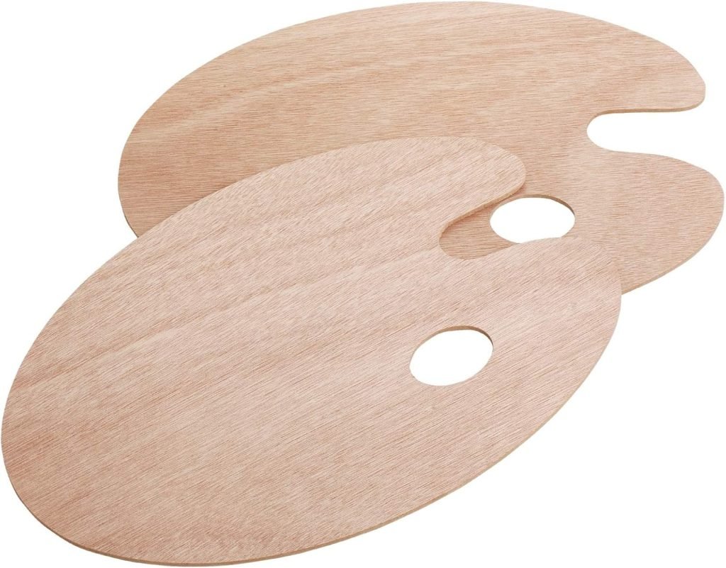
    • Wooden Palette – Traditional and great for mixing, but requires prepping the palette carefully with layers of linseed oil. I love the romanticism of a good wood palette. More importantly, I think this is the best palette for students as they can hold their palette up close to their canvas when mixing colors.
    • Glass Palette – Some students really love using a glass palette due to its larger size and the ability to set the glass on a table in front of you. (You do not want to hold a glass palette! HEAVY!) However, as an experienced atelier instructor, I dislike that their color mixing is done so far away from their canvas. I feel this is a disadvantage for seeing color as a beginner.
    • Disposable Paper Palette – Convenient for quick setups and cleanups but lacks durability, and frankly, is a huge pain in the rear. It moves, tears, and makes mixing colors annoying. A wood palette is much easier to clean than most people realize. You can simply scrape off the paint with a palette knife and wipe it with a paper towel. That’s it. Don’t be afraid.
    Palette Recommendation

    I’m obsessed with these super thin (and therefore light!) wood palettes. I find they last me a long time as long as I care for them well. They to have a tendency to warp, but this is easily fixed by making sure you oil both sides of your palette after use.

    Keep It Simple: Avoiding Unnecessary Oil Painting Mediums

    It’s tempting to use mediums like liquin, turpentine, and alkyds, but at SAA, we advocate for keeping things as simple as possible. The less you have to think about that is not actually painting the better.

    Also, I believe in letting oil paint act and behave like oil paint. It is not watercolor, you do not need to thin it as if it were. It is not acrylic, so stop adding dryers to your paint to make it act like acrylics. It is oil paint. Let it be oil paint.

    Instead, use paint straight from the tube, occasionally adjusting with a small amount of refined linseed oil if the paint out of the tube is excessively thick. Overuse of solvents or mediums can create a nasty smell, introduce unknown chemical elements into your studio, and can create unknown safety hazards as many secret painting mediums have unknown substances in them. Keep it simple, and let the oil paint do its oil paint thing. It is, after all, oil paint.

    Painting Medium Recommendations

    Gamsol is a popular solvent in oil painting circles because it is formulated to evaporate at a lower rate than other additives. If you insist on having an additive to your paint, this is the one I recommend over all others and you will find it on our oil painting materials list.

    I encourage students to only use this to thin paint when drawing on a canvas. That’s it. Even then, I am starting to transition students to drawing directly with pure paint instead of thinning it. The more stinky extras you eliminate from your painting practice the better.

    Refined Linseed Oil is a useful medium to have around your studio, but with the caveat that you need to be very careful with how you use it. Leaving a rag soaked in linseed oil crumpled on your studio floor may cause it to spontaneously combust. This is why when I use linseed oil to prime my palettes, I immediately dispose of the cloth flat in an outside garbage can away from anything flammable. Please note that SAA is not responsible for your studio safety.

    Linseed oil may also be added in very small amounts to thin especially thick paint.

    Make sure you only use refined linseed oil, not commercial grade linseed oil. It is important that all impurities are removed from your linseed oil to ensure it does not darken your painting over time.


    Palette Knives

    There are good palette knives and bad palette knives. You can tell simply by holding one and bending the blade.

    A good palette knife offers flexibility. It’s blade is thin yet durable. A bad palette knife is brittle and breaks under pressure. It might also be very thick and unwieldy.

    Please do not use those dumb plastic palette knives, they are a nightmare for serious painting.

    If you are a school teacher looking to put a class set together, invest in a smaller number of good quality palette knives for students to share instead of the worthless plastic ones that do not do their job well at all.

    I have found that a single palette knife is sufficient for most purposes, especially beginner painters learning to use one for the first time. If you have many palette knives, there is a tendency to lose them. If you have one palette knife, you keep track of it.

    Palette Knife Recommendation

    I like this size 5 smallish trowel-shaped palette knife from Blick.
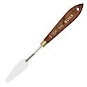
    Blick Painting Knife - Small Trowel, 5Blick Painting Knife – Small Trowel, 5 Blick Palette Knives by RGM are tempered and ground by hand for consistent flexibility and quality. They feature solid brass ferrules and ergonomic wood handles that are comfortable to hold.They’re both handsome and comfortable to hold. – Blick Painting Knife – Small Trowel, 5

    Painting Surfaces

    Ah canvasses, canvasses. So many to choose from. But all canvasses are NOT created equal my friends.

    Cotton Canvas

    Cotton canvasses were not widely used by artists until the 1800’s when mass manufacturing made the material more broadly available.

    As a canvas choice, cotton is often cheaper than linen. But it is also often much more course than many linens. Low resolution surfaces tend to be very difficult for students to learn on. I have witnessed many student projects fail simply because they could not control their paint on such a highly textured surface.

    Students are tempted to use cotton canvasses when learning how to oil paint due to its lower cost, but this comes at its own price. This is because each support you practice painting on teaches you something about material handling for that support. When you switch to a different type of canvas later, you have to relearn your paint handling skills.

    This is why I encourage students to use professional grade paints and canvasses as early as possible in their learning journeys. The cost difference is not so astronomical, but the benefits of learning on materials you intend to use for the longevity of your career has incalculable benefits.

    Linen Canvas

    Linen canvas is the preferred surface used by most easely painters for the longest period of time. There are probably good reasons the Old Masters had for that.

    My reasons for recommending linen canvasses is that we have evidence in museums that it upholds reasonably well over long periods of time. It is a natural substance that we know for sure does not interact adversely with any of the pigments that were used historically. Its finer threads and subsequently tighter weave create a smoother painting surface which is especially desirable for students learning how to paint.

    Although linen tends to be more expensive than cotton, there are economical options that work quite well for student work.

    Canvas Board

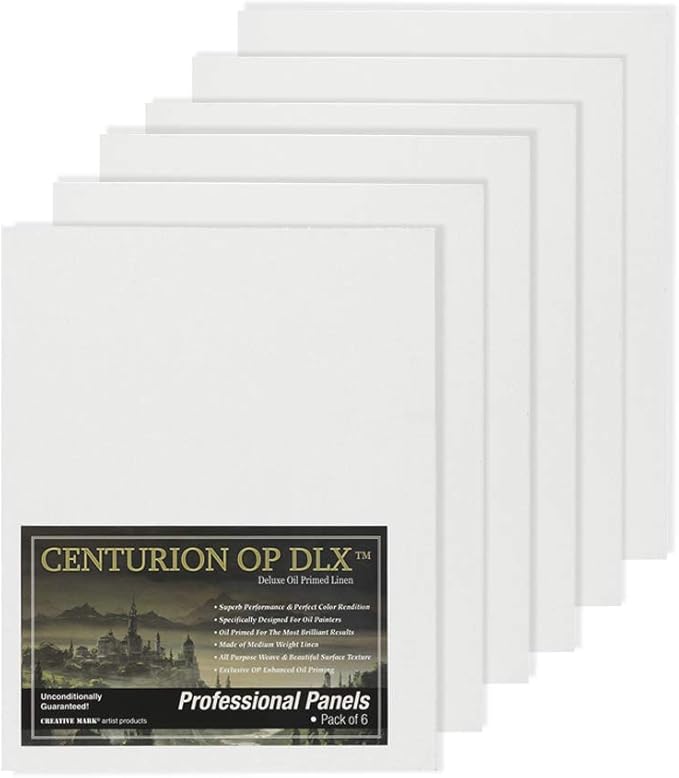
    Canvas board is a cheaper alternative than stretching canvas or purchasing pre-stretched canvas. It is also sturdier to work with than taping loose canvas to a board. I recommend this option for beginner oil painting students.

    Centurian oil paint board

    Other Supports

    In addition to canvas, some other support options include wood and metal. I do not use these supports in my own painting practice, and therefore will not offer recommendations on these materials.

    Oil vs. Acrylic vs. Primed Canvas

    Now that you have selected a canvas, you need to consider the primer. This is what rests between the cotton/linen/other support and your painting on top of it.

    I am generally against using materials that we do not have long term information on. As plastics (and therefore acrylics) were not made widely available to artists until the second half of the last century, I do not trust that we know what their true longevity may or may not be.

    We do have a substantial track record that oil primed linen will last centuries when treated properly. Therefore this is the only type of primed canvas I recommend to my students.

    Unprimed Canvas: Do not do this to yourself. Especially if you are a beginner. There is no reason to learn an entire new oil painting skillset that is required to prime a raw canvas well. Why mess with rabbit skin glue, weeks of drying time and sanding, etc. when there are really wonderfully primed canvass options readily available? This is art materials geekery territory. If you want to learn how to paint, do that first then circle back to this.

    Canvas Weaves & Gesso Layers

    Canvasses come in a variety of weave densities. Oil Primed Portrait Linen is generally considered the smoothest painting surface with tightly woven fibers. To my knowledge there is no standard for measuring weave in painting canvas, but most producers of painting linen will list in their descriptions how smooth or rough a surface is.

    The smoothness of a painting surface is also determined by how many layers of gesso are applied to it. The more layers, the smoother the surface.

    Pre-Stretched vs. Hand Stretched Canvasses

    For beginner students, I recommend using canvas board or pre-stretched canvasses. Please don’t distract yourself from the very difficult task of learning how to paint by going on unnecessary side quests like stretching canvas. Learn how to stretch canvas once you have a solid set of painting skills under your belt.

    Some students dislike how loosely pre-stretched canvas tends to sit on the frame. The little “keys” on the back of the canvas can be inserted on the back side to tighten the canvas.

    Loose Canvas

    Students often overlook the usefulness of loose canvas. You can cut it easily to any size you need. It is less expensive than stretched canvas. If you paint something you especially love, you can matt it under glass like a drawing, or have it dry mounted to foam core at a frame shop and frame it the same as any other painting.

    Canvas Boards

    Canvas boards are not often included in oil painting materials lists, but I think that is a mistake. Canvas boards are economical, offer a firm support for framing, and are easier to store than fully stretched canvases. I find them to be a very good compromise for students between the time, energy and expense of stretched canvas and the less professional looking loose canvas.

    For beginners, Centurion makes affordable oil primed linen with a smooth surface. They also make the most acceptable versions of pre-stretched canvasses I have tried.

    Sometimes students find the surface of Centurian canvas too smooth, in which case I recommend Clausens. Clausens is my favorite oil primed linen for professional work. It has a wonderful weight to it and stretches well on bars. It comes in rolls and must be stretched by hand onto stretcher bars for professional paintings. It is fine to cut up into small pieces for studies as well. Although pricey, it will last a very long time.
    Claessens Linen Canvas Roll - 82Claessens Linen Canvas Roll – 82″ x 5-1/2 yds, Oil Primed, No. 13, Smooth Texture Experts and internationally renowned artists alike appreciate the qualities of a Claessens Belgian linen – an archival support of exceptional quality. Claessens linen canvas is made from natural materials. – Claessens Linen Canvas Roll – 82″ x 5-1/2 yds, Oil Primed, No. 13, Smooth Texture

    Easels

    Next on our oil painting materials list is easels. You don’t need 15 easels. You need one maneuverable easel that accommodates the majority of the work you will ever make in your career.

    There are big expensive H-Frame easels, and smaller pack-and-play plein air easels. Table easels. All the easels.

    However, I try to convince my students to keep their setups as simple as possible. Learning how to paint is already challenging. Pondering an infinite number of easel options is a distraction.

    Easel Recommendation

    The easel I most recommend to students AND my professional peers is the Testrite Aluminum Easel. It is metal and durable, It’s easy to fix. It collapses quite small. It’s not terribly heavy. I can easily take it with me plein air painting (although not for extended plein air painting hikes, more the type of park and paint). Yet, it is sturdy enough for my clumsy self to stumble into it without knocking it over in my studio. It also has a small footprint ideal for tight studio spaces. And it is one of the more affordable options on the market. If you are especially tall, they make an extension that I recommend getting as well.
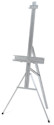
    Testrite Aluminum EaselTestrite Aluminum Easel “Autolock” feature anchors top of canvas. 21″ wide tray securely holds canvases up to 48″ high. 69″ high easel folds flat to 52″. Aluminum Easel Extension locks on top to paint larger canvasses. No tools needed for setup. – Testrite Aluminum Easel

    List of Miscellaneous Oil Paint Materials

    Automotive Blue Paper Towels

    These help keep paint off your hands as they were designed to absorb oil. Regular paper towels allow oil paint to soak through and get on your hands.

    Dish for Storing Brushes in Linseed Oil

    This is the cheater’s way of not having to wash brushes. Wipe off excess paint with paper towels after your painting session. Then, simply submerge the brush end of brushes in oil to keep them from drying out. It helps to slightly elevate one end of the dish at an angle by placing a roll of tape under one side.

    If you want the non cheater way to wash brushes, you can learn how to wash brushes here.

    Fire Proof Trash Can

    This is a good safety measure to have in your studio. Rags soaked in oil can spontaneously combust. Always use oil in minimum amounts and never leave an oil soaked rag lying around. Please note SAA is not responsible for studio safety.
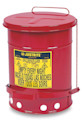
    Justrite Oily Materials Waste Can - 6 GallonJustrite Oily Materials Waste Can – 6 Gallon The Justrite Oily Materials Waste Can is essential protection wherever solvent or oil cloths, paint rags, and similar hazardous materials are used. It is ventilated to prevent spontaneous combustion. The self-closing cover is made of heavy terne plate. – Justrite Oily Materials Waste Can – 6 Gallon

    Cotton Paint Rags

    These rags are useful for the wipeout technique, as well as other studio purposes.
    Bag of Rags - 1 lbBag of Rags – 1 lb Bag of Rags contains 1 lb of general-purpose, reusable rags that are ideal for washing, polishing, dusting, painting, staining, and more! Made of 100% new material, the rags are pre-washed to make them soft and absorbent, and can be machine-washed. – Bag of Rags – 1 lb

    Artist Tape

    An essential for taping canvas to boards and other studio needs.
    Blick Artist Tape - White, 1Blick Artist Tape – White, 1″ x 60 yds Blick Artist Tape is a multi-purpose paper tape that is essential for many art projects. It has a repositional adhesive backing that does not leave residue when removed. – Blick Artist Tape – White, 1″ x 60 yds

    Foam Core Boards

    These lightweight boards are superior to heavy wood ones. They are easy to move around and are great for taping loose canvas to for painting studies.
    Blackcore Foam Board Pack - 16Blackcore Foam Board Pack – 16″ x 20″ x 3/16″, Black, Pkg of 3 Black Foam Board is just like regular foam board, except the foam core is black, and it�s laminated on both sides with black, coated paper stock. – Blackcore Foam Board Pack – 16″ x 20″ x 3/16″, Black, Pkg of 3

    Thin Black Sharpie

    These are great for transferring drawing as they do not dissolve when painted over.
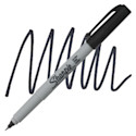
    Sharpie Ultra-Fine Point Marker - BlackSharpie Ultra-Fine Point Marker – Black Ultra-fine point in a metal sleeve produces an 0.3mm line. Permanently mark almost any surface. Sharpie markers are available individually in a variety of colors, and in sets. – Sharpie Ultra-Fine Point Marker – Black

    Tracing Paper

    Tracing paper is useful for transferring drawings to canvas.
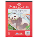
    Faber-Castell Tracing Paper Pad - 9Faber-Castell Tracing Paper Pad – 9″ x 12″, 40 Sheets The Faber-Castell Tracing Paper Pad is ideal for tracing your favorite drawing or photo on its 9″ × 12″ (229 mm × 305 mm) paper. 40 sheets per pad. Works great with markers. – Faber-Castell Tracing Paper Pad – 9″ x 12″, 40 Sheets

    By choosing high-quality materials, and avoiding unnecessary additions to your studio practice, you set yourself up for success in your artistic journey. Here are our complete list of oil painting materials recommendations.

    Titanium White
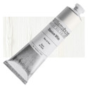
    Williamsburg Handmade Oil Paint - Titanium White, 150 ml tubeWilliamsburg Handmade Oil Paint – Titanium White, 150 ml tube Williamsburg Oil Paints source the best raw materials in the world. Each is carefully ground to enhance the beauty and luminosity specific to each pigment. These paints are uniquely hand-crafted and of the highest quality available. – Williamsburg Handmade Oil Paint – Titanium White, 150 ml tube

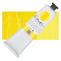
    Cadmium Yellow

    Gamblin Artist's Oil Color - Cadmium Yellow Light, 150 ml tubeGamblin Artist’s Oil Color – Cadmium Yellow Light, 150 ml tube Gamblin Artist’s Oil Colors are crafted by hand with the well-being of artists, their work, and the environment in mind. They combine the best traditions of the past with the latest technical innovations, giving you the freedom to create without compromise. – Gamblin Artist’s Oil Color – Cadmium Yellow Light, 150 ml tube

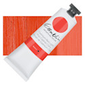
    Cadmium Red

    Gamblin Artist's Oil Color - Cadmium Red Light, 37 ml tubeGamblin Artist’s Oil Color – Cadmium Red Light, 37 ml tube Gamblin Artist’s Oil Colors are crafted by hand with the well-being of artists, their work, and the environment in mind. They combine the best traditions of the past with the latest technical innovations, giving you the freedom to create without compromise. – Gamblin Artist’s Oil Color – Cadmium Red Light, 37 ml tube

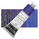
    Ultramarine Blue

    Michael Harding Artists Oil Color - Ultramarine Blue, 40 ml tubeMichael Harding Artists Oil Color – Ultramarine Blue, 40 ml tube This is a professional line of oil paint formulated to the highest standards. Using techniques dating back to the days of the Old Masters, Michael Harding creates powerful, intense colors of paint that are both beautiful and durable. – Michael Harding Artists Oil Color – Ultramarine Blue, 40 ml tube

    Ivory Black

    Gamblin Artist's Oil Color - Ivory Black, 37 ml tubeGamblin Artist’s Oil Color – Ivory Black, 37 ml tube Gamblin Artist’s Oil Colors are crafted by hand with the well-being of artists, their work, and the environment in mind. They combine the best traditions of the past with the latest technical innovations, giving you the freedom to create without compromise. – Gamblin Artist’s Oil Color – Ivory Black, 37 ml tube

    Brushes

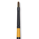
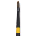
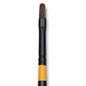
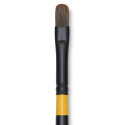
    Utrecht Manglon Synthetic Brush - Filbert, Size 2, Long HandleUtrecht Manglon Synthetic Brush – Filbert, Size 2, Long Handle Utrecht Manglon Synthetic Brushes are known for their excellent paint capacity, their silky feel, an extraordinary snap-back, and great shape retention. – Utrecht Manglon Synthetic Brush – Filbert, Size 2, Long Handle
    Utrecht Manglon Synthetic Brush - Filbert, Size 4, Long HandleUtrecht Manglon Synthetic Brush – Filbert, Size 4, Long Handle Utrecht Manglon Synthetic Brushes are known for their excellent paint capacity, their silky feel, an extraordinary snap-back, and great shape retention. – Utrecht Manglon Synthetic Brush – Filbert, Size 4, Long Handle
    Utrecht Manglon Synthetic Brush - Filbert, Size 6, Long HandleUtrecht Manglon Synthetic Brush – Filbert, Size 6, Long Handle Utrecht Manglon Synthetic Brushes are known for their excellent paint capacity, their silky feel, an extraordinary snap-back, and great shape retention. – Utrecht Manglon Synthetic Brush – Filbert, Size 6, Long Handle

    Utrecht Manglon Synthetic Brush - Filbert, Size 8, Long HandleUtrecht Manglon Synthetic Brush – Filbert, Size 8, Long Handle Utrecht Manglon Synthetic Brushes are known for their excellent paint capacity, their silky feel, an extraordinary snap-back, and great shape retention. – Utrecht Manglon Synthetic Brush – Filbert, Size 8, Long Handle
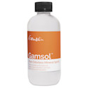
    Gamblin Gamsol Odorless Mineral Spirits - 8 ozGamblin Gamsol Odorless Mineral Spirits – 8 oz Gamsol is an excellent solvent for thinning Gamblin mediums and for general painting. It evaporates 100% and leaves no residue in paint layers. It’s also useful for studio and brush cleanup. – Gamblin Gamsol Odorless Mineral Spirits – 8 oz
    Gamblin Refined Linseed Oil - 4 oz bottleGamblin Refined Linseed Oil – 4 oz bottle Pressed from 100% American flax seeds, Gamblin Refined Linseed Oil is must-have medium for today�s oil painter. Pure, light, and very pale, this highly refined oil can be used in moderation. – Gamblin Refined Linseed Oil – 4 oz bottle
    Blick Painting Knife - Small Trowel, 5Blick Painting Knife – Small Trowel, 5 Blick Palette Knives by RGM are tempered and ground by hand for consistent flexibility and quality. They feature solid brass ferrules and ergonomic wood handles that are comfortable to hold.They’re both handsome and comfortable to hold. – Blick Painting Knife – Small Trowel, 5
    Testrite Aluminum EaselTestrite Aluminum Easel “Autolock” feature anchors top of canvas. 21″ wide tray securely holds canvases up to 48″ high. 69″ high easel folds flat to 52″. Aluminum Easel Extension locks on top to paint larger canvasses. No tools needed for setup. – Testrite Aluminum Easel
    Justrite Oily Materials Waste Can - 6 GallonJustrite Oily Materials Waste Can – 6 Gallon The Justrite Oily Materials Waste Can is essential protection wherever solvent or oil cloths, paint rags, and similar hazardous materials are used. It is ventilated to prevent spontaneous combustion. The self-closing cover is made of heavy terne plate. – Justrite Oily Materials Waste Can – 6 Gallon
    Bag of Rags - 1 lbBag of Rags – 1 lb Bag of Rags contains 1 lb of general-purpose, reusable rags that are ideal for washing, polishing, dusting, painting, staining, and more! Made of 100% new material, the rags are pre-washed to make them soft and absorbent, and can be machine-washed. – Bag of Rags – 1 lb
    Blick Artist Tape - White, 1Blick Artist Tape – White, 1″ x 60 yds Blick Artist Tape is a multi-purpose paper tape that is essential for many art projects. It has a repositional adhesive backing that does not leave residue when removed. – Blick Artist Tape – White, 1″ x 60 yds
    Blackcore Foam Board Pack - 16Blackcore Foam Board Pack – 16″ x 20″ x 3/16″, Black, Pkg of 3 Black Foam Board is just like regular foam board, except the foam core is black, and it�s laminated on both sides with black, coated paper stock. – Blackcore Foam Board Pack – 16″ x 20″ x 3/16″, Black, Pkg of 3
    Sharpie Ultra-Fine Point Marker - BlackSharpie Ultra-Fine Point Marker – Black Ultra-fine point in a metal sleeve produces an 0.3mm line. Permanently mark almost any surface. Sharpie markers are available individually in a variety of colors, and in sets. – Sharpie Ultra-Fine Point Marker – Black
    Faber-Castell Tracing Paper Pad - 9Faber-Castell Tracing Paper Pad – 9″ x 12″, 40 Sheets The Faber-Castell Tracing Paper Pad is ideal for tracing your favorite drawing or photo on its 9″ × 12″ (229 mm × 305 mm) paper. 40 sheets per pad. Works great with markers. – Faber-Castell Tracing Paper Pad – 9″ x 12″, 40 Sheets

  • Painting Composition: The Key to Making Better Art

    Painting Composition: The Key to Making Better Art

    Creating a stunning painting composition isn’t just about the rule of thirds or following mathematical formulas. In fact, those rules aren’t very helpful, and can even harm your compositions, if you don’t understand the big underlying concepts of pictorial design.

    A well-balanced composition draws viewers in, directs their eye through the piece, helps to tell a visual story, and makes the overall artwork much more compelling.

    Yet, many artists struggle with composition. They tend to bumble about placing things on their canvasses awkwardly, and inevitably end up with paintings that feel like something is always “off”.

    If this sounds familiar, you’re not alone. I’ve been teaching students realistic drawing and painting skills for more than a decade, and composition continues to be the most difficult aspect of painting for students to grasp.

    Fortunately, mastering composition is possible with guidance from a knowledgeable atelier-trained instructor. So, let me be your guide today through the world of pictorial composition and let’s discover what good painting composition is, what it isn’t, and how to practice your composition skills effectively and elevate your art.

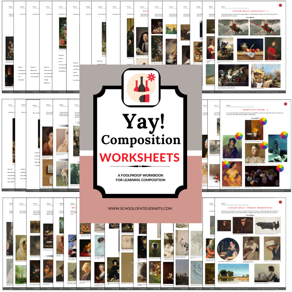
    The Yay! Composition Worksheets from The School of Atelier Arts are designed to teach you our foolproof system for creating powerful, dynamic compositions—without frustration or guesswork… Get yours today!


    Mastering Painting Composition

    Creating a strong composition is the foundation of compelling artwork. Whether you’re drawing a portrait, designing an outdoor plein air painting, or even arranging abstract forms, understanding composition helps guide the viewer’s eye and enhance visual impact.

    The following key composition techniques offer a structured approach to building complex and visually engaging artworks. By practicing these methods, artists can develop a deeper understanding of how visual elements work together to create harmonious compositions. Mastering these principles allows for greater artistic confidence and the ability to communicate ideas more effectively – and intentionally – through art.


    painting composition s curve

    Sweeps & S-Curves

    Sweeps and S-curves are powerful compositional tools that create movement and unity within a piece. By learning to recognize how flowing these implied curves lead the viewer’s eye through a composition, you can make your painting feel dynamic and cohesive.

    Learn how to harness the natural elegance of curves to create rhythm and harmony in your artwork. Whether used subtly in a portrait, or prominently in a landscape, sweeps and S-curves are a useful tool for achieving a visually engaging composition.

    painting composition big shapes

    Big Shapes & Spots

    One of the most effective ways to simplify composition is by focusing on the big ideas, such as big shapes and spots. These concepts help students to identify dominant forms that establish structure and balance within an artwork.

    By organizing a composition around major shapes before diving into details, artists can create a solid compositional foundation that delivers clarity for the viewer. Learning to place key shapes and focal spots strategically helps create compelling visual hierarchies, guiding the viewer’s attention carefully through the piece.

    Designing with Edges & Silhouettes

    Edges and silhouettes play a crucial role in how we read the big ideas of a composition. Edges and silhouettes can work to your benefit, or detriment if you are not careful.

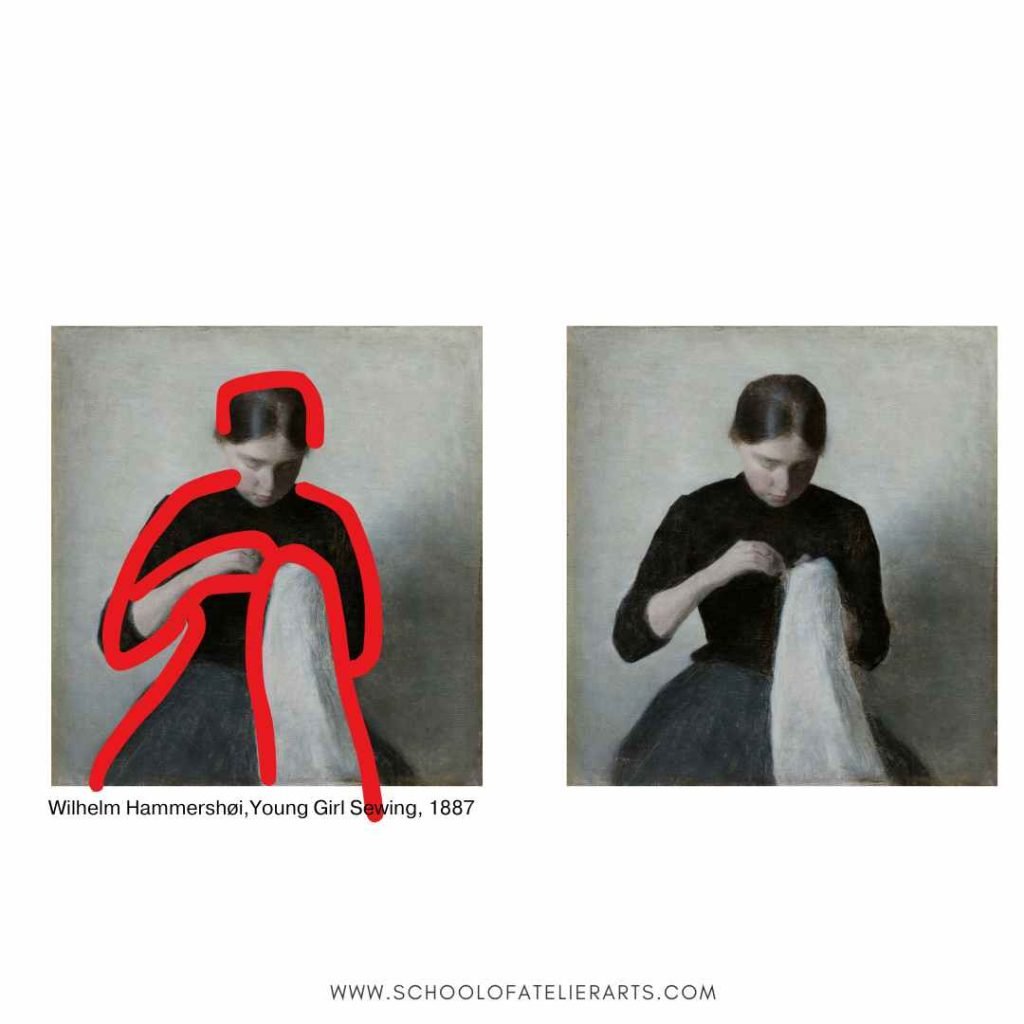
    If you want something to read cleanly and clearly, strong contrasts of light on dark or dark on light create clear edges.

    If you want your subject to read calmly and mysteriously, low contrasts of light on dark or dark on light create subtlety and nuance in a painting composition.

    Carefully placed edges and silhouettes create visual statements. By studying how two different colors meet (Softly? Harshly?), students can gain mastery and use edges and silhouettes to control the visual feeling of their compositions.

    Linear Ideas in Painting Compositions

    Understanding the power of lines in composition is fundamental to creating visually engaging artwork.

    Sometimes the more subtle applications of this concept are difficult for students to see at first. Identifying and utilizing diagonal, vertical, horizontal, and converging lines in a composition creates visually effective structures in paintings.

    Lines not only guide the viewer’s eye, but also establish guidelines for placing other elements in the composition.

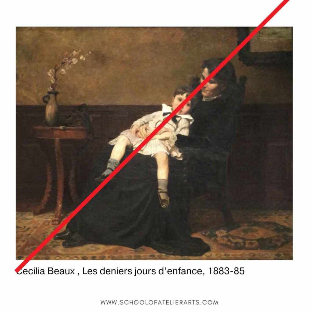
    Designing your painting composition around lines also contributes to the mood of your painting. Diagonal lines create energy and movement, verticals evoke strength and stability, while horizontals hint at calmness.

    The best way to learn how to effectively learn these concepts is to practice seeing how other artists used them. This is exactly what our Yay! Composition Worksheets teach students how to do. Through deliberate worksheet practice, students learn how to use these linear elements to create balanced and dynamic compositions.

    Color/Value of a Picture

    Color and value are essential compositional tools that impact the overall feel and readability of an artwork. Students need to learn how to recognize and apply dominant color schemes and value structures to strengthen their compositions.

    By understanding how a picture can be light, medium, or dark, artists can control the mood of their painting compositions.

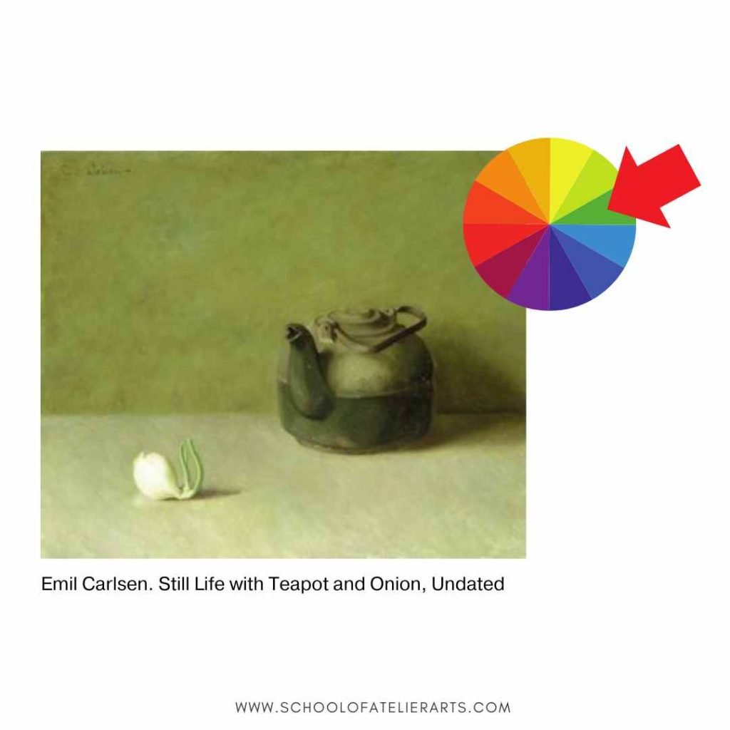
    By practicing identifying the overall color of a picture, students can manipulate their hues to evoke specific feelings from their viewing audience.

    Mastering seeing a picture holistically, including its overall value and hue, allows artists to control the emotional and visual impact of their compositions with confidence.

    Painting Composition: Putting It All Together

    Mastering composition involves the ability to integrate multiple elements seamlessly. That’s why our popular Yay! Composition Worksheets have students practice each element individually, and then combine them together. By practicing the ideas presented in this article, artists can create compositions that are visually captivating.

    Deliberate composition training ensures that students can apply their knowledge in real-world artistic scenarios, leading to more confident and effective artwork.


    Why Artists Love our Yay! Composition Worksheets for Learning Painting Composition

    Artists and educators alike have seen immediate improvements in their work using our popular worksheets. Here’s what some have said:

    “My students were always intimidated to try and draw realistically. With the help of the School of Atelier Arts resources, I now know how to help them experience success with their drawings every time! Their confidence is through the roof!”
    Nina Dirienzo, High School Art Teacher

    “I am extremely thankful for these resources because they offer skill-based lessons that give my students a strong foundation for their artworks.”
    Kelsea Fischer, Elementary Art Teacher


    What’s Included in the Yay! Composition Worksheets?

    When you purchase the Yay! Composition Worksheets, you get:

    • 50+ digital worksheets that guide you through the composition process step by step.
    • A Spanish translation for educators teaching bilingual students.
    • A structured approach that makes learning composition easy and practical.

    These worksheets are designed for artists of all skill levels, whether you’re a beginner struggling with composition or an experienced artist looking to refine your skills.


    Start Creating Stronger Painting Compositions Today

    If you’ve been struggling with composition, it’s time to stop guessing and start mastering it. The Yay! Composition Worksheets provide a clear, repeatable method that works every time. No more frustration. No more uncertainty. Just strong, confident compositions in every painting you create.

    Get instant access to your digital worksheets:
    ➡️ BUY NOW

    30-Day Money-Back Guarantee – If you don’t love the worksheets, we’ll give you a full refund. Simply write to help@schoolofatelierarts.com with your refund request, no questions asked.

  • Art Podcasts

    Art Podcasts

    Are you a fan of audio learning and searching for some new great art podcasts? You’re in luck – here is a collection of art podcasts from a wide range of content creators.

    Art School Live

    Although technically more of a free online class/video format, this show makes for great listening if you are wanting to learn more about art. The host, Eric Rhoads, is a prolific content producer and creates fantastic art podcasts. Here are several episodes of Art School Live that feature School of Atelier Arts Director Mandy Theis.

    Never Use White in Paintings with Mandy Theis

    In this art podcast, you will discover why there is no such thing as white. Guest Mandy Theis will take you through a process for figuring out how to detect which color your white actually is, and how to use whites well in your painting process.

    How to Paint Like a Master with Mandy Theis

    Learn how to create a small study of a master painting in this art podcast with Mandy Theis. Mandy will teach you how to find the big ideas of a painting, and how to create an effective study.

    Do you want to learn how to paint with Mandy? Join our Ateliyay! Painting Bootcamp today.

    Conspiracy Clearinghouse

    This art-themed podcast goes into the shadowy subject CIA involvement in the visual arts during the cold war. It is a well-researched podcast with cited sources. And, it is a highly entertaining episode that features atelier-trained painter and educator Mandy Theis.

    EPISODE 107 | Traces of Reality: Abstract Art and the CIA (World Is Weird 13)

    Don’t miss our latest art podcasts, join our popular art newsletter today.

    Rebel Rebel Podcast

    This a fabulous art podcast hosted by Michael Dargie. The tagline for the podcast is “Think Audaciously. Act Courageously.” In this episode, Michael interviews School of Atelier Arts Director Mandy Theis about atelier-style art education.

    This art podcast episode is a delightful romp through arteducationland and covers some of the history of art education, and why learning how to draw and paint realistically requires finding the right teachers.

    Rebel Rebel Podcast: Creators of the Lost Art

    Are you ready to take your painting to the next level? Join our online Ateliyay! Painting Bootcamp today.

    The Light Inside Podcast

    This is a neuroscience podcast that looks at mental health through many different lenses, including art. In this art podcast episode, discover how to use your art thinking to actually change what and how you see the world.

    The Illusion of Reality: How Art Shapes Our View of the World

    Looking for more great art podcasts? Check out our post on Unexpected Podcasts for Art Teachers here.

  • 6 Easy Steps to Draw & Paint Realistically

    6 Easy Steps to Draw & Paint Realistically

    6 EASY Steps to Draw and Paint Realistically RIGHT NOW

    Here are 6 easy steps you can take to to learn how to draw realistic things RIGHT NOW.

    If the idea of being able to draw realistically and paint like the Old Masters makes your heart sing, there are some simple steps you can take to get started on your atelier journey right away.

    In order of smallest time commitment to biggest time commitment, here are some ways to start learning how to draw and paint realistic things TODAY.

    1 Minute: Join our SAA mailing list for tips, tricks, inspiration & more. We send out lesson plans and other resources for learning how to draw realistically.

    10-15 Minutes: Watch an atelier video that teaches a skill. The videos in this mini-series on color theory take only 10-15 minutes to watch, and you will come away with at least one new color concept you didn’t know before.

    30-90 Minutes: Download some of our free art lessons and give them a spin. These short, easy-to-follow lessons will help you build some realistic drawing skills with only a 30-90 minute time commitment.

    10-15 Hours: Ready for a bit more serious study? Try our Yay! Portraits Worksheets that take you through a series of realistic drawing exercises to help you make accurate portraits.

    1 Week: Ready to jump in to your first full atelier project? This free YouTube class takes you step-by-step through the process of completing a project that most ateliers have you do as your very first one. It’s called a Bargue Plate. Don’t worry – you don’t have to do it all at once! Each video is about 15 minutes long, and the series has ~30 videos. You can work through them at your own pace. And by the end, you will know how to draw realistic images at a high level.

    6 Weeks: Apply for the MA in Studio Art. Now you are playing in the big-kids pool.

    This accredited MA in Studio Arts program is summers-only, has remote and in-person options, is 100% studio-based, and requires ZERO year-round obligations. Train intensively in atelier skills for 3 summers.

    If you are serious about expanding your technical art skillset without quitting your current job, this is what you need. This program will teach you how to draw and paint realistically.

    It’s not easy taking first steps towards atelier training, but the most important thing is to take a step.

    So pick one and give it a try, your future self will thank you when you are drawing realistic images!

    What steps are you taking to start your atelier journey? Let me know in the comments below!

  • The Perfect Drying Rack Alternative for Art Teachers

    The Perfect Drying Rack Alternative for Art Teachers

    Is there a better drying rack for art teachers out there?

    Traditional drying racks are big, unwieldy, and don’t even hold that many wet paintings. They take up a lot of floor space, and only 1-2 students can be in front of them at a time which creates a bottleneck in the art classroom.

    Worse yet, the paintings often fall off of them and onto other wet artworks, defeating the purpose altogether. And they are expensive!

    But what if there was a better, easier, cheaper, cleaner, more efficient way to dry paintings? This art teacher hack will cure all of your painting-drying woes.

    Check out our Ateliyay! Curriculum for more great art education resources.

    drying rack for art teachers

    THE DRYING RACK ALTERNATIVE THAT WILL BLOW YOUR MIND

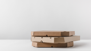
    Now this might sound a little crazy, but hear me out. The best drawing rack for art teachers are actually pizza boxes.

    You heard me right.

    Pizza boxes.

    Pizza boxes are by far the best system for drying wet artworks. They are light, they securely store wet artworks, and they can easily be stacked out of harm’s way. Best of all they are free – local pizza places will often give you a stack of pizza boxes when presented with the ole “I’m an art teacher and my students need your help” routine.

    Check out our Ateliyay! Curriculum for more great art education resources.

    PIZZA BOX RACK DRYING SYSTEM
    1. Students paint something
    2. Fold pizza boxes. Save time by having students fold their own boxes as part of the lesson (there’s no reason you have to do it!).
    3. Distribute tape. Do this while students fold pizza boxes. I suggest distributing tape by tearing 3″-4″ pieces and attaching the pieces lightly to the back of students’ seats. This distribution method prevents a taking-forever-to-get-your-tape situation with students.
    4. Have students place artwork in boxes. If you have large pizza boxes, multiple student artworks can be stored in a single box. For elementary students, I like to have four paintings per box as that is the number of students I usually have at each table.
    5. Tape down artwork. You can tape artworks by rolling some artist’s tape to gently adhere it to the back of the work, or by taping over two of the corners of the artwork to attach it to the box. If you have a ton of students in each class, you can also tape an additional four artworks to the lid of the box, allowing one large box to store up to 8 artworks.
    6. Label. On the edge of the box, write the table number and class period. Pizza boxes have a spot to do this specifically on the edge. Do not write on top of the box because when they are stacked you won’t be able to see it. By writing on the edge, you can see the label for every box no matter how many are stacked on top of each other.
    7. Stack boxes and place out of the way. The great thing about pizza boxes is that because they are so light, it is easy to store them in otherwise under-utilized areas of your classroom such as on top of cabinets.

    Are you enjoying this article? Join our mailing list for art teacher delights delivered directly to your inbox.

    SPECIAL NOTE

    Did you know folding pizza boxes is a skill? Your local pizza place might gladly fork over a stack of boxes, but they will be unfolded. You might be thinking to yourself, “Oh Mandy, I can fold a pizza box. I can figure it out, it’s fine.” But I have given hundreds of art teachers pizza boxes throughout the years of giving workshops, and not a single person who insisted on doing it without instruction did it correctly. So do yourself a favor and watch this quick video to save yourself some time and frustration.

    Although you can get pizza boxes donated to your classroom, you may prefer unprinted boxes for yours students.

     (Please note that this is an affiliate link.)

    What do you think? Will you try a pizza box drying rack system in your classroom? Is it the best drying rack for art teachers? Let me know in the comments below.

    The Must-Know Secret for Teaching Oil Painting on a Budget

    How to Clean Oil Painting Brushes
    Did you enjoy this article? Join our mailing list for art teacher delights delivered directly to your inbox.

    Check out our Ateliyay! Curriculum for more great art education resources.

    Learn more about atelier training by listening to Director Mandy Theis on this podcast.

  • How to Paint

    How to Paint

    Do you want to learn how to paint? Here is how special art schools, called “ateliers“, teach painting to students.

    how to paint

    Learning How to Paint Starts with Drawing

    Everyone who enters an atelier for the first time just can’t wait to start painting! And then they find out that before the school will teach them color work, they have to acquire some realism drawing skills first.

    Many students see drawing as something to get through in order to get to the “good stuff”, but it is important to note that a good portion of painting IS drawing. If you can’t make a shape correctly with a pencil, there is little chance that you will be able to do so with a relatively unwieldy brush.

    One key to learning how to paint is to make sure your drawing is in tip top shape.

    Not to mention that as you start to master the art of drawing, it is easy to fall in love with the beauty and challenge of it. When I was training with Juliette Aristides, she had to MAKE me start painting. I was completely enamored with drawing by the time I really started to understand the nuances of it, and I needed a nudge to move on to the next phase of my art education.

    If you truly want a rock-star art education, you need to learn how to draw first. Luckily for you, the School of Atelier Arts has online painting classes that can teach you everything you need to know to become a successful painter.

    Check out our Ateliyay! Curriculum for more great painting resources.

    atelier painting school
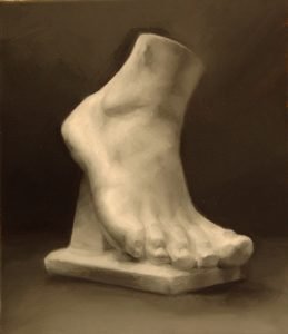
    “Foot” painted en Grisaille by Mandy Theis

    Grisaille Painting

    The next step in learning how to paint is to learn Grisaille. Grisaille means painting in black and white. It is similar to drawing in the sense that you are using lights and darks in order to create believable forms. You’re just doing it with paint now instead of pencil or charcoal.

    However, Grisaille can be frustrating because your hand is always a little bit better than your eye at this stage in your painting education.

    Drawing has trained your eye to see things much better than you used to. Drawing has also trained your hand to manipulate charcoal and pencil with nuance. Therefore, it can be frustrating to start SEE what needs to be done, but you do not yet have the experience with paint manipulation to make it happen at the level you can see it.

    In fact, this is such a common frustration that I wrote and entire article on how your hand gets better before your eye.

    Are you enjoying this article? Join our newsletter full of art education delights today!

    WarmCoolSetupEducation

    How to set up a white object to paint warm/cool

    Warm/Cool Method

    Warm/Cool painting is one of the most exciting phases of learning how to paint. By now you’ve learned to master the basics of realism drawing and how to control the medium in a fairly nuanced manner. In the Warm/Cool stage of training, you now start adding colors to your palette.

    But not too many colors.

    There are many variations of Warm/Cool painting, but the palette that I learned and teach uses titanium white, burnt sienna, and ultramarine blue.

    By limiting colors on your palette, it helps keep students from being overwhelmed while they are trying to integrate learning color with their drawing skills.

    Using the warm/cool method is also very satisfying. Even though I made this painting with only 3 colors, it feels like a full-color painting.

    painting education

    This was the stage of my own painting education that I found the most inspiring. I was learning how to paint, and all the previous drawing and Grisaille work was paying off.

    Did you know that EVERY color is BOTH warm AND cool? Read about warm and cool colors here. 

    Ready to start taking painting classes? Join our Ateliyay! Painting Bootcamp today.

    Full Color Painting

    Want to start learning full color right now? Our Yay! Color Theory Worksheets teach you how to think about and mix colors. Say good bye to cartooney coloring by mastering value, chroma, and hue in these worksheets.

    After exploring a limited color palette, the next step of your painting education is to start adding colors to your palette.

    But again, not too many colors at first. The fewer colors you have to work with, the less overwhelming it is to explore and apply your color palette.

    You will start to discover what colors you really need as you go. There is a color palette, known as the Zorn palette, that is a great place to start when you are working with a full color palette for the first time.

    Zorn Palette

    Red

    Yellow

    White

    Black

    That’s it. That’s the Zorn palette, and you can get some variation of every color you might need out of it.

    Some of you might be wondering about not having blue in the palette. But in this case, black acts as the blue. If you add white to it, it will become a grayish blue.

    Start learning color today with  our  Yay! Color Theory Worksheets .

    Adding More Colors

    As you advance in our painting education, you might find that you need a stronger blue than black provides. If you just can’t live without a true blue, you can add an ultramarine blue to your palette.

    The green that is mixed with black and yellow is fairly neutral, so a Viridian Green helps artists hit more chromatic notes. If you find you can’t make your mixed green as green as you need it, Viridian Green is a good color to add to your expanding palette.

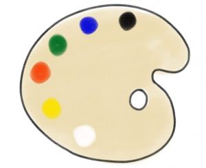
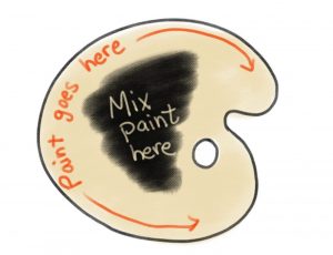
    (Want to learn where to place paint on your palette? Check out this article on How to Set Up an Oil Painting Palette.)

    learning how to set up an oil painting palette

    Once you can easily manipulate the colors in a more basic palette, there are many different palettes that can be explored. Examples include the Fletcher Palette, the Gilbert Stuart palette, and many others that artists have recorded for us in their journals and writings.

    *** Warning about jumping from palette to palette***

    Often students believe they just need that one more color to be a better painter, when really what it is they need is more experience with their current palette. The colors on your palette cannot make you a better painter. Putting in the hours practicing painting with your palette is what makes you a better painter.

    Master color mixing with our  Yay! Color Theory Worksheets .

    “Roses” by Mandy Theis, 2018

    Are you enjoying this article? Join our newsletter full of art education delights today!

    Anyone Can Learn How to Paint Realistically

    There is a pervasive myth that somehow people get bopped on the head by a talent fairy one day, and paint like Rembrandt the next.

    Well, the truth is that Rembrandt and Da Vinci and nearly any other artist working realistically had a painting education. They learned how to paint in ateliers.

    And you can learn how to paint realistically too. You simply need to go to a school that offers what is called “atelier training” such as our online Ateliyay! Painting Bootcamp. This online class offers extensive painting training that will teach you the skills you need to draw and paint anything your heart desires.

    Do you think atelier training is right for you? Tell me about it in the comments below.

    Did you enjoy this article? Join our newsletter full of art education delights today!

  • Why Is Red So Hard to Paint?

    Why Is Red So Hard to Paint?

    Red subjects have a bad reputation for being difficult to paint. But if you take time to identify its attributes, you can easily learn how to paint red well.

    How to paint the color red

    Have you ever tried to Cosplay Sabastian from The Little Mermaid? It’s no easy feat. Sabastian is a red crab, and you are a human. In order to really get that crabby-looking skull, you will need to use red makeup, and lots of it, to manipulate the forms of your face.

    In short, you will have to learn how to paint form using the color red.

    Want to start atelier training? Join our Ateliyay! Painting Bootcamp today!

    Often, cosplayers are successful changing the appearance of the shapes of their skulls by using dark and light values. For example, if you place a very dark eyeshadow under your cheekbones, they will look really sunk in. This effect can be further enhanced by adding white on top of your cheekbones. Together, the light and dark areas make the cheekbones look like they are protruding from the face much further than they actually are in reality. A general rule is that dark values will create an indented or concave feel, and light values will create a protruding, convex feel.

    But Sabastian is red. And red has a notoriously challenging reputation to work with. 

    Why is red so hard?

    The difficulty lies in the main attributes of the color red. Imagine, if you will, Sabastian-the-crab red. For those of you who are unfamiliar with this character, Sabastian is approximately the color of a bright red stop sign.

    Let’s analyze this version of red together. Like all colors, stop-sign-red has three attributes, a value, chroma, and hue.

    The hue (red, orange, yellow, green, blue, purple) is perhaps the most obvious. It’s red.

    Want to start atelier training? Join our Ateliyay! Painting Bootcamp today!

    Red is dark in value.

    The value (how light or dark the color is) of stop-sign-red is actually fairly dark. If we compare this color to a value scale 1-9, with 1 being the brightest and 9 being the darkest, stop sign red is a 5 or 6. Compare that value to the value of an average bright yellow, which is closer to a value 2.

    This attribute – having a dark value – makes red difficult to pin down. When colors are very light or very dark, it makes it more difficult to discover one of their other major attributes – chroma.

    Red is chromatic.

    Stop-sign red is also a very chromatic red. If an artist wants to paint a stop sign on canvas, the most chromatic red in the paintbox is likely needed. You cannot make a color more chromatic by mixing it. In fact, mixing any color will automatically make it less chromatic than colors available out of the tube. So in order to paint stop-sign-red, a very chromatic tube of red paint is needed.

    How do you proceed?

    Now, let’s pretend that we are cosplaying Sabsatian and need to paint our face to look like the head of a crab. As mentioned earlier, in order to achieve the perception that you have a crab head instead of a human one, light and dark values are needed to trick the viewer into thinking the skull is a different shape.

    Overall, the color for our Sabastian cosplay needs to look stop-sign-red. But we also need to make it feel lighter and darker in order to pull off an authentic Sabastian look. Remember, we want to trick anyone looking at our face that we are a crab, using mastery of paint as our weapon.

    Want to start atelier training? Join our Ateliyay! Painting Bootcamp today!

    Avoid the pink!

    Because stop-sign-red has a dark value, about a value 5 on a 1-9 scale, it seems counter-intuitive to use it to paint the parts of the face that would be receiving light (like the top of the cheekbones in our earlier example). But this is exactly what is needed. If you add white to red to lighten it for a light area, it is no longer red – it becomes pink. Instead, in order to preserve the accurate chroma of stop-sign-red, we must paint the light areas with our most chromatic stop-sign-red paint, even if it is a value 5.

    If you are painting a chromatic subject, the darks are chromatic too.

    The shadows also create unique problems when painting a stop-sign-red face. This is because Sabastian is so chromatic. A common solution to making a color darker is to add black. But black is a very neutral color, and it will sap away the chromatic intensity of our red. Instead, we need to find a chromatic red that is darker than our stop-sign-red paint. Often, Alizarin Crimson is used for this purpose. It is much darker than stop-sign-red, but still very much a chromatic red. It is a chromatic red that is darker in value.

    To paint a stop-sign red crab skull without losing its most obvious attribute (it’s chromatic bright red color), cosplayers cannot depend on adding white and black to show light and dark areas. Instead, the effects must be created by preserving chroma and changing hues, from a warm, bright stop-sign red to a colder, darker, but still intense Alizarin Crimson.

    Other chromatic colors work this way too.

    This method can be used for many very chromatic potential Cosplay characters. Avatar? Get the most chromatic light and dark blues you can find to create the effects instead of relying on black and white to show the forms.

    Making up a new neon-pink alien to cosplay? Keep away from that white paint and find chromatic pinks that are different values!

    Want to start atelier training? Join our Ateliyay! Painting Bootcamp today!

    What are you waiting for?

    I hope this example helps you to understand the challenges specific to painting red. Happy chromatic cosplay painting, and I look forward to seeing many elevated examples on my social media feed. Send your links in the comments below!

    Want to learn more about color mixing? Check our our free art lesson plans here.

    Want to start atelier training? Join our Ateliyay! Painting Bootcamp today!


  • The Must-Know Secret for Teaching Oil Painting on a Budget

    The Must-Know Secret for Teaching Oil Painting on a Budget

    Teaching oil painting with a small budget is possible if you apply this one simple principle.

    (Please note this article contains affiliate links.)

    Many art educators avoid teaching oil painting in their classrooms due to expense. It is true that purchasing oil paint, palettes, canvas, and brushes can add up quick.

    But, if we challenge some of the assumptions about teaching oil painting in the classroom, it’s possible to teach it on a more modest budget than previously thought.

    There is one secret above all others that will keep your supply costs down.

    Paint small.

    Simple, but true. Everything becomes more manageable, and cheaper, when you have your students complete projects that are physically a small size.
    Want to start atelier training? Join our Ateliyay! Painting Bootcamp today!

    Painting small reduces the amount of canvas used by students.

    There is no need to buy canvas panels, stretched canvas, wood panels, or any other expensive support for painting. Instead, cut a 5″x7″ piece of canvas from a roll, and then tape it on all sides to a drawing board. You can get a TON of 5″x7″ pieces of canvas out of a single roll, and you can get rolls of canvas for as cheap as $90.

    How to teach oil painting
    Art teachers at a workshop taught by Mandy Theis learning how to teach oil painting to students. Notice the paintings taped to the boards are then transferred to the inside of a pizza box for safe keeping.

    Bonus Tip: Have students transfer their wet paintings to the inside of a pizza box. The tape around the edges will allow them to stick snugly to the bottom of the box. You can easily store 4 paintings per pizza box. Close the lid, write the name of students on the edge of the box where it is easily viewable, and stack away knowing that your students’ paintings are safe and sound until the next class. You can reuse these pizza boxes the entire year, and most pizza places will straight up give you a stack if you ask nicely with your art teacher puppy dog eyes. 

    (I personally prefer to purchase blank pizza boxes and have my students do their color theory color wheels on the lid of the box. That way they always have their color wheels on hand to reference.)

    Want to start atelier training? Join our Ateliyay! Painting Bootcamp today!

    Painting small reduces the amount of paint used.

    If you have small canvases for your students, you don’t need as much paint to cover said canvasses. I can get 3-4 5″x7″ paintings out of a class of 25 on 3 tubes of titanium white, and one tube each of cad red, cad yellow, ivory black, and ultramarine blue.

    (The amount of each color may change depending on what subject you have them paint. If oceans are your theme, you may need more blue, for example.)

    My painting projects take about 10 classes each to complete which is 30-40 days’ worth of lessons with a relatively small amount of money spent on paint.

    Painting small reduces the number of brushes you need per student. Also, smaller brushes are cheaper.

    This is a bit of a no-brainer. If you don’t have big surfaces to cover, you don’t need big brushes. In fact, most of the time I give my students a size 2 and size 4 filbert brush and that is it. There isn’t a reason to need bigger brushes than that when working on 5″x7″ canvasses. I keep small detail brushes at my desk that students can check out as needed.

    Painting small reduces the number of palettes you need because students can share.

    Having students share palettes is one way to reduce your costs. Painting on small canvasses with small brushes means students only need a small space to mix their colors. Palettes are not terribly expensive, but when you are on a tight budget every little bit helps.

    I do not recommend sharing palettes if you have an easel setup in your classroom, but if that is the case you can probably afford the extra palettes with that supportive admin you appear to have.

    So, what do you think? Will painting small help you take the plunge and teach oil painting this year? Let me know your thoughts in the comments below.

    Want to start atelier training? Join our Ateliyay! Painting Bootcamp today!


  • How to Care for a Class Set of Wood Painting Palettes

    How to Care for a Class Set of Wood Painting Palettes

    Discover how to make your wood painting palettes last years and even get better with age.

    wood palettes

    Please note that this post contains affiliate links. Additionally, our programs for art teachers are supported by generous donations of paint and Gamsol from Gamblin.

    Welcome to the wonderful world of wood painting palettes. Once you adapt to how to care for them, you will never revert back to the white, plastic, impossible-to-clean kind.

    Please Note

    This how-to article is for using oil paint only. These procedures are not appropriate for acrylic painting.

    How to Prep a Wood Palette

    The first thing you need to know about wood painting palettes is that they need a little time and attention before you use them for the first time in your classroom. Most wood painting palettes are delivered raw, meaning they have not yet been properly treated for use.

    You will need oil (preferably linseed) and a cloth/paper towel.

    ***WARNING*** Do not EVER leave an oil-soaked rag or paper towel crumpled. It can spontaneously combust. After use, immediately lay flat to dry outside, and always dispose in an outside garbage can. *Disclaimer* SAA is in no way responsible for damage caused by using information provided in this article.

    Because oil-soaked rags can spontaneously combust if left crumpled and abandoned, I NEVER let my students prep new painting palettes. I always do these in batches on my own to make sure that there is never an oil-soaked rag lying around where I don’t know about it. The good news is that if you do it correctly, you only have to do it once and your palettes will last years.

    So, if I haven’t scared you away from the magic of wood palettes, let’s discover how to prep them.

    Want to start atelier training? Join our Ateliyay! Painting Bootcamp today!

    How to Prep Wood Painting Palettes

    1. Rub them down with oil and a cloth. Dab a few drops of oil on the palette, then rub vigorously with a cloth until the wood changes to a slightly darker color.
    2. Use the right amount of oil. The oil should not be dripping off of the palette. If it is, you have used too much. Rather, you should use just enough oil that it quickly absorbs into the wood when moved around by the cloth.
    3. Make sure to cover all the wood on BOTH sides of the palette. If you only oil one side of the palette, it will warp, especially if the palette is made of thinner wood like I prefer to use in the classroom.
    4. Let the oil absorb and dry for several hours, and then repeat this process several times for new palettes.

    You only have to do this prepping process for brand new palettes. Once they start being used regularly, your students will maintain the palettes by using proper cleanup procedures.

    Proper Clean-Up Procedures for Palettes

    1. Remove all excess oil paint on palette by scraping it with a palette knife. Any useable paint from the class set of palettes can be moved to a central palette and stored in the freezer. The unusable paint should be wiped into a paper towel and discarded. There should be a small amount of paint remaining on the palette. This is good.
    2. Add a few drops of Gamblin Gamsol to the palette and rub over the front of the palette. (This will thin out and pick up the remaining oil paint and distribute it around the palette. Gamsol is the only thinner I would ever use in my classroom as it has almost no smell. It is formulated to evaporate at a slower rate than other options and is by far the least obnoxious choice to use in a classroom setting. You can read more about Gamsol and its safety properties here: https://gamblincolors.com/studio-safety/studio-safety-create-without-compromise/)
    3. Make sure to use the same rag to rub the back side of the palette. It is important to always apply oil (or in this case diluted oil paint which contains oil) to the front AND back of the palette in order to keep it from warping. Do not skip this step! (In this case, the small amount of remnant oil paint is being used to patina the palette. Because the oil is diluted with pigment, the rag/paper towel is not in danger of spontaneously combusting like pure oil on a rag. It should, however, be disposed of in a fire safe trash can or an outside garbage can.)
    4. Never let paint dry on the palettes. Depending on how hardened the paint is when you discover it still on the palette, it may need to be sanded off and the palette re-oiled.

    Want to start atelier training? Join our Ateliyay! Painting Bootcamp today!

    If you follow these procedures for prepping and maintaining your palettes, you will discover that your palettes actually get better with use. Every time they are wiped down, it helps build a nice patina that makes the surface easier for mixing on. You can get years and years out of a class set of palettes when cared for correctly.

    Wood Palette RecoMmendationS

    I personally prefer to use thin wood palettes in my classroom because they are light, and when you are handling 25+ palettes at a time this makes a big difference. The downside is that they are more prone to warping if you are not very careful about always rubbing down both sides after every use. These palettes are 3mm thick:

    If you prefer slightly more robust painting palettes that are less likely to crack or break over time, a standard thickness palette will work quite well in the classroom, even if it is a little heavier. These palettes are 4 mm thick:

    What do you think? Are you ready to attempt wood painting palettes in the classroom? Let me know in the comments below.

    Want to start atelier training? Join our Ateliyay! Painting Bootcamp today!


  • How to Set Up a Painting Studio

    How to Set Up a Painting Studio

    Save yourself frustration and hassle by setting up your painting studio space the right way.

    painting studio setup

    Learning how to draw and paint at the highest levels is challenging enough – there is no need to make the task even harder with an inadequate painting studio setup. In order to make your painting studio space work for you, you need to set up your painting studio space in a way that allows you to set your easel properly, control your light, and place your still life setup in the right location in relation to your easel.

    Please note that this article contains affiliate links.

    Make sure to check out our shop for more great drawing and painting resources.

    Easel Setup

    An extraordinarily common mistake I see students make is that they set up their easels so that they are tilting backwards quite a bit. This is bad! You want your canvas or drawing board to be in the most vertical position on your easel that you can make it. When your work surface is tilted away from you, it creates distortion in your work due to perspective. Having your drawing or painting surface vertical eliminates much of this distortion.

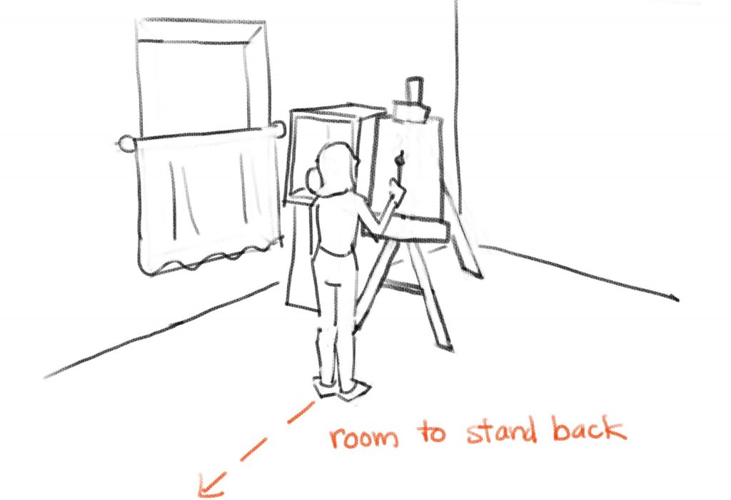
    Another common mistake I see is students sitting at their easel in their painting studio. One of the greatest assets you have as an atelier student is to stand back far away from your work. It helps you see big, which is one of the most important skills to learn in atelier training. If you do not have room to stand back when you set up your painting studio, you are depriving yourself of a huge advantage for progressing in your realistic drawing and painting skills.

    If you have physical limitations that prevent you from standing for long periods, I strongly encourage you to place a second chair further away from your easel so that you can see it from a distance in between painting sessions.

    Enjoying this article? Join our newsletter full of art delights.

    Lighting

    There are two approaches to lighting for a painting studio. One is to use natural light, and the other is to use artificial light. Both approaches have their pros and cons. Determine your preference in order to set up a painting studio for your needs.

    Natural Light

    Pros: Subtlety of light on the forms of your subjects, more nuance of color visible when painting, atmospheric with a wide range of edges visible.

    Cons: You cannot work after sundown, the light can shift the colors of your subjects depending on how overcast it is, and ideally you need north-facing light in order to have the most consistent lighting which limits the potential locations of your studio space.

    Want to start atelier training? Join our Ateliyay! Painting Bootcamp today!

    Artificial Light

    Pros: More defined lights and shadows which make it easier to draw and paint, you can work any time day or night, you can set up anywhere

    Cons: Sometimes it is challenging to light your easel without polluting the lighting of your subject, working in a dark room with spots on your subject and easel can be hard on the eyes, there is less nuance of value and color on your subject when lit by a spotlight.

    Enjoying this article? Join our newsletter full of art delights.

    How to set up a painting studio – Natural Light Setup

    If you want to work with natural light in your painting studio, you need to be able to control the light as much as possible. Ideally, you want to find a North-facing window.

    The worst option is a South-facing window. This is because you don’t want any direct sunbeams hitting your subject, only indirect light.

    You can make do with a West- or East-facing window as long as you understand what the limitations of them are.

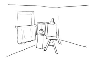
    You never want direct sunbeams on your subject. Instead, you want to make an oculus out of your window that allows only some of the indirect sunlight to hit your still-life setup. You can do this by blocking out the lower half of your window. This allows light to enter your studio from above and creates a nice angle of light for lighting your subject.

    In the image below, notice how the lower half of the window is covered with a curtain. If you have other windows in your studio space, you want to block them out entirely. You want only one light source coming from one direction on your subject.

    Make sure to check out our shop for more great drawing and painting resources.

    how to set up a painting studio

    How to Set Up a Painting Studio – Artificial Light Setup

    This is the recommended painting studio setup for anyone who is new to atelier training. Artificial light creates clearly-defined shadows, bed-bug lines and cast shadows, which are all very helpful when drawing and painting using atelier methods for the first time. Artificial light also makes values when shading more obvious.

    The most important thing about setting up with artificial light is to make sure that the light on your easel does not pollute the subject which is lit by its own separate light. See the image below and notice how the light on the easel is raking from upper left to lower right across the easel board.

    how to set up an art studio

    The easel light is placed in a way where light pollution from the light on the easel will not get into the still life setup. It also prevents your arm from casting a shadow on your canvas in the area you are working. If you are left handed, you will want to set up the lighting in reverse.

    Want to start atelier training? Join our Ateliyay! Painting Bootcamp today!

    ARtificial Light Recommendations

    I recommend these lights for your painting studio setup:

    Option 1: A small, easy to maneuver light. My favorite thing about this light is that it has both warm and cool lighting options. (Natural light is cool, light from interiors is often warm. So, depending on your subject you have more control over the entire mood of the setup.)

    Option 2: This light has more stability than the first option because it does not have a bendy feature and instead uses solid arms to hold its position. It can be a but more bulky, but it is a solid option to use in the studio.

    Where does your still life go?

    Finally, to perfect your painting studio setup you want to be smart about where you place your still life setup.

    If you are right handed, you want to place the still life to your left. This way, you do not have to look over your arm in order to get a clear view of your setup. Left-handed folks will want to place their subjects to their right.

    If you are working sight-size, you will want to align the front edge of your shadow box with your drawing board.

    Generally speaking, you do not want to have to look too far up or too far down in order to see your subject. This is why I recommend to set up your painting studio by placing both your drawing board and the center of your box at eye level. See the image below.

    Make sure to check out our shop for more great drawing and painting resources.

    how to set up a painting and drawing studio

    You may have a specific artistic purpose to place your still life higher or lower than this recommended location. But if you are new to atelier training, you can literally save yourself some neck aches by being smart about your still life placement in relationship to your easel.

    I hope that this article helps you with how to set up a painting studio that works for you and propels you into a period of prolific art-making.

    What do you think about this easel setup? Do you do something different at home? Let me know your thoughts on how to set up a painting studio  in the comments below.

    Want to start atelier training? Join our Ateliyay! Painting Bootcamp today!

    Make sure to check out our shop for more great drawing and painting resources.

  • How to Set Up an Oil Painting Palette

    How to Set Up an Oil Painting Palette

    You can make a complete mess of your oil painting palette, or you can set it up the smart way.

    oil painting palette

    Nothing is worse than being really into your painting only to discover your palette has left a trail of oil paint all over you, your space, and pretty much everything within a 5′ radius.  But if you set up your oil painting palette the smart way, it minimizes mess while maximizing painting time.

    Want to start atelier training? Join our Ateliyay! Painting Bootcamp today!

    Before You Start

    If you are using a brand new palette, you need to prime it by adding thin coast of oil to both sides and allowing it to soak into the raw wood. Make sure you never leave an oil-soaked rag lying around as it can spontaneously combust!

    If you add paint onto an unprepared palette, it will leave colored stains. When you build up a nice patina of oil on your palette, it creates a desirable mixing surface. Learn how to safely prep a palette. 

    Know Where the Paint Goes

    First, make sure that when you place paint on your palette that you place it on the outside edge. This may seem counterintuitive because it feels safer when our paint is in the middle.

    But to use a palette most effectively, you also need space to mix your colors. And the more space, the better when it comes to keeping you in a steady work flow. Without enough space to mix, you have to interrupt your painting session to make a clean mixing spot on your palette.

    This is why artists place their paint on the outside edge of the palette, as it maximizes the amount of real estate for mixing their colors on the interior. See the illustration below.

    how to mix oil paint

    Want to start atelier training? Join our Ateliyay! Painting Bootcamp today!

    Organize Colors Light to Dark

    The next most important step when setting up your palette is to make sure you place your paint on the outside edge in the correct order.

    If you place light colors directly next to dark colors, you are more likely to pollute the colors. If instead, you keep your light colors as far away as possible from your dark colors, you are less prone to cross-contamination.

    oil painting palette

    New to Oil Painting? Use These Colors.

    If you aren’t sure which colors to put on your oil painting palette, fear not! Here is a handy guide for a basic color palette that can help you tackle most painting challenges.

    Ivory Black

    Ultramarine Blue

    Viridian Green

    Cadmium Red Light

    Cadmium Yellow

    Titanium White

    I hope you now have confidence on how to set up an oil painting palette that minimizes mess and maximizes painting time.

    Want to learn more about oil painting? Make sure to join our mailing list for tips, tricks, and lessons.

    Want to start atelier training? Join our Ateliyay! Painting Bootcamp today!

    What do you think about this method of palette prep? Do you do it differently? Let me know in the comments below.

  • Best Easels for the Art Classroom

    Best Easels for the Art Classroom

    art easelsDiscover the best art easel style for your teaching needs.

    There are 2 major easel types that are useful for teaching art to large groups of students. There are pros and cons of each kind of art easel, and these reviews will help you find the right match for your art classroom needs.

    Easel Type #1: H-Frame

    This is the most sturdy and least tippy easel style. These qualities make it a good choice for middle school classrooms where students might not have a good understanding of how much space their growing bodies take up and consequently run into things frequently.

    Although they can collapse, it is a cumbersome process so it is best to use this art easel style if you intend to keep them up most of the time. They also have a larger floor footprint because the bases cannot be staggered like they can with A-frame easels. H-frame easels also take up a fair amount of space when collapsed, so this easel type is best for spacious classrooms.

    Although not always true, H-frame easels tend to be more expensive than other styles. If you are committed to using art easels as your primary art-making tool in you classroom and your budget is generous, this could be the right easel style for you.

    Want to start atelier training? Join our Ateliyay! Painting Bootcamp today!

    H-Frame easels are a good choice for you if

    You have clumsy students in your classroom

    You are committed to using easels and will leave them up most of the time

    You have a fair amount of space in your classroom

    You work in a school that financially supports their arts programs

    H-Frame Easels are probably not a good choice for you if

    You want to use easels only part of the time and intend to set them up and take them down often

    You have an overcrowded classroom or very little space

    You have a miserly budget from a Scroogey school board

    Recommended H-Frame Easel

    This H-Frame Easel does the basics very well, like holding a drawing board vertical. It isn’t encumbered by lots of extras that you don’t want or need in your classroom (such as extra shelves at the bottom that make it difficult to fold and store).

    This H-frame easel does come with the choice between “tray” or “tray and storage”. I recommend getting the “tray and storage” option. It is slightly more expensive but gives a landing place for pencils, brushes, and other art room accoutrement that might otherwise be rolling around on your floor.

    Want to start atelier training? Join our Ateliyay! Painting Bootcamp today!

    Easel Type #2: A-Frame

    A-frame easels are my personal favorite choice for classroom use, but with the caveat that you have to get the right A-frame easel. A-frame easels tend to be the most economical option, and this attribute seems to spawn a fair amount of very low quality, practically useless easels that you definitely don’t want to get stuck with.

    A good A-frame art easel is fairly sturdy, has some weight to it, and has a fully adjustable slant and fully adjustable board-holders.

    Avoid any A-frame art easel that has only one setting for a slant, or a small number of notches to choose from to set the slant, as these are completely pointless. (This is because the most important advantage of using an easel is to eliminate distortion when drawing. If the only setting the easel has is on a slant, most of the benefits of using easels disappear. You want to be able to place drawing boards in a vertical position to eliminate distortion when drawing.)

    A-frame easels tend to be easier to collapse than other models, and take up less space when collapsed. The three “feet” of the easel allow you to stagger the easels in a way where you can pack them tightly together in a smaller classroom space.

    They tend not to be as heavy as H-frame art easels which makes them easier to move around but slightly more prone to tipping. Investing in high quality A-frame easels helps with potential tipping problems.

    A-Frame Easels are a good choice for you if

    You have a small or crowded classroom

    You need to collapse easels and store them often

    Your students are only a little bit clumsy and not super likely to bump the easels often

    A-frame Easels are probably not a good choice for you if

    Your budget is so tight that you are tempted to get the cheap worthless ones on a permaslant. Don’t do it, you are better off with no easels.

    Your students are prone to knocking things over

    Recommended A-Frame Easel

    The Stanrite 500 art easel is absolutely the best easel I have ever used in a classroom setting. It is metal instead of wood, which makes it super durable. I have seen students drop, tip, crash, knock, and otherwise create acts of violence against these easels and there is nary a ding on them.

    Metal also solves an easel maintenance problem, as wood easels will eventually strip screws over long periods of use. These use a screw and wing nut system, which are easily replaced with basic supplies from your local hardware store if they wear out.

    They fold up easily and relatively flat for easy storage in the classroom.  They can collapse partially by pulling up the back leg and stacking them 5-10 deep against a wall. Or they can collapse fully, where the bottom legs fold upward and they are small enough to carry on a subway train if need be.

    These easels can handle super small to quite large artworks. You can even purchase an extension that will allow you to hold very large works.

    They also have a decent amount of weight to them that keeps them upright. However, occasionally students will trip over one of the two front legs. This can be largely avoided by placing the easels evenly in a row instead of a mish-mash orientation.

    A word of warning: because these easels are cut from metal, they can occasionally arrive with somewhat sharp edges. It is important to sand down any sharp edges on these easels before using in the art classroom.

    Pro Tip: If you are an art teacher working in a public school, I encourage you to reach out to the manufacturer directly for a price quote on a class set of easels. This company has been super generous towards the art teachers I work with who are seeking to create atelier setups in their classrooms.

    Want to start atelier training? Join our Ateliyay! Painting Bootcamp today!

    Also of Note

    There are many other styles and configurations of easels, including travel easels, that may be useful to you personally. However, they are not reviewed in this article because they are not particularly useful for classroom purposes.

    What kind of easels do you use in your classroom? Let me know in the comments below.

    Want to start atelier training? Join our Ateliyay! Painting Bootcamp today!