Colour Theory Archives - School of Atelier Arts

Category: Colour Theory

Colour Theory? Color Theory? No matter how you spell it, these articles will help you learn color concepts.

  • Choosing the Right White: A Guide to White Oil Paints

    Choosing the Right White: A Guide to White Oil Paints

    White is the most used color in oil painting, but not all white oil paints are created equal. Artists often struggle to choose the right white for their work, as different types have varying properties that affect color mixing, drying time, and durability.

    In this guide, we’ll explore the most common white oil paints and their characteristics, including Flake White, Lead White, Stack White, Titanium White, Crimnitz White, Permalba White, and why Zinc White has fallen out of favor.

    The Department of Aesthetics Blog is reader supported. When you purchase through the links on our site, we may earn affiliate revenue. Please note that SAA is not responsible for your studio safety, and that you should make sure to research how to safely use all pigments.

    Enjoying this free article? You’ll love our wildly popular newsletter full of art delights. Sign up for our art newsletter here.

    Flake White Oil Paint

    Flake White is a traditional oil paint usually made from lead carbonate and linseed oil. It is known for its fast drying time, slightly warm tone, and excellent durability. Because of its lead content, Flake White forms a strong, flexible paint film that resists cracking over time. Many classical painters favored it for its ability to create luminous color mixes without overpowering other pigments. However, its toxicity has led to limited availability and a decline in use.
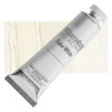
    Williamsburg Handmade Oil Paint - Flake White, 37 ml tubeWilliamsburg Handmade Oil Paint – Flake White, 37 ml tube Williamsburg Oil Paints source the best raw materials in the world. Each is carefully ground to enhance the beauty and luminosity specific to each pigment. These paints are uniquely hand-crafted and of the highest quality available. – Williamsburg Handmade Oil Paint – Flake White, 37 ml tube

    Lead White

    Lead White is another name for Flake White, but sometimes refers to whites made using a different preparation method. It shares the same properties, offering strength, flexibility, and a fast drying time. Despite its exceptional performance, modern artists must handle it with caution due to lead’s toxicity. Some manufacturers produce alternatives that mimic its effects while being less hazardous.

    Lead White Replacement

    For artists seeking a safer alternative to traditional Lead White, several modern replacements are available. Some manufacturers offer lead-free whites that mimic the handling and drying properties of Lead White while eliminating toxicity concerns. These substitutes often blend titanium dioxide with other pigments to achieve a similar warmth and flexibility.

    Options like Michael Harding’s Warm White or Rublev Colours’ Lead White Alternatives are formulated to provide durability and a strong paint film without the brittleness of Zinc White. While no replacement perfectly replicates the unique qualities of Lead White, these alternatives allow artists to work safely without compromising performance.
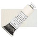
    Michael Harding Artists Oil Color � Warm White, 40 ml tubeMichael Harding Artists Oil Color � Warm White, 40 ml tube This is a professional line of oil paint formulated to the highest standards. Using techniques dating back to the days of the Old Masters, Michael Harding creates powerful, intense colors of paint that are both beautiful and durable. – Michael Harding Artists Oil Color � Warm White, 40 ml tube

    Stack White Oil Paint

    Stack White is a historically significant version of Lead White produced using the “stack process.” In this traditional method, sheets of lead were stacked with layers of manure and vinegar to encourage a slow chemical reaction that resulted in the formation of lead carbonate. This method produced a uniquely textured, slightly warmer white with superior handling properties. Though largely obsolete today, some niche paint makers still recreate it for historical and restoration purposes.
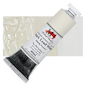
    Michael Harding Artists Oil Color - Stack Lead White, 40 ml tubeMichael Harding Artists Oil Color – Stack Lead White, 40 ml tube This is a professional line of oil paint formulated to the highest standards. Using techniques dating back to the days of the Old Masters, Michael Harding creates powerful, intense colors of paint that are both beautiful and durable. – Michael Harding Artists Oil Color – Stack Lead White, 40 ml tube

    Titanium White

    Titanium White is the most common white used by contemporary artists. Made from titanium dioxide, it is the brightest and most opaque white available. It provides strong coverage and a cool tone, making it excellent for mixing and creating high-intensity highlights. However, it can be overpowering in color mixing, and its slow drying time can be a drawback for artists who prefer a faster workflow. Despite this, its non-toxic nature and versatility make it a staple in most studios.
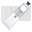
    Gamblin Artist's Oil Color - Titanium White, 150 ml tubeGamblin Artist’s Oil Color – Titanium White, 150 ml tube Gamblin Artist’s Oil Colors are crafted by hand with the well-being of artists, their work, and the environment in mind. They combine the best traditions of the past with the latest technical innovations, giving you the freedom to create without compromise. – Gamblin Artist’s Oil Color – Titanium White, 150 ml tube

    Cremnitz White Oil Paint

    Cremnitz White is another lead-based white, similar to Flake White but with a softer texture and a slightly higher tinting strength. It is often favored by portrait painters for its smooth consistency and warm undertones. Like other lead whites, it is highly durable but comes with toxicity concerns, requiring careful handling and ventilation.
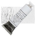
    Michael Harding Artists Oil Color - Cremnitz White (Walnut Oil), 40 ml tubeMichael Harding Artists Oil Color – Cremnitz White (Walnut Oil), 40 ml tube This is a professional line of oil paint formulated to the highest standards. Using techniques dating back to the days of the Old Masters, Michael Harding creates powerful, intense colors of paint that are both beautiful and durable. – Michael Harding Artists Oil Color – Cremnitz White (Walnut Oil), 40 ml tube

    Permalba White Oil Paint

    Permalba White is a modern, non-toxic alternative to traditional lead whites. It is a blend of Titanium White and other white pigments, designed to provide high opacity while maintaining a soft, workable consistency. It dries faster than Titanium White alone and is a popular choice among artists looking for a safe, high-quality white with good mixing properties.
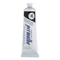
    Weber Permalba Artists Oil Color - Permalba White, 150 mlWeber Permalba Artists Oil Color – Permalba White, 150 ml These professional oil colors are formulated from refined linseed oil, safflower oils, and highly concentrated, lightfast pigments. Tubes issue creamy, smooth, consistent color. – Weber Permalba Artists Oil Color – Permalba White, 150 ml

    Why Zinc White Oil Paint Fell Out of Favor

    Zinc White, or zinc oxide white, was once a popular choice for its transparency and cool tone, making it ideal for subtle glazing and mixing. However, over time, it was discovered that Zinc White produces a brittle paint film that is prone to cracking and delamination, especially when used in thick layers or mixed with other paints. This structural weakness has led many manufacturers and conservators to discourage its use, and it has largely been replaced by alternatives like Titanium White or specially formulated lead-free whites.

    Enjoying this free article? You’ll love our wildly popular newsletter full of art delights. Sign up for our art newsletter here.

    Choosing the Right White Oil Paint for Your Purpose

    • For strong, flexible paint layers: Lead-based whites (Flake White, Lead White, Stack White, Crimnitz White) are the best but require careful handling due to toxicity.
    • For high opacity and brightness: Titanium White is the best choice, though it can be overpowering in mixtures.
    • For more transparency and glazing: Lead white is more transparent than other options and tends to become even more transparent over time.
    • For historical accuracy: Stack White is a great option for period-specific techniques and restoration work.
    • For a safe, versatile white: Permalba White is a great non-toxic alternative with good mixing properties.

    Why White Isn’t On the Color Wheel

    Ever wonder why white isn’t on the color wheel? Actually it is, but you might not realize it. This article explains why white and black aren’t the colors you think they are.

    Which White Oil Paint Do You Use?

    Every artist has their preferred white based on their technique and artistic goals. By understanding the strengths and weaknesses of different white oil paints, you can make informed choices that enhance your painting practice. Which white do you prefer, and why? Let us know in the comments!

    Enjoying this free article? You’ll love our wildly popular newsletter full of art delights. Sign up for our art newsletter here.

  • FREE Online Color Theory Class

    FREE Online Color Theory Class

    Color theory can be one of the most confusing yet rewarding aspects of painting, but not with our FREE online color theory class.

    If you’ve ever struggled with muddy colors, contradictory color wheels, or mixing the perfect red, you’re not alone!

    As a licensed art teacher and atelier-trained artist, I’ve seen firsthand how frustrating color mixing can be. And you know what? It doesn’t have to be so hard.

    This FREE color theory training will break it all down, from understanding the power of brown to uncovering the truth about warm and cool colors. (Hint: what you were taught might be wrong!)

    Plus, if you stay in the class until the end, there’s a special bonus waiting for you. Let’s dive in and make sense of color once and for all!

    My Journey with Color Theory: Before and After Atelier Training

    Before I truly understood color theory, I struggled with achieving the technical ability I envisioned having. One of my early paintings, which I was incredibly proud of at the time, had all the hallmarks of an artist struggling with color mixing: the skin tones were muddy, the colors lacked clarity, and I didn’t have a clear goal in mind when I was mixing. While it was the most realistic portrait I had ever created at that point, something about it didn’t feel right—it didn’t match the image in my head.

    Everything changed when I studied in an atelier, a traditional art training method that focuses on realism and technical precision. Atelier training isn’t typically found in universities. Instead, art training including color theory classes is passed down from master to student, preserving centuries of artistic knowledge. Through this structured learning process, I finally cracked the code of color theory.

    Ready to practice your color theory? Our popular Yay! Color Theory Worksheets will help you practice your newfound color theory knowledge.

    The Key to Understanding Color: A Systematic Approach

    If you’ve ever mixed red and yellow to make orange, only to find that your orange wasn’t the RIGHT orange, you already know that color mixing isn’t as simple as basic formulas. The secret to mastering color is breaking it down into three fundamental elements:

    1. Value – How light or dark a color is.
    2. Chroma – The intensity or saturation of a color.
    3. Hue – The actual color family (red, blue, yellow, etc.).

    By understanding these three elements, you can mix colors with intention and avoid common pitfalls, such as unintentional muddy notes.

    Why White and Black Aren’t Really Colors

    One of the biggest misconceptions in color theory is that white and black are standalone colors. In reality:

    • White is not a color but rather an extremely light version of a hue, such as a very light yellow or blue.
    • Black is not a color but an extremely dark version of a hue, like a deep red or blue. This is why black clothing items sometimes don’t match—one may have a cooler (blue) undertone, while the other has a warmer (red) undertone.

    If you’ve ever used a black marker and added water to it, you may have noticed that it separates into different colors. That’s because black is made from pigments of other hues, just in their darkest form.

    Here is a post explaining these white and black color concepts in depth.

    Read more about White Paint and Black Paint.

    The Mystery of Brown—Solved!

    A common question I receive is, “Why isn’t brown on the color wheel?” The answer? It actually is! Brown is simply a darker, lower-chroma version of orange. Once you understand how to manipulate value and chroma, you’ll see that brown is just a neutralized orange.

    How to Mix Brown Paint

    A Path Forward in Color Mastery

    While understanding these concepts is an important first step, true mastery comes with practice. Atelier training provides a structured approach to learning and applying color theory. Structured approaches help artists move beyond trial-and-error mixing.

    If you’ve ever felt frustrated that your artwork doesn’t match what’s in your head, know that there is a path forward! Through the right training and consistent practice, you can develop the technical color theory skills to fully express your artistic vision without compromise.

    Ready to take your color skills to the next level? Keep practicing, keep studying, and most importantly—keep painting!

    Get your Yay! Color Theory Worksheets today to practice what you learn in this free color theory training: https://shop.schoolofatelierarts.com/products/yay-color-theory-worksheets

    Want more great art knowledge? Read our other posts from our Department of Aesthetics Blog.

  • Triadic Colors

    Triadic Colors

    Triadic colors can seem pretty straightforward on the surface, but we’re going to take a little bit of a deeper dive to get a better understanding of what triadic colors are and why they are important.

    What are Triadic Colors?

    Triadic colors are colors that relate to each other on a triangle on a color wheel. So when we’re looking at the color wheel, if I were to draw a triangle between the red the yellow and the blue, the red yellow and blue would be considered triadic colors.

    So red, yellow, and blue they make a triangle on the color wheel. Great! We have triadic colors!

    But the triangle doesn’t always have to point towards yellow. So for example, if we made a triangle going between the orange, the green, and the purple, these are also triadic colors. They make a triangle on the color wheel, and these colors relate to each other in a triangular way. Therefore they are triadic colors.

    Want to learn even more about colors? Get our Yay! Color Theory Worksheets today!

    Triadic Colors

    Advanced Triadic Colors

    Now this is a very simple approach to what a triadic color is, but there are more complicated ways to think about triadic colors.

    Let’s go to a color wheel that has a few more colors on it. Before, we went to red, yellow, and blue. But what if we went from a purpley-red to an orange-yellow to a greeny-blue? These would also be triadic colors.

    You can basically rotate this triangle any way you want on the color wheel to find triadic colors. Triadic colors can be nearly any three colors. The term “triadic” simply represents the relationship of those colors on the color wheel.

    Some people play with this idea of triadic colors by adjusting it a bit. For example, what if your triangle was not a perfect triangle? You can have triangles that are not equilateral. So you can have a skinny triangle and some would say it is still a triadic color.

    You can sign up for our FREE color class here.

    The Fletcher Palette

    For those of you color geeks out there, the Fletcher palette uses this concept of unequal triangles to find variable triadic color harmonies.

    Fletcher came up with a system where he wanted to make colors match music harmonies. He was really into using triadic colors and he tried to match the colors to the structures of musical chords. So, he divided colors into major and minor keys using triangles and other shapes.

    If you really want a thorough understanding of his system, I recommend reading the Fletcher Palette book. For the purposes of this article, I just wanted to give you an example of a way that triadic colors can be taken into a more sophisticated realm.

    So to review, we covered what a triadic colors essentially are, and a few ways they can be used by artists to determine color schemes for their work. If you enjoyed this article, make sure to join our wildly popular art newsletter for art tidbits in your inbox every week.

    Watch our video on Triadic Colors below.

  • How to Make Brown Paint

    How to Make Brown Paint

    If you have ever wondered how to mix brown paint, this article will teach you everything you need to know to get it right.

    What exactly is brown?

    When we think of colors, we tend to think about red, orange, yellow, green, blue or purple. These are the colors we are often taught about in school.

    But we all have likely seen colors in the real world that were not exact matches to what we see on a color wheel. Like the color brown.

    But what colors do I need to mix together to make brown paint? And why specifically isn’t brown on the color wheel?

    By solving these two mysteries, you will unlock the secret of how to mix brown paint.

    Want more great color theory information? Read this article on colors opposites on the color wheel.

    There are three elements to every color.

    If you truly want to understand colors and how to mix them, you need to learn how to identify the three major elements of color.

    Every color that you observe has three elements: value, chroma, and hue.

    Value is how light or dark a color is. Lemon yellow is a very light color, for example, and blue jeans are a darker color.

    Chroma is how intense the color is. A lemon is very, very yellow. Mustard is also yellow, but not as intense of a yellow as the lemon.

    The lemon is more chromatic than the mustard. Mustard is more neutral than the lemon.

    Hue is where the color is located on the color wheel. The hue can be red, orange, yellow, green, blue, or purple. The hue of a lemon is yellow. The hue of mustard is also yellow. The hue of blue jeans is blue.

    Enjoying this article? Join our popular mailing list for more great art insights delivered directly to your inbox.

    Why isn’t brown on the color wheel?

    Brown isn’t on the color wheel because brown is actually orange.

    What?

    You heard me.

    Brown is orange.

    Now before you panic, let me explain why brown is orange and how to mix brown paint with this knowledge.

    The hue of brown is actually orange. This means if you had to assign the color brown to be red, orange, yellow, green, blue or purple, it fits most closely with orange than with any of the other colors.

    Some of you might be thinking, “It doesn’t look orange!”

    And that is because of the chroma of brown. Brown is an orange, but it is a very neutralized orange. It is not very chromatic.

    Think of the earlier example when we compared the intensity of a yellow lemon to the intensity of yellow mustard. The yellow mustard is a more neutral yellow than the yellow of the lemon.

    Now think about orange. A very intense orange, like the color of an orange fruit, is highly chromatic.

    But if you think of other examples of the color orange, such as a bad spray-on tan, it is still orange but less chromatic than the fruit.

    If you neutralize it even more than that, you will get brown.

    So, the reason brown is not on the color wheel as a separate color is because it’s already there – orange! The hue of brown is orange.

    So now what? How can this help you mix brown paint?

    Want to master color theory? Check out our worksheets that will help you learn everything you want to know about color.

    A Formula for Exactly How to Mix Brown Paint

    Now that we know the three elements of every color (value, chroma, and hue), and have recognized that brown is in fact a neutralized orange, we are ready to start mixing brown paint.

    There are 3 steps to mixing brown paint

    • Step 1: Make orange paint.
    • Step 2: Make a neutral paint
    • Step 3: Add your neutral paint to your orange paint.
    • Step 4: Adjust the value

    Each of these steps requires a little bit more knowledge to execute successfully. Here is what you need to know in order to mix brown paint successfully.

    Read more about Colour Theory here.

    Step 1: Make orange paint

    Because brown is a neutralized orange, we need to start by making the color orange. You can do this by adding yellow and red together to make orange.

    But it is not quite that simple. Many people think that you need to take equal parts red and equal parts yellow to make orange paint, but that is not quite true.

    Different pigments have different strengths. Red is often a much stronger pigment than yellow. So if you want to make orange paint, you need to add quite a bit more yellow than red in order for it to come out orange.

    Step 2: Make a neutral paint

    Mixing a truly neutral paint is worthy of its own post, but I will put a simplified version of it here.

    A neutral color is a color that doesn’t look like any color on the color wheel.

    It is like a grey, but it is not a green-grey, or blue-grey, or red-grey, or yellow-grey. It is a grey that doesn’t look like any other color.

    You can make this color by mixing together red, yellow, and blue. This mixture is called a chromatic neutral, which sounds contradictory but you do not need to worry about it too much for mixing brown paint.

    What you do need to worry about is mixing red, yellow, and blue together until they look like no color.

    But be careful! Remember that different colors have different strengths of pigment. You cannot take equal parts of red, yellow, and blue and expect to get a true neutral.

    And there is one other pitfall to watch out for! When you mix red, yellow, and blue together, the color will look quite dark. It’s hard to tell if it is truly neutral or not when it is so dark in value.

    This is why you also want to add some white paint to your neutral. By lightening the value, it makes it easier to see if your mixture is truly neutral.

    It’s important that your mixture is the most non-color (kind of greyish) possible in order to mix brown paint successfully in the next step.

    Want to master color theory? Check out our worksheets that will help you learn everything you want to know about color.

    Step 3: Add the neutral paint to the orange paint in order to mix brown paint

    So far you should have mixture of orange and one mixture of neutral.

    In order to neutralize the orange in order to turn it into brown, we need to add some of the neutral paint to the orange paint.

    BUT BE CAREFUL! GO SLOW!

    Do not add too much neutral to your orange paint too quickly. Your neutral mixture is going to be stronger than your orange mixture. Therefore, you need to add small amounts of neutral to your orange mixture at a time.

    As you slowly add neutral paint to the orange, you will notice that it will start to turn brown.

    If you want to mix a brown that still feels pretty orange, like a bad spray-tan, you don’t need to add very much neutral.

    If you want to mix brown that is very brown, you will need to add more of your neutral paint to the orange.

    Check out our free Color Theory Lesson Plans

    Step 4: Adjust the value of your brown paint

    Once you have mixed a brown that feels the right amount of brown to you, there is one more step to consider.

    Remember that one of the three elements of color is value, or how light or dark your brown paint is.

    If the brown you mixed is too light, you can darken it by mixing a neutral that does not have white in it.

    Another way to darken the value is to add a little black to it, but be careful about adding too much black because black is actually a very dark blue, red, or purple and it will change your brown into a different color if you ad too much.

    If you need to make your brown lighter in value, you can add white to it. But white is often just a very light blue, so if you add too much you will change your brown into a different color.

    Enjoying this article? Join our popular mailing list for more great art insights delivered directly to your inbox.

    Voila! You just learned how to mix brown paint.

    Mixing brown paint can be a struggle. It is a very finicky color to mix, because if you add too much neutral or not enough, you won’t get the exact color of brown you are looking for.

    You also have to balance the value out, often with white or black, which can change the overall color of your brown.

    But, if you understand the underlying principles of value, chroma, and hue, and follow these detailed instructions, you will be mixing browns in no time.

    Read More Color Theory Articles:

    Colour Theory

    How to Make Blue Colors

    How to Make Purple Paint

    How to Make Yellow Darker

    Color Theory for Beginners

    Color Theory Lesson Plans

    Have you tried mixing brown? Let me know in the comments below. How did it go? What was hard? What was easy?

    Join our newsletter for great art information delivered directly to your inbox!

  • How to Make Purple Paint

    How to Make Purple Paint

    It’s a lot more complicated than just mixing red and blue together. Here is everything you need to know about how to make purple paint.

    how to make purple paint

    The Basics of How to Mix Purple Paint

    Here is the nitty gritty about how to make purple paint. Take some red, add some blue, and then voila! Purple paint.

    Except not really.

    If you have ever mixed red and blue together and got, well, muddy brown, this is why. And don’t worry, we will teach you how to fix it.

    Want to really master color theory? Check out our Yay! Color Theory Worksheets.

    How Color Works

    Every color has a value, a chroma, and a hue.

    Value is how light or dark a color is.

    Chroma is how intense the color is.

    Hue is where it lands on the color wheel – red, orange, yellow, green, blue or purple.

    Want more great color theory information? Read this article on colors opposites on the color wheel.

    Ugh, What Is This Purple Sludge? How Do I Make Purple Paint Look More Purple-y?

    The problem with purple is that when you mix red, which is a fairly dark-value color, with blue – which is a very dark-value color, the resulting color is so dark that it is difficult to decipher whether or not it is even purple.

    One quick fix? Add white.

    White will lighten the value of your red-and-blue-sludge, and make it appear more purple-y.

    Want more great color theory information? Check out this Colour Theory article.

    What If I Want to Make a Better Purple Paint?

    If you want a more purple-y purple, you need to find a better paint to start with.

    Dioxazine purple, for example, is much more chromatic than any purple you can mix with just red and blue.

    This is because any time you mix two colors together, the resulting color will be more neutralized than many colors that come directly out of the tube.

    The reason for this has a lot to do with things I do not claim to be an expert on – something about particle size of pigments and how they lock together.

    But what I DO care about is mixing the exact color that I want. And I know that if I want to mix a purple color that is very intense (chromatic) that my best bet is to reach for my tube of purple paint.

    Barring that, if you only have red and blue to mix your purple with, adding white to the mixture helps the purple come alive a bit more than the dark brown sludge red and blue make on their own.

    Enjoying this article? Join our popular mailing list for more great art insights delivered directly to your inbox.

    How Do I Mix THE RIGHT Purple?

    What also matters when it comes to purple is how reddy-purple versus bluey-purple you want your final purple to appear.

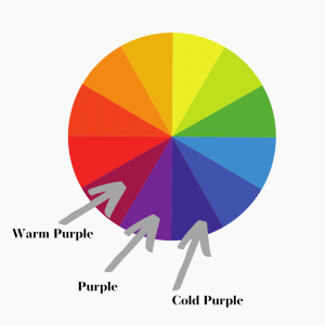
    Every color can be both warm and cool. And purple is no exception.

    Do you need to know how to make a purple that is warm? Make sure to add more red than blue.

    Do you need to know how to make purple that is cool? Make sure to add more blue than red.

    How to make purple paint

    Read More Color Theory Articles:

    Colour Theory

    How to Make Blue Colors

    How to Make Purple Paint

    How to Make Brown Paint

    How to Make Yellow Darker

    Color Theory for Beginners

    Color Theory Lesson Plans

    What do you think about mixing purples? Let me know in the comments below.

    Check out our free Color Theory Lesson Plans

    Master color theory once and for all with our Yay! Color Theory Worksheets.

    Did you appreciate this article? Join our popular mailing list for more great art insights delivered directly to your inbox.

  • How to Make Blue Colors

    How to Make Blue Colors

    How to make blue colors? It’s easy if you know these 3 simple tricks for mixing blues.

    First, let’s start with the basics.

    Every color is composed of three elements: value, chroma, and hue.

    Value is how light or dark a color is.

    Chroma is how intense the color is.

    Hue is where it lands on the color wheel – red, orange, yellow, green, blue or purple.

    Want to learn even more about value, chroma and hue? Our art lesson plan worksheets teach you everything you need to know about color.

    How to Mix Different Values of Blues

    Blues can be very light and in value, like a baby blue. In order to make your blue lighter in value, you can add white. Simple enough.

    Blues can also be very dark in value.

    In fact, most people don’t realize that black is often just a very dark blue.

    So if you need to make your blue darker, one option is to add black to it.

    However, black is much more neutral than a sky blue. So not only will it darken your blue, it will also neutralize it, which we will discuss in a moment.

    Another option to make your blue appear lower in value is to add a blue that is darker in value than the one you currently are using.

    For example, if you are using a cerulean blue (which is medium in value), and add ultramarine blue (which is darker than cerulean blue in value), it will darken your overall blue when mixed together.

    Enjoying learning about color? This article gives you a deep dive into colour theory.

    How to Adjust the Chroma of Blues

    Most blues that we observe in the natural world are not super chromatic. In other words, many blues are not very intense. They are the opposite of chromatic. They are neutralized blues.

    If you look at the ocean in New England, for example, there is a lot of particulate in the water which makes it appear muddy. The ocean in New England is still decidedly blue, just not a very intense blue. We would say it is a neutralized blue.

    So, if you want to paint the ocean off the coast of Maine, how would you mix that blue?

    If you want to neutralize the color blue, but NOT change its value, you need to add a neutral that is the same lightness/darkness as the blue you are using.

    So if you are using a medium blue paint, but it is too intense (or chromatic), then you need to find a neutral that is the also medium in value.

    A true neutral is a color that is as close to NO color as you can get. It’s like a grey, except that it is not even a little bit red-grey, or blue-grey, or yellow-grey. It is a grey that has no discernible color.

    If you want to adjust the intensity of your blue, but NOT change the value, then you need to add a grey that is the same value as the blue you are using.

    Our Yay! Color Theory Worksheets will help you master color theory once and for all.

    Are you finding this article helpful? Join our mailing list for more detailed knowledge about how to draw and paint.

    Chromatic neutral? How is this a thing?

    One answer to your troubles is to mix what is called a chromatic neutral, and then add this neutral to your blue paint in order to diminish its chroma.

    A chromatic neutral is a no-color color that is made by mixing yellow, blue, and red together.

    Now, it is important to know that not all pigments are created equal. Some are stronger than others. Red, for example, is often much more potent than yellow.

    So in order to make a chromatic neutral, you cannot expect to mix equal amounts of red, yellow, and blue together and get a grey that is perfectly neutral.

    Instead, you will likely have to mix a lot of yellow, with a medium amount of red, and a slightly less amount of blue. (This of course, all depends exactly on what the quality of paint you are using is as well as the specific pigments in your paint.)

    Mixing red, yellow, and blue together WILL get you a neutral color, however it is very difficult to determine exactly what the color is when the value of the neutral is dark. Therefore, I encourage you to ALSO add white to your mixture. This will lighten the overall color and make it easier to determine if you are getting close to a true neutral.

    Keep adding small amounts of red, yellow and/or blue (and maybe more white if you can’t tell what color it is) until you have a color that doesn’t look even a little bit orange, or green.

    Tada! You’ve mixed your first chromatic neutral.

    If you add a small amount of this chromatic neutral to your blue, it will neutralize it. The more you add, the more “muddy” your blue will become.

    If you are painting the ocean off of Maine, you will need to add a lot of neutral to get the famous murky color of the ocean there.

    Did you know we offer extensive worksheets in our store that help you learn nuanced art skills?

    The Chroma Catch

    A more difficult problem artists face is how to mix a blue that is MORE chromatic than the blue you have on your palette.

    The answer is YOU CAN’T.

    You CANNOT make any color more chromatic than it already is UNLESS…

    You add a MORE chromatic blue to the blue you already have.

    This means you need a NEW BLUE. Cerulean blue, Pthalo blue – these are notoriously chromatic blues.

    But if you mix white with your ultramarine blue, you are not going to be able to make that bright-clear-sky-over-the-Arizona-desert blue. It’s simply not chromatic enough. You need to add a more chromatic blue to your palette to achieve that effect. (And a cooler one – this blue has more yellow in it than ultramarine blue.)

    how to mix blue chromatic
    You can’t mix this blue with ultramarine blue. You need a more chromatic – and cooler – blue.

    Learn more about opposites on the color wheel here.

    How to Adjust the Hue of Blues to Get Exactly the Right Color

    Now we come to what I believe is the trickiest element of painting the right blue for your purpose – the hue.

    Did you know that blue can be either warm or cool?

    It’s true.

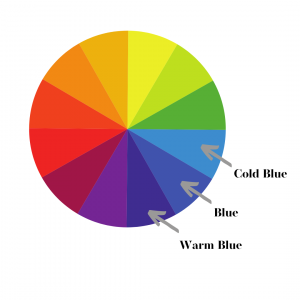
    If the blue looks like it leans closer to the green part of the color wheel than the purple part of the color wheel, we say it is a “cool blue”.

    If the blue looks like it leans closer to the purple part of the color wheel more than the green part of the color wheel, we say it is a “warm blue”. This is because if it leans towards purple, it has a little bit of red in it (remember, purple is made of red + blue).

    Don’t Be Blue About Blues

    With this guide, try practicing mixing different blues that you see around you. Now that you know what to look for, you will be able to get closer and closer to the color of blue you are trying to make.

    Want to learn even more about art? Our art lesson plan worksheets teach realistic drawing and painting skills.

    Read More Color Theory Articles:

    Colour Theory

    How to Make Blue Colors

    How to Make Purple Paint

    How to Make Brown Paint

    How to Make Yellow Darker

    Color Theory for Beginners

    Color Theory Lesson Plans

    Discover more great color theory lessons here.

    Did you find this article helpful? Join our mailing list for more detailed knowledge about how to draw and paint.

  • Colors Opposite on the Color Wheel

    Colors Opposite on the Color Wheel

    Color wheels can be confusing, but this article describes how to accurately find colors opposite on the color wheel.

    What is a color wheel?

    A color wheel is circle with colors around it, and sometimes inside it. The outside circle almost always represents the hues of various colors (red, orange, yellow, green, blue or purple).

    The inside of the circle sometimes show the colors getting lighter or darker (the value). Other times, the inside of the circle shows varying chromas.

    If you don’t know what these words mean yet, don’t panic! By the end of this article you will know all their definitions.

    Master color with our extensive worksheets.

    How It Works

    colors opposite on the color wheel

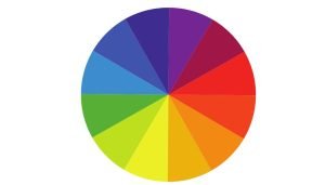
    In order to find the compliment of any color, use a color wheel as a guide. Whatever is directly across from a color is its opposite.

    For example, directly across from blue on the color wheel is orange. The opposite of green is red. The opposite of yellow is purple, etc.

    But what happens if your color isn’t exactly the same as the relatively few colors on this color wheel? Then what?

    Ever wonder why black and white aren’t on the color wheel? This article explains why.

    A Case Study: Blue

    The opposite of blue on the color wheel is orange. That is the simple answer.

    However, it can be more complex than that.

    It really depends on what kind of blue you are looking to find the compliment of.

    For example, if you are looking at a very light blue, then you need to find an orange of equal lightness for it to be a true opposite.

    opposites on a color wheel

    On the color wheel above, you can see that each color becomes lighter as it gets closer to the center of the circle. So if your blue is the lightest blue available, you want to match it with the color opposite of it that is also the lightest available.

    Want to learn even more about color theory? Check out these free online color theory video tutorials.

    But what about the “weird” blues?

    Sometimes, the blue we are trying to find the opposite of is not such an obvious blue. Take blue jeans for example. They are blue, sure, but not as intense of a blue as what you see in the color wheel above.

    Blue jeans are a neutralized blue. They are like a blueish grey. A little bit muddied in appearance. But still blue.

    opposites on neutralized color wheel

    On the color wheel above, you can see that there are three different versions of blue, Blue 1, Blue 2, and Blue 3.

    Blue 1 is the most bluey blue. It is the most chromatic. But Blue 2 is still blue, just not as intense as Blue 1. And Blue 3 is the most neutralized of all, but still a blue.

    So if you are looking at a blue, and trying to find blue’s opposite on a color wheel, you need to figure out how intense of a blue it is.

    If it is a very intense blue, its compliment on the color wheel is a very intense orange.

    If it is a neutralized blue, it’s complement on the color wheel is a neutralized orange.

    Want to learn even more about the nuances of color? Follow along with these free color theory lessons.

    Finding Colors with Confidence

    I hope this article helps you to find colors with more confidence. Did you learn something new? Let me know in the comments below!

    Did you know we offer extensive worksheets that teach realistic drawing and painting skills?

  • Color Theory for Beginners

    Color Theory for Beginners

    Do you want to understand color theory better, but don’t know where to start? This article explains the three most basic elements of color theory for beginners..

    The 3 Elements of Color Theory for Beginners

    Every color is composed of three elements: Value, Chroma, and Hue. When learning about color theory as a beginner, it is best to consider each of these elements individually in order to better understand the exact color you are observing.

    It is especially important when mixing paint colors to consider each variable separately as it will help you mix colors more accurately.

    Check out our extensive worksheets that teach realistic drawing and painting!

    Color Values

    What is Value?

    Value represents how light or dark a color is.

    A stop sign is red, and poinsettias also red.

    But even though they are both red, the red stop sign is a lighter value of red than the darker red of a poinsettia. The poinsettia is a darker value of red than that of the stop sign.

    If you were to take a black-and-white photo of the poinsettia next to the stop sign, the stop sign would appear lighter in the photograph.

    If you are a beginner, recognizing how light and dark colors are is one of the essential elements of color theory.

    (But what about black and white? Read this article on black and white to learn why black – which is often just a very dark blue – will turn yellow into green.)

    Colors can be light or dark. The stop sign is lighter in value than the poinsettia.

    Color Chroma

    What is Chroma?

    Chroma is how intense a color is.

    Purveyors of Caribbean vacations are often quick to showcase the “azure” water on island beaches. This water is appealing to us because it is intensely colored. There is less particulate in the water than the greyer seas found in New England, which gives Caribbean waters the appearance of a more intense blue.

    So although New England waves are blue, and Caribbean island waves are blue, the Caribbean water is more chromatic – it is a more intense color of blue.

    This is the color theory element of chroma. If the color you are looking at is very intense, it is chromatic. If it is not very intense, it is not chromatic.

    New England Ocean Blue vs. Caribbean Ocean Blue

    What is the opposite of chroma?

    The opposite of chroma is neutral. The New England water is a bluish grey and the blue is not very intense, it’s a neutralized blue.

    What is a true neutral?

    It is possible for a color to be so neutralized that it isn’t any color at all. It simply looks like a grey that is not a green-grey, or a blue-grey, or a red-grey – not even a little bit. This is called a “true neutral”.

    Enjoying this article? Join our popular mailing list for more great art insights delivered directly to your inbox.

    Color Hues

    In color theory, the word “hue” describes which color family, of you had to assign just one, the overall color belongs to.

    The color families are red, orange, yellow, green, blue or purple. Some people refer to this collection of hues in color theory as ROYGBP for short. (Sometimes they are also abbreviated as ROYGBIV, ROYGBV, etc.)

    So in the example of the oceans mentioned earlier in this color theory article, we would say that the hue of both oceans is “blue”, even though these two oceans are different colors of blue. If we had to assign just ONE color – and our choices are limited to red, orange, yellow, green, blue and purple – BLUE is the hue that stands out to us the most.

    Do you like learning how to draw and paint? Check out our Ateliyay! Curriculum for worksheets that will teach you art skills.

    Color Theory Hues – Red, Orange, Yellow, Green, Blue, Purple

    Color Theory for Beginners Conclusion

    You can start practicing these color theory concepts quite easily.

    Simply find an object in the room and ask yourself the 3 color theory for beginners questons:

    1. What is the value (how light or dark is this object)?
    2. What is the chroma (how intense is the color of this object)?
    3. What is the hue (red, orange, yellow, green, blue, or purple)?

    You will find that just by practicing thinking about colors and their specific attributes that your eyes will start noticing more nuanced color.

    Did you enjoy this article? Join our popular mailing list for more great art insights delivered directly to your inbox.

    Want more color theory knowledge? Check out our other color theory articles:

    Colour Theory

    Opposites on the Color Wheel

    Color Theory Lesson Plans

    How to Make Yellow Darker

  • Colour Theory

    Colour Theory

    Colour theory can be intimidating, but it is simpler than you might think. This article will teach you everything you need to know in order to master colour theory.

    Value, Chroma & Hue

    Every colour is made up of three different components: value, chroma, and hue. By discovering how to isolate each of these three variables, you can learn to identify the nuances of colours.

    Colour Theory: Value

    Value represents how light or dark a colour is.

    A stop sign is red, and poinsettias are also red.

    But even though they are both red, the red stop sign is a lighter value of red than the darker red of a poinsettia. The poinsettia is a darker value of red than that of the stop sign.

    If you were to take a black-and-white photo of the poinsettia next to the stop sign, the stop sign would appear lighter in the photograph.

    Artists often use a value scale to evaluate how light or dark a colour is. There are many different value scales available, but the one I use in my teaching and lessons is a 9 step scale, where 9 is the darkest and 1 is the lightest.

    So, on a scale of 1-9 with 9 being the darkest and 1 being the lightest, what number would you give the stop sign? What about the poinsettia?

    The poinsettia is darker than the stop sign, so it should have a higher number.

    The poinsettia is close to a value 7, and the stop sign is close to a value 6.

    Pro tip: colours that have a lot of chroma tend to trick our eyes into feeling like they are brighter. Red is usually darker than we think because it tricks us by being so chromatic.

    Colour Theory – Red Stop Sign vs. Red Poinsettia

    Do you like learning how to draw and paint? Check out our Ateliyay! Curriculum for worksheets that will teach you art skills.

    Colour Theory: Chroma

    Chroma is how intense a colour is.

    The Caribbean Ocean is often described as having “azure” water. This water is appealing to us because it is a very intense colour of blue.

    New England, on the other hand, boasts water that is much murkier. These greyer New England seas are less chromatic. By comparison, the Caribbean waters the appear to be a more intense colour of blue.

    So although New England waves are blue, and Caribbean waves are blue, the Caribbean water is more chromatic – it is a more intense color of blue.

    What is the opposite of chroma?

    The opposite of chroma is neutral. The New England water is a bluish grey and the blue is not very intense – it’s a neutralized blue colour.

    What is a true neutral?

    It is possible for a color to be so neutralized that it isn’t any color at all. It simply looks like a grey that is not a green-grey, or a blue-grey, or a red-grey – not even a little bit. This is called a “true neutral”.

    Do you prefer learning with videos? Check out our video colour theory lessons here.

    Colour Theory – Hue

    Hue is a colour theory word that describes which overall colour – from the choices of red, orange yellow, green, blue or purple – the colour you are looking at belongs to.

    Hues are also known by the acronym ROYGBP for short. (Sometimes they are also abbreviated as ROYGBIV, ROYGBV, etc.) ROYGBP stands for red, orange, yellow, green, blue, purple.

    Hues are basically any color on the outside of the colour wheel. Red-orange, yellow-orange, yellow-green, blue-green, and red-blue are also hues.

    You can take it one step further and add yellow-yellow-green, yellow-yellow-orange, etc. to the list of hues.

    In the picture below, there are three colours that are considered to be the hue “blue”, even though they are all different shades of blue.

    Learn more about our Ateliyay! Painting Bootcamp, our online class that teaches you how to paint realistically.

    The Extra Colour Element: Warm & Cool

    Some colour theorists prefer to think of “warm” and “cool” colours as the 4th element of colour.

    However, using the terms “warm colours” and “cool colours” is actually just a different way of describing a colour’s hue.

    Green, for example, can be considered either a “cold” yellow or a “warm” blue.

    The terms “warm” and “cool” describe a colour’s relationship to other colours. In the image above, there are three different kinds of blues. The blue closest to red is warm compared to the blue closest to the yellow.

    Did you know we have extensive worksheets in our store that teach realistic drawing and painting skills?

    Give it a try

    Now that you know about the three elements of colour, try evaluating a colour just one element at a time.

    Colour Theory
    Identify the value, chroma, and hue of these colours.

    For example, on the image above, let’s evaluate together the top right colour.

    What is its hue? (Red, orange, yellow, green, blue, or purple?)

    The hue is green.

    What is its value on a scale of 1-9, with 9 being the darkest and 1 being the lights?

    The value is probably a number 6. It is not super light and leans slightly towards darker.

    What is its chroma? Is it a very greeny green, the greeniest green you ever did see? Or is it a little muddied, or neutralized?

    This green is somewhat neutralized. It is not a super chromatic green, although it still reads clearly as a green.

    How did you do? Keep practicing by identifying the value, chroma, and hue of the other colours on this chart I made of colours I observed in Iceland.

    Colour Theory
    The upper right colour is the hue green, a value 6, and is somewhat neutralized.

    Conclusion

    Learning colour theory takes practice, and the best way to improve your ability to see colours is to ask yourself these three very important questions:

    1. What is the value?
    2. What is the chroma?
    3. What is the hue?

    By consistently practicing your colour observation, you will become a master of colour theory in no time.

    Read More Color Theory Articles:

    How to Make Blue Colors

    How to Make Purple Paint

    How to Make Brown Paint

    How to Make Yellow Darker

    Color Theory for Beginners

    Color Theory Lesson Plans

    Did you enjoy this article? Join our popular mailing list for more great art insights delivered directly to your inbox.

  • How to Make Yellow Darker

    How to Make Yellow Darker

    Yellow. The trickiest color to learn to make darker. But why is it so hard?

    The answer to “How to make yellow darker?” is somewhat complex. It requires a deep dive into color theory, so here we go.

    Value, Chroma & Hue

    Every color is composed of three elements: value, chroma, and hue.

    Value is how light or dark a color is.

    Chroma is how intense the color is.

    Hue is where it lands on the color wheel – red, orange, yellow, green, blue or purple.

    Obviously, in this article we are dealing with the hue yellow. We want to know how to make yellow darker.

    Okay, so far we know we are dealing with the hue yellow. But what about the other two elements?

    The intensity of the yellow, or the chroma of yellow, also matters. Most often when we think of yellow, it is a very bright, chromatic yellow – like the yellow of a lemon.

    But there are also other kinds of yellows out there.

    For example, mustard is considered yellow, but it is not nearly as intense as lemon yellow. It’s what we call a neutralized yellow.

    Neutral is the opposite of chroma.

    The problem with trying to make yellow darker is that we cannot do so without affecting the chroma – or intensity – of the yellow. We will circle back to this in a moment.

    Check out our extensive worksheets that help you learn how to draw and paint realistically.

    How to Make Yellow Darker

    The final element of a color is its value. Is it a very light value or a very dark value?

    We are trying to figure out how to make yellow darker. This means we need to take the hue, yellow, and somehow bring the value down.

    The most obvious way to do this is to add black to yellow.

    But if you do this, something strange will happen… the yellow will turn into green.

    (Read this article on black and white to learn why black – which is often just a very dark blue – will turn yellow into green.)

    And this is he entire trick to making yellow darker.

    In order to make yellow darker, you have to add a darker color to it. This will do two things to the yellow.

    It will neutralize the yellow (just like mustard is darker than lemon yellow but is darker in value).

    It will also turn the yellow into a green.

    Enjoying this article? Join our popular mailing list for more great art insights delivered directly to your inbox.

    How can this be?

    If you think about it, green is a combination of yellow PLUS blue. So in a way, green IS a kind of yellow.

    A neutralized yellow-green IS a dark yellow.

    This is why when you look at paintings by the Old Masters that have gold objects, you will notice that green is often used to represent a dark yellow.

    Check out this colour theory article for more great colour theory information.

    Look to the Past to Learn How to Make Yellow Darker

    One artist that is well-known for painting gold objects is Emil Carlson. Look at one of his paintings below.

    Emil Carlsen – Still Life with Yellow Roses

    Notice how dark the yellow/gold object reads to the viewer?

    Try to look at each of the colors he uses to paint the gold objects in isolation by focusing on just one small part of the gold bowl. Do you see the neutral green?

    In fact, the only truly “yellow” hue used in the gold bowl at all are the highlights he places on the rim.

    If you truly want to master how to make yellow darker, the best thing you can do is study how the artists of the past managed such a feat.

    There is so much to learn from them.

    I hope you now feel confident about how to make yellow darker in your own paintings.

    Did you enjoy this article? Join our popular mailing list for more great art insights delivered directly to your inbox.

    Check out our other color theory articles:

    Colour Theory

    Opposites on the Color Wheel

    Color Theory Lessons

    Color Theory for Beginners

  • Black and White Aren’t Colors

    Black and White Aren’t Colors

    Is white a color? What about black?

    When I was growing up, one of the first color theory lessons I remember learning is ROYGBIV, which is an acronym for the order of colors in a rainbow – red, orange, yellow, green, blue, indigo, violet. White didn’t get a letter in the acronym, Why not?

    And then there were color wheels. Lots and lots of color theory wheels. But although I learned that red and yellow make orange, I never knew where white belonged on the color wheel. Or black. Black isn’t in ROYGBIV, where does it go?

    color theory

    Check out our extensive worksheets that teach color theory skills.

    Value, Chroma and Hue

    I eventually learned the mysterious answers to these questions, and they stem from the concept that there are three elements to every color: value, chroma, and hue. These three elements together are the key to understanding color theory.

    Hue is essentially ROYGBIV. It represents the outermost circle of the color wheel. Between red and yellow is orange. Between orange and yellow is yellow orange. Between yellow and yellow-orange is yellow-yellow-orange, etc. These are all called “hues”.

    Chroma is how intense the color is. Purveyors of Caribbean vacations are often quick to showcase the “azure” water on island beaches. This water is appealing to us because it is intensely colored. There is less particulate in the water than the greyer seas found in New England, which gives Caribbean waters the appearance of a more intense blue.

    So although New England waves are blue, and Carribean island waves are blue, the Caribbean water is more chromatic – it is a more intense color of blue. The opposite of chroma is neutral. The New England water is a bluish grey and the blue is not very intense, it’s a neutralized blue.

    Value represents how light or dark a color is. A stop sign is red, and poinsettias also red. But even though they are both red, the red stop sign is a lighter value of red than the darker red of a poinsettia. The ponsettia is a darker value of red than that of the stop sign.

    Now that we have mastered the 3 basic elements of color, let’s take a closer look at why white and black are not actually colors.

    Join our newsletter for great art resources delivered directly to your inbox!

    White

    Have you ever tried to match whites before – say a shirt and pants –  and been aggravated by the experience of trying to find the right white? When you put the two together, something just doesn’t look right?

     So here’s the rub: the reason it is so difficult to match a white top with white pants is because there’s no such thing as white. White is not a color.

    Think about it for a minute. Where does white go on the color wheel? Red, orange, yellow, green, blue, purple. I’m a licensed art teacher and I have never seen or heard anyone throw a “white” in there. There’s no “W” in ROYGBIV.

    Is White a Color?

    White is actually more of a color adjective than anything else. Saying something is “white” is actually a descriptor for saying a color is very, very, very light in value. So, the “white” being described is really just a very, very light red, orange, yellow, green, blue or purple.

    When you hear interior decorators talk about a “warm white”, what they are usually describing is a very light-in-value yellow or orange. When they talk about “cool whites” they are often describing very light blues or purples.

    To be fair, the lighter a color is, the more difficult it is to discern its color. This is why so many people believe that white exists as its own color – it’s a catchall for any color that is light in value.

    But if you take time to compare whites to each other, and then try to describe them as a very light red, orange, yellow, green, blue, or purple, you will find that they are easier to identify with practice.

    I encourage you to try it now; look around the room and see if you can find three different “white” objects. If you HAD to assign a color to each of the whites, what would it be? It’s often helpful to put them next to each other for reference. Side-by-side, it is often easier to tell which white is warmer and which white is cooler, which is the first step to identifying its true color.

    Ready for more color theory knowledge? Check out this Free Online Color Theory Training.

    Why Does It Matter?

    Why should you bother spending time deciphering whites? Well, for one it is a great parlor trick to pull out the next time someone you’re being forced to converse with is being annoying. Also, it could keep you from losing your mind in a very different way.

    White Torture

    There is a type of psychological torture called “white torture” that is used to extract information from targets by depriving them of sensory input. This often includes putting them in a white room, serving them white food, making them wear white clothing, etc.

    Fortunately for the would-be torturers, there is no such thing as white. Armed with a thorough understanding of the concept “white”, well-trained prisoners can identify the broad rainbow of whites within their orbit, and stave off the intended distress of being placed in a world “without color”.

    A well-practiced eye can see that the pillow case is a very light blue, and the mashed potatoes are a very light red. They can even take joy in knowing that their pants and shirt are actually very different colors despite the certainty of captors that they are white.

    Dentists Know Whites

    If you care about teeth, you might also want to pay closer attention to whites.

    When making composite fillings, dentists have access to any variety of pre-mixed “whites”, and often have cards to help them choose which one to use on which patient. But they also have to cope with varying light sources, the fact that teeth are slightly transparent, and many other variables which affect the way humans view the dentist’s color choices in their final work.

    Being able to break down “whites” into value, chroma, and hue can improve your dentist’s ability to match colors accurately because it isolates complex variables to be independently thought upon before making color-matching decisions. The next time you go to the dentist for a composite filling, I encourage you to check their art credentials.

    Light Has Color

    Understanding the properties of white is also highly beneficial to anyone who needs to buy a lightbulb. Have you ever really noticed how many options there are? How some lightbulbs claim to be “natural light” bulbs, and others “warm”? What they are really saying is that they are selling various light-value hues (ROYGBIV) of light bulbs.

    The bulb described as “warm” is actually a very light value yellow. The bulb described as “natural” is actually a very light value blue. That’s right, natural light has a color, and it is blue. Considering the oceans and sky reflect blue, is it surprising that natural light does as well?

    So the next time you are out lightbulb shopping, use your new color theory knowledge to make informed choices about which color you wish your light to be. Do you want your inside to feel like the outside? Pick the blue-hue bulb. Do you want your room to feel like light casting from a fire? Go for that yellowy-orange one.

    Enjoying this article? Join our popular art newsletter for more great art information delivered directly to your inbox! 

    Black

    Black also doesn’t appear to have a home on the color wheel. This is because black is a very low value (dark) blue, purple, or even sometimes red.

    If you ever drop water onto black ink, it runs blue or purple, or less commonly red. The value of these blues, purples, and reds is so dark, that we cannot see the hue very easily, and resort to calling it “black” which is a catchall phrase for very dark hues. When our water thins the pigment (and lightens the value) of the black ink, the hue becomes more easily decipherable. It becomes downright obvious, in fact, as we see it run in streams of hues that we DO recognize from the color wheel: reds, blues, and purples.

    I will never forget the first time my mother turned to my five-year-old self while shopping to tell me the pants I picked out to match a shirt were the “wrong black”. My mind was blown – how could there be a “wrong black”? That was the first of many color lessons my mother taught me growing up through the palette of clothes-shopping.

    I now understand that what my mother described as the “wrong” black was actually two different blacks with varying root colors. Some were very dark reds, while other were very dark blues or purples. So the shirt I had in my hand was a very dark value red, while the pants I mistakenly thought matched it were actually a very dark value blue. And my mother was right, the pants were the wrong black.


    Conclusion

    It takes training and knowledge to see the nuanced distinctions between different blacks and different whites. The lighter a color is, like what is commonly called “white”, the more difficult it is to discern its hue. The same is true for very dark colors. When something is very, very dark, it is difficult to tell which hue it is.

    The important thing to remember is that whites and blacks both have hues. If you approach them with the knowledge that there is a ROYGBIV color in there somewhere, you are more likely to spot it. And by looking for these subtle differences between white and black hues, you can expand the color information your eye receives and processes.

    What other colors are color wheel misfits? Let me know which ones you are curious about in the comments below.

    Want to learn more art skills? Check out our Ateliyay! Curriculum today!

  • Why Is Red So Hard to Paint?

    Why Is Red So Hard to Paint?

    Red subjects have a bad reputation for being difficult to paint. But if you take time to identify its attributes, you can easily learn how to paint red well.

    How to paint the color red

    Have you ever tried to Cosplay Sabastian from The Little Mermaid? It’s no easy feat. Sabastian is a red crab, and you are a human. In order to really get that crabby-looking skull, you will need to use red makeup, and lots of it, to manipulate the forms of your face.

    In short, you will have to learn how to paint form using the color red.

    Want to start atelier training? Join our Ateliyay! Painting Bootcamp today!

    Often, cosplayers are successful changing the appearance of the shapes of their skulls by using dark and light values. For example, if you place a very dark eyeshadow under your cheekbones, they will look really sunk in. This effect can be further enhanced by adding white on top of your cheekbones. Together, the light and dark areas make the cheekbones look like they are protruding from the face much further than they actually are in reality. A general rule is that dark values will create an indented or concave feel, and light values will create a protruding, convex feel.

    But Sabastian is red. And red has a notoriously challenging reputation to work with. 

    Why is red so hard?

    The difficulty lies in the main attributes of the color red. Imagine, if you will, Sabastian-the-crab red. For those of you who are unfamiliar with this character, Sabastian is approximately the color of a bright red stop sign.

    Let’s analyze this version of red together. Like all colors, stop-sign-red has three attributes, a value, chroma, and hue.

    The hue (red, orange, yellow, green, blue, purple) is perhaps the most obvious. It’s red.

    Want to start atelier training? Join our Ateliyay! Painting Bootcamp today!

    Red is dark in value.

    The value (how light or dark the color is) of stop-sign-red is actually fairly dark. If we compare this color to a value scale 1-9, with 1 being the brightest and 9 being the darkest, stop sign red is a 5 or 6. Compare that value to the value of an average bright yellow, which is closer to a value 2.

    This attribute – having a dark value – makes red difficult to pin down. When colors are very light or very dark, it makes it more difficult to discover one of their other major attributes – chroma.

    Red is chromatic.

    Stop-sign red is also a very chromatic red. If an artist wants to paint a stop sign on canvas, the most chromatic red in the paintbox is likely needed. You cannot make a color more chromatic by mixing it. In fact, mixing any color will automatically make it less chromatic than colors available out of the tube. So in order to paint stop-sign-red, a very chromatic tube of red paint is needed.

    How do you proceed?

    Now, let’s pretend that we are cosplaying Sabsatian and need to paint our face to look like the head of a crab. As mentioned earlier, in order to achieve the perception that you have a crab head instead of a human one, light and dark values are needed to trick the viewer into thinking the skull is a different shape.

    Overall, the color for our Sabastian cosplay needs to look stop-sign-red. But we also need to make it feel lighter and darker in order to pull off an authentic Sabastian look. Remember, we want to trick anyone looking at our face that we are a crab, using mastery of paint as our weapon.

    Want to start atelier training? Join our Ateliyay! Painting Bootcamp today!

    Avoid the pink!

    Because stop-sign-red has a dark value, about a value 5 on a 1-9 scale, it seems counter-intuitive to use it to paint the parts of the face that would be receiving light (like the top of the cheekbones in our earlier example). But this is exactly what is needed. If you add white to red to lighten it for a light area, it is no longer red – it becomes pink. Instead, in order to preserve the accurate chroma of stop-sign-red, we must paint the light areas with our most chromatic stop-sign-red paint, even if it is a value 5.

    If you are painting a chromatic subject, the darks are chromatic too.

    The shadows also create unique problems when painting a stop-sign-red face. This is because Sabastian is so chromatic. A common solution to making a color darker is to add black. But black is a very neutral color, and it will sap away the chromatic intensity of our red. Instead, we need to find a chromatic red that is darker than our stop-sign-red paint. Often, Alizarin Crimson is used for this purpose. It is much darker than stop-sign-red, but still very much a chromatic red. It is a chromatic red that is darker in value.

    To paint a stop-sign red crab skull without losing its most obvious attribute (it’s chromatic bright red color), cosplayers cannot depend on adding white and black to show light and dark areas. Instead, the effects must be created by preserving chroma and changing hues, from a warm, bright stop-sign red to a colder, darker, but still intense Alizarin Crimson.

    Other chromatic colors work this way too.

    This method can be used for many very chromatic potential Cosplay characters. Avatar? Get the most chromatic light and dark blues you can find to create the effects instead of relying on black and white to show the forms.

    Making up a new neon-pink alien to cosplay? Keep away from that white paint and find chromatic pinks that are different values!

    Want to start atelier training? Join our Ateliyay! Painting Bootcamp today!

    What are you waiting for?

    I hope this example helps you to understand the challenges specific to painting red. Happy chromatic cosplay painting, and I look forward to seeing many elevated examples on my social media feed. Send your links in the comments below!

    Want to learn more about color mixing? Check our our free art lesson plans here.

    Want to start atelier training? Join our Ateliyay! Painting Bootcamp today!