Some of us are super into it, others not so much. And probably the majority of us wish we could look put together but simply don’t have the time or know-how as all of our brain resources are monopolized by our students.
I was definitely in this last group, and then something magical happened. I discovered capsule wardrobes, and suddenly art teacher fashion was within my grasp.
Capsule wardrobes encompass a small number of mostly neutral pieces that all go together. The idea is that you can pull any top and bottom out of your closet and they will look great together. There are many different ways to put together a capsule wardrobe, but I really like the guidelines of the 333 Project, and have selected just 33 items to make up my fabulous art teacher wardrobe.
(If you don’t have many basic pieces in your wardrobe, try using an online thrift store like Thredup to purchase high quality pieces at art teacher prices.)
HOW A CAPSULE WARDROBE MAKES ARE TEACHER LIFE WAAAAAAY EASIER
Less decisions to be made. You already make 100 kazillioin decisions every day as an art teacher, there is no need to burn out on decision making before you even leave the house.
Less expensive. Let’s face it, we art teachers don’t get paid all that well. A capsule wardrobe keeps your costs down and makes sure everything in your closet gets used and used well.
Less waste. A capsule wardrobe prevents magpie syndrome. When you ask yourself if a piece will fit into your capsule wardrobe and go with the things you already own, it keeps fast fashion impulse buys at bay.
Effortless style. When you plan for everything in your capsule to go together, you look put together. Even when you just had that one class that the whole school dreads and they somehow trampled tempera paint all over the floor of your room. You will look fabulous when you sheepishly approach the custodian (if you have one) and fess up to needing an extra floor cleaning.
ART TEACHERS CAPSULE WARDROBE NEEDS
What makes an art teacher capsule wardrobe different from all the other examples out there? Well, let’s face it – art teachers have special art teacher needs.
SPECIAL ART TEACHER NEED #1 Most wardrobe capsules are so neutral that they are no fun at all for art teachers. No one, and I mean NO ONE, loves color more than art teachers. This is why we need our own special kind of wardrobe capsule – one that allows us to embrace our color impulses.
SPECIAL ART TEACHER NEED #2 We get paint and markers and ink on things. We need a wardrobe that can take high damage points and still be not just presentable, but fabulous!
YOUR ART TEACHER CAPSULE WARDROBE
First, pick 2 colors that you just love to include in your wardrobe. I use a cherry red and cheery yellow because primaries just scream “ART TEACHER!” to me. Although I am using red and yellow in my example, you should pick colors that YOU just love. Simply switch out pieces labeled “Color #1 and Color #2” with your preferred colors.
Maybe you are a more low key art teacher and prefer a neutral blue or rust. Or maybe you are the kind of art teacher that is known to sport a boa or two and go for hot pink and orange!
You don’t need to overthink your two color choices. In fact, one of the best ways to choose your colors is to simply open your closet door and pick the two colors you already have the most of in your wardrobe.
SOME CAVEATS
CAVEAT #1: I am a straight woman, and my wardrobe examples come directly from my own closet. For men and non-binary folks, you can still use the wardrobe suggestions with common-sense substitutions. Trade the dresses out for button down shirts, the skirts for t-shirts, etc.
CAVIAT #2 Although I use examples from my own closet, each person will have their own style preferences. For example, I use a fuller striped skirt with pockets in my example, because I hate feeling restricted in my movement and adore pockets. But if you have a more modern sensibility, you might prefer a striped pencil skirt instead. Or if you have a more hippy vibe, you might prefer a floor length flowy striped skirt. Or maybe you hate skirts all together and substitute the striped skirt for striped slacks. The key is to not try to match each example exactly, but rather to go with the main themes (stripes and a bottom piece) and apply it to a style that you adore.
CAVEAT #3 Before purchasing anything new for your wardrobe, take stock of what you already have. Find pieces that you already own that make great matches for the suggested art teacher wardrobe capsule. If you do decide you need some additional pieces, consider buying higher quality pieces. You can get some amazing high-end pieces made from quality fabrics that will last a long time at online secondhand stores if you are on a budget. (An as an art teacher, I’m going to go ahead and assume you are on a budget.)
I’m a huge fan of the online secondhand store Thredup, and if you use this link for your first purchase, we both get a free $10 to spend. Art teacher win-win!
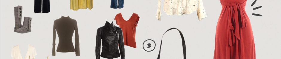
Neutral Stripe Bottom. Patterns are fun! Picking a neutral pattern will guarantee it goes with everything else in your capsule wardrobe. So, when you are fumbling around at 4:30 in the morning because you promised your before-school art club you would do clay but haven’t prepped for it at all and have a million other decisions to make you can literally grab any top you blindly feel for in the dark and it will look great with your striped bottom piece.
Color #1 Skirt. As with any light value colors, it’s probably best to avoid wearing this one on wet media days. But it makes a great colorful splash for less-messy art teaching days. Make sure to consider the height of your students when selecting this skirts, especially if you teach littles.
Your Favorite Jeans. For those clay days when you are granted special permission to wear jeans to school. Or for any art teachers out there whose admins realize that a dress code for grown adults is a load of nonsense. *Note* If jeans are banned at your school, try black jeans. Somehow these often get a pass.
Color #2 Dress. So you are giving an art history lesson on the storied past of true vermillion and want to dress the part a la Miss Frizzle. This colorful staple is just what you need to integrate your look with your lesson.
Neutral sweater Dress. I lost the belt to this dress a long time ago, and a good thing too! because now I get to splash it up with color simply by adding a scarf. Or a belt like a normal person.
Color #1 Fun Dress. Shimmer up your wardrobe by having at least one piece that embodies a touch of flair. I personally love wearing this yellow dress because I feel like I’m on a safari. I have dreams of taking my students on a field trip to the zoo in this dress + cargo jacket.
White Collared Shirt with Small Pattern. Nothing is scarier to art teachers than a white piece of clothing. Will it make it through first period? Lunch duty? It’s pretty stressful. Wearing white is a surefire way to spend the day guarding your shirt with zeal. That’s why art teachers need a special kind of white shirt – one that camouflages potential disasters. For hiding potential paint/marker/crayon/pencil marks, I love this mostly white shirt with colorful hearts all over it. Or ARE they all hearts? You don’t know, do you?
Sacrificial White Shirt. White is just such an important color for a capsule wardrobe, so I’ve included, one, just one, plain white item. Get a nice cheap second hand white shirt that you allow to get messy. Maybe put a mark on it yourself – it’s like a ding in your car, once an imperfection is there, you won’t treat the sacrificial white shirt so preciously. Thredup is a great place to get a high quality, low price sacrificial white shirt.
Neutral Cami. Camis make the process of taking off work clothes and putting on comfy sweater super quick, and therefore it is indispensable.
Color #1 Cami. So you want to get away with wearing a light value color, but want to protect it from the impeding disasters that await light colors in an art classroom. Try a peekabo effect by layering a colorful cami underneath a sweater or button-down shirt.
Grey T-shirt. Duh. You need this. Everyone needs this. Maybe grey offends you because as an art teacher you are more drawn to colors. But grey is a color too! Show it some love. The other colors wouldn’t look nearly so fun if not contrasted next to sturdy ole grey. I like this scoop neck style cotton t-shirt.
Black Long Sleeve Tee. Black is one of the greatest art teacher colors because when you get acrylic paint on your shirt, you can always Sharpie over it.
Pattern Long Sleeve Shirt. Channel your inner Parisian artist with this basic wardrobe staple that goes with every single bottom in your closet.
Neutral Turtle Neck. Good for layering under your fun clothes.
Color #2 Print Graphic Shirt. We all have a favorite t-shirt, and with an art teacher capsule wardrobe it is easy to elevate a t-shirt into something school-acceptable by pairing it with a skirt or layering it with a button down top. I love this t-shirt I had made with the name of my blog on it – Department of Aesthetics. It’s a Bona Fide Art Teacher Credential: there is a white paint stain on the upper part of the shirt. Maybe I should get a red sharpie, too.
Cargo Jacket. Pockets! Lots of pockets! Perfect for teaching art projects that need gradually distributed supplies.
Black Blazer with Working Pockets. Not one of those blazers with faux pockets. Some designers have never had to confiscate kiddie scissors mid-lesson and it shows.
Pull Over Sweater. A nice comfy sweater give you a place to internally retreat on those hard art teaching days. Also good for hiding certain involuntary hand gestures during pointless admin meetings.
Lightweight Scarf Color #2. Brightens up your neutral wardrobe pieces and can double as a belt if you get one long enough. Bonus: A red scarf is especially good for bandaging hands of students who thought it would be fun to play with the paper cutter.
Neutral Scarf. I love a very long scarf for regulating my body temperature in notoriously fickle school heating environments. I can wrap it around my body for an extra layer of sweaterry warmth, or I can drape it loosely around my shoulder for just a little bit-o-insulation. I’ve been known to wrap it granny style around my head in that one inexplicably freezing cold space that has artic-blasting air conditioning while the rest of the school is stifling hot.
Stretchy Grey Fake Pants. Why wear uncomfortable real pants if you can get away with wearing these comfy pants that look like they are real? This is one of the few exceptions I have for a working-pocket rule. Comfort overrides pockets for this item.
Neutral Leggings. If you are in a cold climate, these will layer to keep you warm. If you are in a warm climate and fortunate enough to have air conditioning but too much of it, these will also keep you from shivering. If you teach art to Littles who can easily look up your skirts, this is a must-have layering item.
Neutral Dress Pants. For those times it might be in your best interest to look like all the other normie teachers in your building, like observation day.
Statement Earrings. Because a good portion of your wardrobe is neutral, you can get away with all kinds of fun jewelry and still look very styled. But commit to just one piece. Remember, a capsule wardrobe is about simplifying the dressing process. You can’t marry everyone (at least not at the moment) so pick one piece you can really commit to.
Statement Jewelry Piece #2. Some of you may like a big chunky necklace as a statement piece (my friend Cynthia at Arttechtivity has an epic one made out of color pencil nubbins!). Personally, I am tired of being punched in the face by my necklaces every time I bend over to help a student and have forgone them altogether. No matter what your jewelry preferences, this is a place to go all out and have fun with color and design and letting your art teacher fashion flag fly!
1 Neutral Belt. Imperative for feeling like you have your art teacher sh*t together. Doesn’t matter if you have belt loops or not, throw a belt on anything for instant “Yeah!” points.
Black or Gold Flats. Comfort is KING when it comes to your art teacher shoes. I want to give a special shout out to my Tieks. One advantage of a capsule wardrobe is that it encourages investment in pieces that are timeless classics, and that is what these ballet flats are. It took me a long time before I was willing to pony up for a pair, but they live up to the hype *Fair warning* they are made from Italian leather and require a break-in period during which they are quite uncomfortable. After breaking in, however, these are magical, amazing comfy shoes. Not only that, but they fold (yes, fold!) super small, making them ideal for throwing in your purse so you can always have your dress shoes on hand for that unexpected observation.
Black Ankle Boots. Pick a pair that will stay on your heel when running late to your next class.
Comfy Boots. I like wearing the tall UGGS with knit tops because I feel like they are just a slight dress-up notch above traditional UGGS, but are just as comfy. I also like that they can be folded down for a lower boot look, or when you need extra insulation around your ankles during those bus duty snowstorm events.
Black Leather Jacket. To remind both you and your students what an art teacher bada$$ you are.
Neutral Wool Coat. For keeping you and your broken heart warm after you find student artwork in the trashcan.
Neutral Book Bag. So you can carry all your art teacher things to and fro.
Neutral Purse. For when you have less things to carry and don’t want to look like a student. Must be big enough to hold the magic crockpot*.* If you have not experienced the joy of a hot meal at school, I implore you to add this tiny crockpot to your must-have school kit. You can literally throw frozen food from your freezer into it in the morning, and have a cooked hot meal by lunch time. This is the modern age of art teaching people! You can have a hot meal!
SAMPLE SCHOOL YEAR WITH YOUR NEW CAPSULE WARDROBE
Now that you have selected all your pieces, let the magic begin. Pretty much no matter how you throw your wardrobe capsule pieces together, you will get a great look. Here are examples for fall, winter, and spring showing how you can style the pieces in your wardrobe to look completely different with each season.
Fall
Winter
Spring
CONCLUSION
Although it takes some time and effort to organize a capsule wardrobe up front, the amount of energy and brain power saved makes it worthwhile. Save your sanity for the challenges at school, and let your clothes be one less thing to worry about.
Have you ever tried a capsule wardrobe? Tell me about your experiences below.
When I was growing up, one of the first color theory lessons I remember learning is ROYGBIV, which is an acronym for the order of colors in a rainbow – red, orange, yellow, green, blue, indigo, violet. White didn’t get a letter in the acronym, Why not?
And then there were color wheels. Lots and lots of color theory wheels. But although I learned that red and yellow make orange, I never knew where white belonged on the color wheel. Or black. Black isn’t in ROYGBIV, where does it go?
I eventually learned the mysterious answers to these questions, and they stem from the concept that there are three elements to every color: value, chroma, and hue. These three elements together are the key to understanding color theory.
Hue is essentially ROYGBIV. It represents the outermost circle of the color wheel. Between red and yellow is orange. Between orange and yellow is yellow orange. Between yellow and yellow-orange is yellow-yellow-orange, etc. These are all called “hues”.
Chroma is how intense the color is. Purveyors of Caribbean vacations are often quick to showcase the “azure” water on island beaches. This water is appealing to us because it is intensely colored. There is less particulate in the water than the greyer seas found in New England, which gives Caribbean waters the appearance of a more intense blue.
So although New England waves are blue, and Carribean island waves are blue, the Caribbean water is more chromatic – it is a more intense color of blue. The opposite of chroma is neutral. The New England water is a bluish grey and the blue is not very intense, it’s a neutralized blue.
Value represents how light or dark a color is. A stop sign is red, and poinsettias also red. But even though they are both red, the red stop sign is a lighter value of red than the darker red of a poinsettia. The ponsettia is a darker value of red than that of the stop sign.
Now that we have mastered the 3 basic elements of color, let’s take a closer look at why white and black are not actually colors.
Have you ever tried to match whites before – say a shirt and pants – and been aggravated by the experience of trying to find the right white? When you put the two together, something just doesn’t look right?
So here’s the rub: the reason it is so difficult to match a white top with white pants is because there’s no such thing as white. White is not a color.
Think about it for a minute. Where does white go on the color wheel? Red, orange, yellow, green, blue, purple. I’m a licensed art teacher and I have never seen or heard anyone throw a “white” in there. There’s no “W” in ROYGBIV.
Is White a Color?
White is actually more of a color adjective than anything else. Saying something is “white” is actually a descriptor for saying a color is very, very, very light in value. So, the “white” being described is really just a very, very light red, orange, yellow, green, blue or purple.
When you hear interior decorators talk about a “warm white”, what they are usually describing is a very light-in-value yellow or orange. When they talk about “cool whites” they are often describing very light blues or purples.
To be fair, the lighter a color is, the more difficult it is to discern its color. This is why so many people believe that white exists as its own color – it’s a catchall for any color that is light in value.
But if you take time to compare whites to each other, and then try to describe them as a very light red, orange, yellow, green, blue, or purple, you will find that they are easier to identify with practice.
I encourage you to try it now; look around the room and see if you can find three different “white” objects. If you HAD to assign a color to each of the whites, what would it be? It’s often helpful to put them next to each other for reference. Side-by-side, it is often easier to tell which white is warmer and which white is cooler, which is the first step to identifying its true color.
Why should you bother spending time deciphering whites? Well, for one it is a great parlor trick to pull out the next time someone you’re being forced to converse with is being annoying. Also, it could keep you from losing your mind in a very different way.
White Torture
There is a type of psychological torture called “white torture” that is used to extract information from targets by depriving them of sensory input. This often includes putting them in a white room, serving them white food, making them wear white clothing, etc.
Fortunately for the would-be torturers, there is no such thing as white. Armed with a thorough understanding of the concept “white”, well-trained prisoners can identify the broad rainbow of whites within their orbit, and stave off the intended distress of being placed in a world “without color”.
A well-practiced eye can see that the pillow case is a very light blue, and the mashed potatoes are a very light red. They can even take joy in knowing that their pants and shirt are actually very different colors despite the certainty of captors that they are white.
Dentists Know Whites
If you care about teeth, you might also want to pay closer attention to whites.
When making composite fillings, dentists have access to any variety of pre-mixed “whites”, and often have cards to help them choose which one to use on which patient. But they also have to cope with varying light sources, the fact that teeth are slightly transparent, and many other variables which affect the way humans view the dentist’s color choices in their final work.
Being able to break down “whites” into value, chroma, and hue can improve your dentist’s ability to match colors accurately because it isolates complex variables to be independently thought upon before making color-matching decisions. The next time you go to the dentist for a composite filling, I encourage you to check their art credentials.
Light Has Color
Understanding the properties of white is also highly beneficial to anyone who needs to buy a lightbulb. Have you ever really noticed how many options there are? How some lightbulbs claim to be “natural light” bulbs, and others “warm”? What they are really saying is that they are selling various light-value hues (ROYGBIV) of light bulbs.
The bulb described as “warm” is actually a very light value yellow. The bulb described as “natural” is actually a very light value blue. That’s right, natural light has a color, and it is blue. Considering the oceans and sky reflect blue, is it surprising that natural light does as well?
So the next time you are out lightbulb shopping, use your new color theory knowledge to make informed choices about which color you wish your light to be. Do you want your inside to feel like the outside? Pick the blue-hue bulb. Do you want your room to feel like light casting from a fire? Go for that yellowy-orange one.
Black also doesn’t appear to have a home on the color wheel. This is because black is a very low value (dark) blue, purple, or even sometimes red.
If you ever drop water onto black ink, it runs blue or purple, or less commonly red. The value of these blues, purples, and reds is so dark, that we cannot see the hue very easily, and resort to calling it “black” which is a catchall phrase for very dark hues. When our water thins the pigment (and lightens the value) of the black ink, the hue becomes more easily decipherable. It becomes downright obvious, in fact, as we see it run in streams of hues that we DO recognize from the color wheel: reds, blues, and purples.
I will never forget the first time my mother turned to my five-year-old self while shopping to tell me the pants I picked out to match a shirt were the “wrong black”. My mind was blown – how could there be a “wrong black”? That was the first of many color lessons my mother taught me growing up through the palette of clothes-shopping.
I now understand that what my mother described as the “wrong” black was actually two different blacks with varying root colors. Some were very dark reds, while other were very dark blues or purples. So the shirt I had in my hand was a very dark value red, while the pants I mistakenly thought matched it were actually a very dark value blue. And my mother was right, the pants were the wrong black.
Conclusion
It takes training and knowledge to see the nuanced distinctions between different blacks and different whites. The lighter a color is, like what is commonly called “white”, the more difficult it is to discern its hue. The same is true for very dark colors. When something is very, very dark, it is difficult to tell which hue it is.
The important thing to remember is that whites and blacks both have hues. If you approach them with the knowledge that there is a ROYGBIV color in there somewhere, you are more likely to spot it. And by looking for these subtle differences between white and black hues, you can expand the color information your eye receives and processes.
What other colors are color wheel misfits? Let me know which ones you are curious about in the comments below.
Teaching color theory lesson plans can be lots of fun with the right curriculum resources. But sometimes there is so much contradictory information out there, it’s hard to give your students consistent content. These 3 color theory lessons will help your students learn color theory in a cohesive way.
Lesson #1: What is Chroma?
In this video color theory lesson plan, students will discover what chroma means and how it applies to different colors. If they have ever tried to mix a red before, but it just wasn’t the right red, this video lesson will help them discover what went wrong.
Students will also learn about the opposite of chroma, neutral. By discovering what a neutral is and how it is used, it will expand students’ ability to apply nuanced color theory in their own artworks.
Now that students know all about chroma from Color Theory Lesson Plan #1, they can start to evaluate how it comes into play when painting objects that are both very bright and very chromatic. There is an inherent conflict between the two, and this color theory lesson helps students navigate making difficult color choices when painting.
This color theory lesson plan helps students discover how the words “warm” and “cool” are used to describe different temperatures when it comes to colors. Did you know that EVERY color is both warm AND cool? This is just one of many key takeaways they will get from this video lesson.
There is so much to learn about color, it is impossible to sum up in just a handful of color theory lesson plans.
Are your students’ portraits just so-so? Here are 5 common mistakes to avoid when teaching portraiture to help you get wow-worthy work from your students.
Mistake #1 Bad Student Model Setup
Nothing will kill a student drawing session faster than a bad model setup. If your model is moving and swaying, students become very discouraged very easily. Luckily, there are some easy tips and tricks for helping your model hold a pose well, even if it is their first time ever modeling.
Manageable Pose
First-time models will swear up and down they can hold a pose with arms over their heads, or weight all on one leg, or any number of other poses that are bad ideas. It is your job to dissuade them.
For holdable poses, put your student models in a chair. With arms. With pillows or folded cloth on the arms, and a pillow behind the back. Tape these cushions in place so they don’t move. Have your model keep both feet on the floor (no crossed legs or ankles!), or even place feet slightly elevated on a stool for comfort.
Point of Focus
To keep the head from looking around the room, you need to provide your student model with a single point of focus. Ask them to pick out a small object in the room to look at, or place a piece of tape on the wall for them to focus on. Make sure that the point of focus does not require them to turn their head more than 15-20 degrees from center in either direction. Exaggerated head turns may feel easy to begin with, but will strain the neck of inexperienced models.
Mark the Pose
Once your model is positioned in a comfortable chair that is well-padded, mark the pose. You can do this by placing electrical tape where the arm meets the chair, the feet meet the floor, etc. These tape marks should be easy for the model to see so they can place their limbs correctly after breaks. Marking the pose allows the model to sit as close as possible in the original position when there are breaks between poses.
*Note* Often poses settle during the first 20 minutes of their duration. It’s best to mark the pose at the END of this first 20 minutes, once it has settled. Which brings us to our final important tip about posing student models…
Inexperienced models should not pose for more than 20 minutes. This is both for safety (new models often do not have the experience to know whether or not one of their extremities is falling asleep) and for the most movement-free modeling for your drawing students.
Of course there is always movement when drawing a living, breathing creature. However regular breaks are ideal for helping your models sit still.
A good rule of thumb is to have a model take a 5 minute break for every 20 minutes of posing. If you have block scheduling with 90-minute periods or longer, allow for at least one longer break half way through the sitting.
By following these suggestions, you will be setting your model (and your drawing students) up for a successful portrait drawing session, and avoid one of the biggest mistakes art teachers make when they start their portraiture unit.
Another common mistake I see art teachers make is depending on photographs for their students to copy. Even if the photographs are originals, using photography prevents students from developing the basic portraiture skills they need to build their drawing confidence.
Cameras do a lot of the work for students, without them even realizing it. A photograph has already translated massive amounts of visual information from the three-dimensional world into two dimensions. This makes working from photos extra digestible for students, but simultaneously deprives them of the opportunity to choose which information to include in their portraits for themselves.
There is a huge difference between drawing from life and drawing from photographs. This is such an important (and controversial!) topic that I’ve devoted an entire post to the question, “Why not just use a camera?”.
If you have never had your students work from a live model before, I encourage you to give it a try. It has different challenges and different learning outcomes. When students are able to achieve solid results without a camera, it bolsters their belief in their abilities.
If you are concerned about teaching how to draw portraits from life because you personally prefer photographs, fear not. We have lots of great lesson plans available to help you teach portrait drawing from a living model to your students.
This is a big one. It’s so satisfying to see beautiful, shaded and modeled portrait heads done by students. But if you are going to have students shade their portraits, it is important for ease of student learning that only one light source is hitting the model.
When there is only one light source on the model, shadow shapes are the most obvious, and the ability to identify values becomes easier. It helps students rack up easy wins by correctly identifying and drawing accurate shadow shapes.
Contrarily, many light sources often create the illusion of flattened forms and makes it much more difficult for students to identify shadows. Confusion for students nearly always leads to greyed-out portraits and frustration for all.
How to Control the Light in an Art Classroom
Lighting is a constant source of struggle for single artists, let alone a group of 30 novice artists. Art teachers have to be able to manage light for an entire classroom of students, which is no easy feat.
Additionally, classrooms are often designed with multiple, competing and unwieldy light sources that can be challenging for art teachers to control. This often means coming up with creative ways to control the lighting.
Some art teachers manage multiple light sources in their classrooms by blocking out all of their windows except for one. Others set up a spotlight in their room to focus on the model, and turn off most of the other lights, leaving one far-away light on to act as ambient light to help students see their papers.
Every classroom is unique with its own lighting challenges, and it will likely take a few different attempts at controlling light before you narrow in on the strategy that works best for you. But it is absolutely worth applying a few light-controlling strategies to help make sure only one light source hits your model, as lighting makes a huge difference in the quality of work you can get from students.
When students have their drawing flat on a table, it creates distortion. The bottom part of their drawing is closer to them and therefore appears larger, and the top is farther away and therefore appears smaller. Visually, this tricks students into making the top part of their drawing much too big and the bottom part of their drawing much too small.
Drawing boards reduce the distortion be allowing the drawing to be worked on more upright. Even if you do not have easels in your classroom, drawing boards are easy to implement. Simply have students rest the bottom of the boards on their laps and lean again a table.
In order to teach portraiture successfully, you need to have an easy-to-understand method that breaks down complex drawing skills for your students.
So often I see art teachers set up a model and tell students “Ok, draw!” This is unlikely to yield the results students want for themselves.
Remember, it is your job as an art educator to teach art. This means providing knowledge and insight to help students achieve their objective. If you are teaching realistic portraiture, you need to have a method that helps students achieve this aim.
There are many, many methods for teaching portraiture. The important thing is to stick to ONE METHOD to teach at a time. You can always teach additional approaches at another time, but avoid confusion in the classroom by focusing on just one series of steps students can take to achieve their portrait goals. You can get a free portrait teaching guide here.
By avoiding these 5 common portraiture lesson mistakes, you can up the level of your students’ work, garner more attention for your amazing art program, and bolster the confidence of your students.
Art teachers can never have too many inspiring quotes in their lives! These art teacher quotes are intended to be shared wherever it brings you and your students joy.
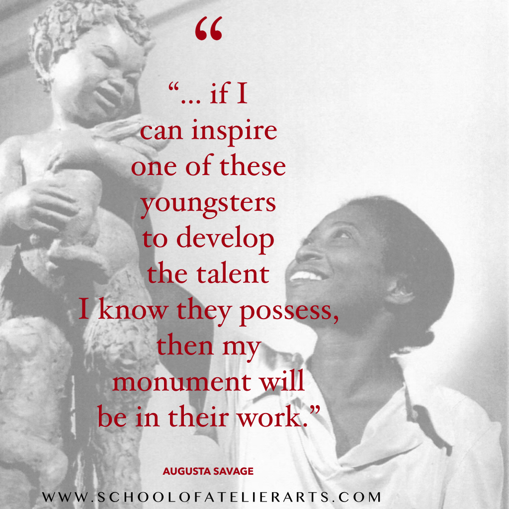
Augusta Savage was an amazing sculptress an art educator working mostly in Harlem. Augusta Savage is one of my favorite art educators. She trained many students who became major players in the Harlem Renaissance at her atelier. Additionally, she was an incredibly talented and successful artist in her own right.
Edward Mitchell Bannister was instrumental for helping create opportunities for learning realism skills in the United States. Because of his passion for art education, he is the perfect artist to quote for art teacher inspiration.
George Bridgeman is another prolific art teacher who taught at the Art Student’s League in New York City. His classes were highly sought after, and many of his students drawings are still admired today.
He also wrote many books to help art students learn his methods for constructing the human figure. He conceived of the human figure as a machine, and his books teach how to draw the human figure as wedges, pulleys, etc.
Leonardo Da Vinci spent nearly 10 years in an atelier before he felt confident in the mastery of his skills. He was one of the world’s great observers, in large part due to his drawing and painting training. Luckily, he left a number of written journals with advice to young artists that are still studied carefully today.
This is another important quote from Da Vinci, reminding our students and ourselves that we must always strive to surpass what is already known and created in order to make something truly original.
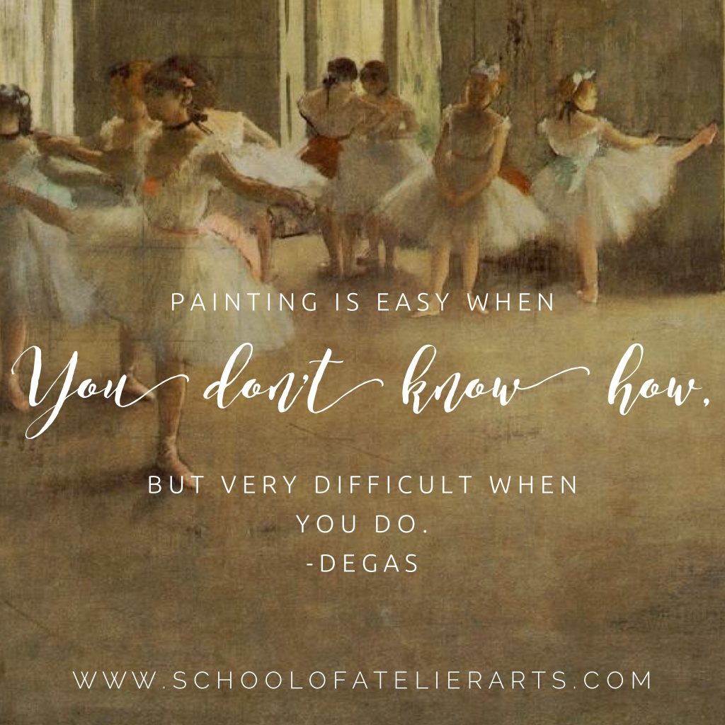
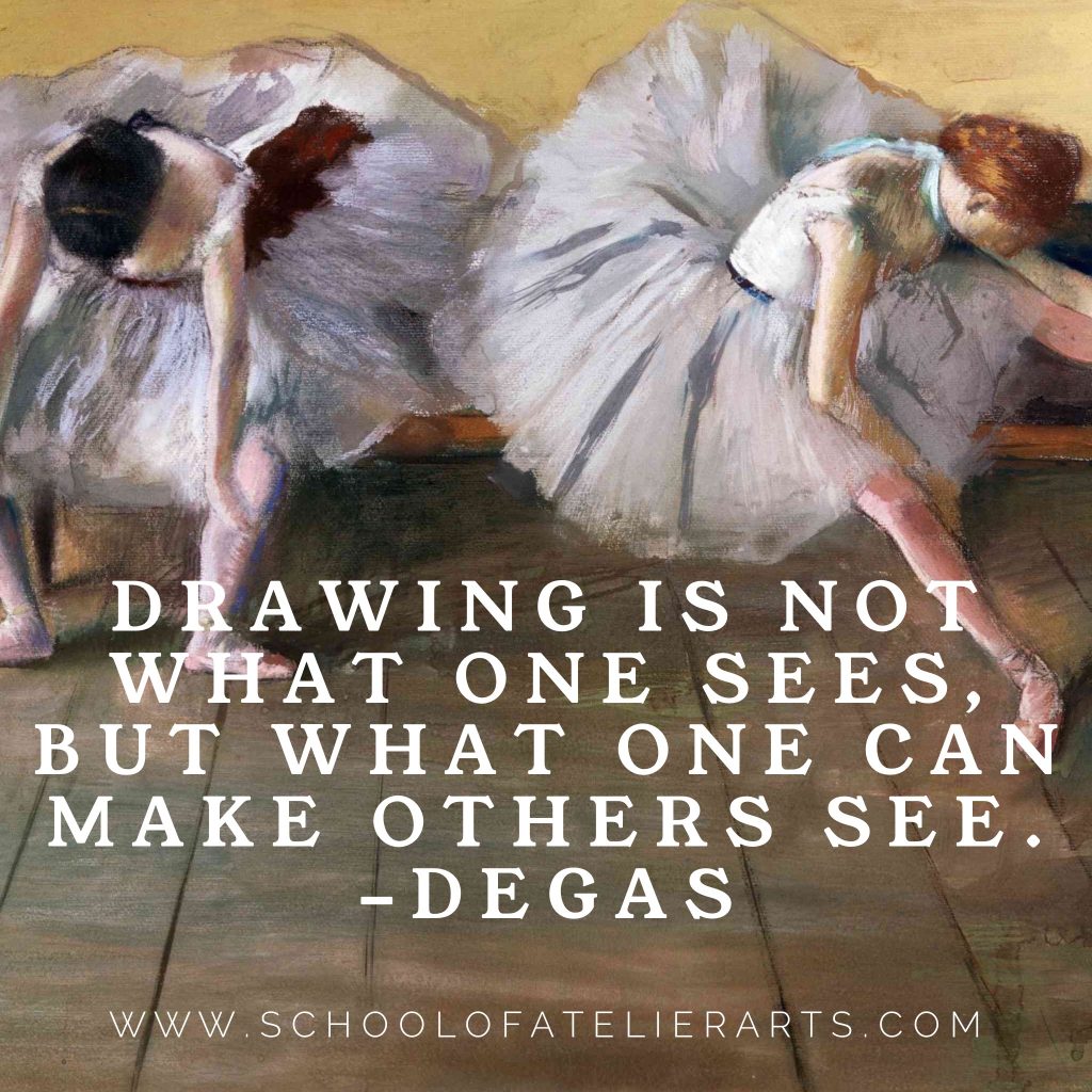
Degas Quotes for Educators
This great quote by Degas emphasizes the importance of mastering skills in art, which is something atelier training teaches.
I always try to remind my students that art is a powerful way to help others see in a new way. For example, the rose hue on a beach at sunset is not noticed by everyone, but artists can help others see it.
Dr. Seuss was a true visionary and talented educator. Due to his vast experience in illustration and education, this quote helps us to remember that seeing is about art, but also about life.
I love this quote by a gardener, as beauty is universal.
If you want to learn how to create beautifully colorful artwork, our Yay! Color Theory worksheets an help. We provide a step-by-step process for understanding color starting at the very beginning and leading through advanced atelier color techniques.
Do you have a favorite art quote? Let me know in the comments below. Join our popular art teacher newsletter for resources and inspiration delivered directly to your inbox!
Often when people find out I’m an artist, they will lean in very cautiously, and embarrassingly admit to me that they just don’t “get” most art being made today. They try to understand it, they tell me. But it just doesn’t make sense to them. They are a victim of art shaming.
If you are one of these people, and I’m pretty sure nearly everyone is one of these people, I’m here to tell you that you are not an idiot. That it is very brave to admit that you don’t understand something at which the rest of the world is smiling and nodding, whether they understand it or not.
Art shaming is rampant in the contemporary art scene, and it adversely affects many of us. But it doesn’t have to be that way.
There is a children’s tale I am fond of called The Emperor Has No Clothes. In it, a hoodlum convinces the Emperor that he is the best tailor in the world, and will make him the most beautiful suit humankind has ever laid eyes on.
It’s a magical suit, where only very smart people can see it, the suit-maker insists. The suit-maker asks the Emperor to provide the raw materials, pure gold thread of course, so that he can weave the magic fabric for the suit. The suit-maker pockets the gold thread and hands over an invisible suit.
When the Emperor tries on his new “suit”, everyone congratulates him on his beautiful suit. They are afraid to say the Emperor is naked because it means they are stupid. So the Emperor goes on parade to show off his new invisible-to-stupid-people suit. Only one person – a child – points to him and asks why the Emperor has no clothes.
The child is the only one with an Innocent Eye, the only one in the crowd who is able to truly see without being blindsided by the labels and the “expert” in the story.
Many people don’t understand the majority of Modern Art, but most of us are afraid to admit it.
It’s like admitting you can’t see the Emperor’s suit.
We are art shamed into going along with the experts’ narratives even as we experience cognitive dissonance between what we see and what we are told is great artistic mastery on par with a Da Vinci or Hokusai.
Smart people are supposed to “get” Modern art whether it makes sense to them or not.
I’m a licensed art teacher, a professional artist, and a recognized expert in the field of art. And I am here to tell you I don’t get most Modern Art, and it is ok if you don’t get it either.
It doesn’t make you stupid to look at a can of human feces and not understand why some people think it is monumental or Earth-shattering.
It’s ok to look at a Jackson Pollock painting and think to yourself, “My child can do that!” As someone who teaches art to children, I can assure you that dripping paint on a canvas is cognitively something a child can absolutely do, as I am sure you already know.
There is no reason to be ashamed of not liking a work of art, or to allow anyone else to art shame you for a perfectly valid opinion.
When we allow ourselves to use our Innocent Eye and not rely on experts weaving invisible suits, we get the joy of using our own judgement and discovering our own aesthetic preferences.
We don’t depend on interpreters to tell us what foods we like to taste or which books we like to read, although we might appreciate recommendations.
Art doesn’t have to be any different.
Do you feel visually moved by the machine spilling blank pieces of computer paper from above? If you do, great. If you don’t, that doesn’t make you dumb.
And if a supposed artwork is stupid to you, you can say so with confidence. You can say it the same way you might declare “I don’t like anchovies” or “I can’t stand Orlando Bloom’s acting outside of Lord of the Rings”.
It is not surprising that there is so much generalized insecurity in the population about understanding art.
Branded Artists and the Museum Elite love purposefully setting up laypeople for failing to recognize what curators claim is a masterpiece, and then art shaming their victims.
In 2001, Damien Hirst created a work consisting of beer bottles and coffee cups which was, unsurprisingly, thrown away. There was much to-do about how a very important work was not recognized by the person who cleaned the space, subtly implying ignorance and stupidity onto someone who saw garbage and threw it away.
In 2004 a bag of paper and cardboard, a work by Gustav Metzger at the Tate Museum, was thrown away. Again, the buzz in the art world swirled to shame the perpetrator who ignorantly disregarded what the establishment elite had labeled great art.
Garbage-as-art is continuously set up specifically for the art elite establishment to look down on the unknowing public by purposefully creating a situation where the “art” would be thrown out by people not in the know. This exclusive circle of decision-makers weave invisible suits, and otherwise intelligent people doubt their abilities because it simply doesn’t make any sense.
Garbage-as-art is just one of many games so-called authorities play to enforce their art shaming onto the public.
I hereby give you permission (not that you need it) to use your own judgement about art. You are entitled to your own aesthetic and to surround yourself with your definition of beauty and good art.
It’s time to stop giving an elite art oligarchy and their crazy-making games complete control over who is allowed to interpret art.
Let’s end the art shaming once and for all. Like the art you like. Hate the art you hate. And own it without fear of ridicule. There is no reason to be ashamed of not understanding something that makes no sense to you. In fact, it is quite brave to inform the Emperor that he is naked.
Capturing a likeness when drawing portraits is one of the most difficult challenges students face in the art classroom. This one secret will make you a hero for teaching students how to make accurate portraits. Every. Single. Time.
First off, I would like to give credit to the incredible work of the forensic illustrator, Karen T. Taylor, for being the first art instructor to introduce me to the significance of the concept I am about to share with you. Although I had glossed over it in my atelier training, in her book Forensic Art and Illustration she proved beyond a doubt that this one overlooked concept is THE KEY to accurate portraits.
I strongly encourage you to read her fascinating (but somewhat morbid) book on forensic illustration. She is a world expert on creating likenesses of people when it matters most for catching heinous criminals, and identifying missing persons.
So, are you ready for the portrait drawing secret that will change your drawing life forever?
It’s simple, really. The one portrait drawing secret you simply must know is this:
Likenesses come from accurately representing the relationship of the features to each other.
What does this mean, exactly?
The key word here is relationship.
When people draw portraits, they tend to obsess on what color the eyes are or what shape the mouth is. And while these things have some importance, they are insignificant compared to the relationship of the features to each other.
Let’s say you draw a mouth that is EXACTLY the accurate shape of your subject, and eyes that are EXACTLY the right color. Both of these things can be perfect, but the drawing won’t have a likeness unless the distance between your mouth and eyes is accurate. Getting the correct relationship between the mouth and eyes is far more important for capturing a likeness than the shapes or colors of those features.
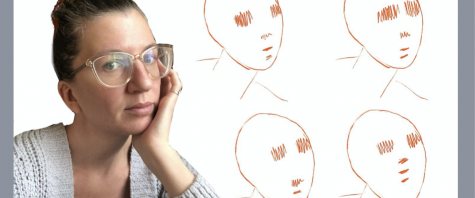
Consider this simple illustration that uses the exact same shapes for eyes, nose, and mouth but changes the relationship of these features to each other. Notice how the likeness completely changes?
(Enjoying this article? Download our Yay! Portraits Teaching Guide for even MORE tips and tricks for drawing portraits.)
Have you ever spotted a friend really, really far away, and immediately knew it was them? You couldn’t possibly see the color of their eyes, so how did you know it was them?
The answer might surprise you.
It turns out that humans rely heavily on contrast for intaking visual information. When your very-far-away friend is first spotted, what you are seeing is a light and shadow pattern on their face created by their facial features.
When the sun is overhead, the eye sockets cast a shadow on the face. The nose casts a shadow on the face. The upper and lower lips cast a shadow on the face. It is the relationship of these dark shadows to each other that create a pattern. This pattern in turn tells your human brain “That’s my friend!”
The reason the relationship of features to each other matters so much is because humans simplify visual intake and rely heavily on patterns. It is simply too much information to take in the color of someone’s eyes, when the only information we really need to identify someone is the pattern of lights and darks created by shadows of the features onto the face.
Getting a true likeness in portraiture is a challenging task. By spending time correctly considering the relationship of the features to each other, and recreating these relationships in their drawings, students will makes portraits with better likenesses.
Did you find this article helpful? Download our Yay! Portraits Teaching Guide for even MORE tips and tricks for drawing portraits.
What is your portrait drawing secret? Let me know in the comments below.
Get more of what you want for your art program, and less of what you don’t. All with the magic of art teacher marketing in just 15 minutes per week.
Marketing? Really? Ugh. It might feel like just one more thing for art teachers to do. But you are leaving a lot on the table by NOT marketing your art program.
When you market your art program well, you are always top of mind when new money rolls in or opportunities come up.Who doesn’t want to be the first one the principal asks if they want to use up a new pocket of money or go to a special conference?
Marketing helps people understand the importance of what you do. No one will be able to help and support you in the art classroom if they don’t know what you are about. Marketing is communicating with your adoring public, and keeping them in the loop about how awesome your art class is.
Marketing gives you a stronger political position within the school to get what you want. When your art newsletter reaches parents, and they tell the principal how happy they are that their students are learning about Rembrandt this week, that looks good for you. Take the opportunity to ask for that special art supply you need to REALLY make the Rembrandt project special.
Good marketing also gives you a legitimized excuse for getting out of unwanted work. “Oh, I would love to help out with [insert dumb thing someone wants you to do], but I promised parents in my newsletter that students would do Part II of the Rembrandt project and they will be so disappointed if I can’t set it up today.”
If you give enough legitimate excuses, people will stop asking you to do busywork. Every school has *that* teacher who inexplicably gets away with things. You can be *that* teacher with good marketing.
Ok, you are ready to give marketing your art program a go. Now what?
Pick ONE Goal. Also known as an Ask. You may want a specific art supply, go on a field trip, want to get off a cart and into a classroom, etc. But the key here is to pick one. ONE.
You need a targeted, precise, and consistent message for best results. You cannot scatter your focus or the focus of the people whose minds you are trying to change by bombarding them with a bajillion requests. If every time admin sees you they know that you need a bus for the art museum field trip, you are more likely to get it.
Persistence. Once you decide on your goal, consistently ask for it every opportunity you get. You can’t expect to communicate with a power broker one time and for them to remember what it is you want. You have to make your goal known again. And again. And again. The more consistently you are able to put your Ask in front of the powers that be, the more likely you are to achieve it.
Communicate. Social media, newsletters, billboards, art shows etc. are all great ways to communicate with your community. However, it can be way overwhelming to run a full marketing spread, and many art teachers fear the potential professional ramifications of social media.
If you are overwhelmed by all the choices, stick to e-mail newsletters. They are so powerful. And effective. You can use services like MailChimp to make it super easy for people to sign up for your newsletter. It helps make pretty newsletters, and it is free if you have less than 2000 contacts, which most of us do.
Target Audience. Make sure as the art teacher that you are communicating and marketing to all the right people. School board members, parents, students, principals, local journalists, local art supply stores, etc. Make sure to invite all of these people to subscribe to your mailing list. Post a link to join your mailing list on your school’s website and in your e-mail signature.
It may be unnerving to send a newsletter to a school board member, for example. But remember, you are communicating to power brokers to show them how important art is. And get this: THESE PEOPLE WANT TO HEAR FROM YOU. That’s why they subscribed to your newsletter in the first place!
Consistency. You can’t communicate just once. You must communicate again and again and again. How were conspiracy theories so successful at infiltrating the public mindset? Repetition. Use repetition for good by getting it into your community’s head how important art is and how cool the things students are doing in art class are. Send out a weekly newsletter and watch your power to get supplies donated and get prioritized for school funding grow.
Before, During & After
Not sure what an art teacher should write or post about when you are marketing your art program? This is a very simple guideline to follow. In your marketing, tell your community what you are about to do. Tell them about it while you are doing it. Tell them that you did it. That’s it, it’s actually quite simple.
Exactly How to Market Your Art Program Step-by-Step
Sign up for newsletter service. I recommend Mailchimp because it is free if you have less than 2000 contacts. There is a slight learning curve for using a mail service, but once it is set up you will be amazed at how easy it is. Basically you need to congregate your contacts into a list, start a new email campaign with one of their templates, upload some photos and insert a few lines of writing, and then send it out. It really is that simple.
Still overwhelmed? I made it even easier for you. Here is a sample newsletter outline. Just follow the steps, and then send out your newsletter.
Sample Newsletter Outline:
Classroom anecdote. Ex. This week, a student accidentally spilled some paint in 3rd grade, and the whole class helped to clean it up. I’m so proud of their helping mindset.
Your ask. This is where whatever it is you need help with or want funding for goes. Ex. “The art classes are so excited about our kiln fundraiser. Last week, the PTA gave us $100 towards a kiln. We now have $400 towards our $2000 goal raised! If you would like to donate money towards a kiln for the school, please send a Venmo or Zelle to the PTA account ptaaccount@yourschool.com. You can do it right now!
Shout Out. Highlight a student who made exceptional art this week and why it was good. ex. “Susie’s Rembrandt project has the most skillfully drawn nose I’ve ever seen. Congratulations to Susie!”
A few sentences about what you did last week. Ex. “Last week we made thumbnail sketches for our Rembrandt project. And good thing, too, as some of the students used that exercise to change their mind about how to approach the main project.”
Pictures. Ex. Here are the progress pics of our Rembrandt project.
A few sentences about what you are doing right now. Ex. “Today was our 3rd day working on our final Rembrandt projects. Most students finished working on their noses this week.”
A few sentences about what you are going to do. “Next week, we will be writing 2 reflection paragraphs about what students learned during the Rembrandt project.”
That’s it. Just follow this formula. Once you have your mailing system set up, it should take you about 15 minutes to put together a newsletter. It doesn’t have to be very long. In fact, 1-2 sentence paragraphs are best for skimming. But it is just long enough to make sure that you, your students, your ask, and your art program are top of mind for your parents, administrators, school board members, and local journalists.
Congratulations! You are on your way to becoming a great marketer and advocate for your amazing art program in just 15 minutes per week!
Do you have a special art teacher in your life you would like to acknowledge with a thoughtful gift? These art teacher gift suggestions will help you give a gift the art teacher in your life will love.
Sub Lesson Plans
Did you know that if your favorite art teacher is sick, that they are responsible for creating lesson plans for their substitute?
It. Is. The. Worst.
As a teacher, you are already super unwell, and now you have to complete work in the form of creating sub lessons in order to not be at work sick.
And this is why these worksheet bundles are the absolute best gift you can give to the art teacher in your life.
These ready-to-go, digitized lessons allow your favorite art teacher to stay home and get better when they are sick instead of stressing about coming up with substitute art lessons. With these lesson plan worksheets, the work is already done for them.
These worksheets come with both English and a Spanish directions so that students can have a meaningful art lesson, even if their substitute teacher knows nothing about the subject. They are digitized so the art teacher in your life can easily email them to their administrators without dragging themselves into school.
How often are you able to give the gift of recovery and peace of mind? That’s why these worksheets make the perfect art teacher gift.
There is one item in my art teacher arsenal that is indispensable for my daily happiness. If you are looking for the perfect gift for the art teacher in your life, I implore you to give this gift a try.
Oh sure, there are the obvious gifts. The art teacher mug, a paintbrush, or a Bob Ross wig. But if you want to shower your favorite art teacher with true appreciation, there is one gift you should give them.
(Please note that this article contains affiliate links.)
What is the perfect art teacher gift?
A crockpot.
Why a Crock Pot?
Hear me out. This isn’t just any crockpot, this is a magic crockpot.
It’s a mini crockpot. It’s so nice and small that it can fit in the typical largish art teacher purse.
It can be filled with frozen food in the morning, plugged in at school, and by lunchtime a nice hot meal is waiting for your art teacher. The key here: your art teacher can have zero planning about what their lunch will be, literally stuff frozen food in their mini crockpot, and still get the joy of a heart-warming meal over their 15 minute lunch break if they get to take it that day.
A hot meal? At school? What crazy is this? Better yet, it doesn’t violate the no-microwave rule many schools now have.
I confess, ever since another art teacher first introduced me to this amazing device I have been a bit of a mini-crockpot evangelical. But that is simply a reflection of how indispensable this one item has become to my art education life.
If you are looking for the perfect gift for your art teacher to show your love and appreciation, look no further than the mini-crockpot.
What is the best gift YOU have ever received as an art teacher? Let me know in the comments below!
Is there a better drying rack for art teachers out there?
Traditional drying racks are big, unwieldy, and don’t even hold that many wet paintings. They take up a lot of floor space, and only 1-2 students can be in front of them at a time which creates a bottleneck in the art classroom.
Worse yet, the paintings often fall off of them and onto other wet artworks, defeating the purpose altogether. And they are expensive!
But what if there was a better, easier, cheaper, cleaner, more efficient way to dry paintings? This art teacher hack will cure all of your painting-drying woes.
THE DRYING RACK ALTERNATIVE THAT WILL BLOW YOUR MIND
Now this might sound a little crazy, but hear me out. The best drawing rack for art teachers are actually pizza boxes.
You heard me right.
Pizza boxes.
Pizza boxes are by far the best system for drying wet artworks. They are light, they securely store wet artworks, and they can easily be stacked out of harm’s way. Best of all they are free – local pizza places will often give you a stack of pizza boxes when presented with the ole “I’m an art teacher and my students need your help” routine.
Fold pizza boxes. Save time by having students fold their own boxes as part of the lesson (there’s no reason you have to do it!).
Distribute tape. Do this while students fold pizza boxes. I suggest distributing tape by tearing 3″-4″ pieces and attaching the pieces lightly to the back of students’ seats. This distribution method prevents a taking-forever-to-get-your-tape situation with students.
Have students place artwork in boxes. If you have large pizza boxes, multiple student artworks can be stored in a single box. For elementary students, I like to have four paintings per box as that is the number of students I usually have at each table.
Tape down artwork. You can tape artworks by rolling some artist’s tape to gently adhere it to the back of the work, or by taping over two of the corners of the artwork to attach it to the box. If you have a ton of students in each class, you can also tape an additional four artworks to the lid of the box, allowing one large box to store up to 8 artworks.
Label. On the edge of the box, write the table number and class period. Pizza boxes have a spot to do this specifically on the edge. Do not write on top of the box because when they are stacked you won’t be able to see it. By writing on the edge, you can see the label for every box no matter how many are stacked on top of each other.
Stack boxes and place out of the way. The great thing about pizza boxes is that because they are so light, it is easy to store them in otherwise under-utilized areas of your classroom such as on top of cabinets.
Did you know folding pizza boxes is a skill? Your local pizza place might gladly fork over a stack of boxes, but they will be unfolded. You might be thinking to yourself, “Oh Mandy, I can fold a pizza box. I can figure it out, it’s fine.” But I have given hundreds of art teachers pizza boxes throughout the years of giving workshops, and not a single person who insisted on doing it without instruction did it correctly. So do yourself a favor and watch this quick video to save yourself some time and frustration.
Although you can get pizza boxes donated to your classroom, you may prefer unprinted boxes for yours students.
(Please note that this is an affiliate link.)
What do you think? Will you try a pizza box drying rack system in your classroom? Is it the best drying rack for art teachers? Let me know in the comments below.
Whether you love it or hate it, portraiture is an important and sometimes required unit for art educators to teach. Here is a realistic drawing approach for teaching portraits to students in your art classroom.
You Need a Drawing Process for Teaching Portraiture
When asking students to draw portraits, we are asking them to do something quite challenging. They have to think about shapes, and forms, and values, and symmetry, and asymmetry, and textures, and sometimes even color! This is SOOOOOO much.
Don’t make them think about everything all at once! Give them a process that allows them to think about one part of their portrait at a time.
This is not to force students to give up their creativity. Rather, it is so students can learn one way of drawing portraits that is consistent so that the steps can be practiced and improved upon.
Teaching portraits with a clear process is essential for helping students learn the techniques to achieve high level results.
✏️ Make Portrait Drawing Simple! Struggling to teach portraits without overwhelming your students? Our Yay! Portrait Worksheets break the process down into clear, step-by-step exercises so students can build confidence and skill—one step at a time.
Imagine if you wanted to learn how to cook, but every time you went into the kitchen you had to make a completely different recipe using completely different techniques. That would feel so overwhelming!
Now, Imagine going into the kitchen and learning how to make cookies by following the same process 5 times in a row.
Let’s say the first time you forgot to add an egg, and your cookies came out super flat and gross. Then the next time you go to make cookies, you remember the egg and are super happy with your results. It’s an edible cookie!
Maybe by the 3rd or 4th time, you start tweaking the recipe to meet your preferences. You take out the nuts, or add some chocolate chips. By now you have the experience you need to do so without ruining the good parts of the cookie that you want to keep.
By the 5th time you go through the process of making the same cookie, you have created the perfect cookie for you, exactly to your preferences.
But this perfect cookie for you could not have existed if you didn’t have a process to follow to begin with. You first mastered making a tasty cookie, and THEN started making your cookies unique.
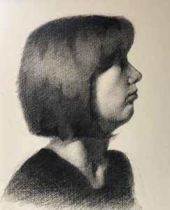
This methodology is the best way for teaching portraits in the classroom. Here is how you can do it. Portrait Study by Mandy Theis, Charcoal on Paper, 2019
🎨 Teach Portraits with Confidence! 🎨 Want to help your students create portraits they’re proud of? Our Portrait Worksheets provide a structured approach to drawing faces, so students can develop strong foundational skills without frustration.
✔️ Learn proportions and structure ✔️ Build skills progressively with guided steps ✔️ Perfect for beginners and advanced students alike
Your Drawing Process Needs to Make Sense to Both You and Your Students
Ok, so you agree you need a process because you both like tasty cookies and want to teach students to make portraits that they are proud of.
But how do you come up with one?
First, you have to decide what kind of portraiture you are teaching. Line drawing? Value drawing? Color painting? When teaching portraits, each of these techniques needs its own approach.
The most important aspect of teaching portraits is to make sure you are giving instructions for ONE, and ONLY ONE approach. You can always teach an additional method once students have mastered the first portraiture technique.
In order to teach portraits effectively to your art class, your chosen approach needs to make sense to them, which is something easier said than done. Want to improve your portrait drawings? Our Yay! Portraits Worksheets can help.
Follow a Drawing Process when You Are Teaching Portraits
However you currently teach portraits, think of a way to simplify it into chunks that are digestible and chronological. Break down the portrait drawing process into smaller and smaller pieces until students feel like “Hey, I can do that!”.
Here is the process I use to teach my students portraiture:
Find the height vs width of the entire head
Find the biggest shape of the head
Find the division between the hair and face
Draw the line of symmetry of the face
Use lines to indicate where the ears meet the side of the head
Use horizontal lines as place makers for the top of the eye socket, bottom of the eye socket, bottom of the nose, top and bottom of the upper lip, and bottom of the lower lip
Put restrictions on what part of a portrait students can work on in each lesson. This keeps them from getting overwhelmed by trying to get everything in. Break it down into simple steps where you ask them to think about one aspect of their drawing at a time.
For example, have them start by finding the height vs. width of the head, then the overall shape of the head.
*Hint* Humans have a LOT of different shapes of heads. Is it squarish? Roundish? Pointy on the bottom? Flat on the bottom? What IS the biggest shape of the head?
*Hint #2* There is a big ole ball in the back of your head that is wider than most peoples’ faces. This is the biggest part of the head, and one that students often miss. Do you need lessons that take students from the very beginning to advanced portrait techniques? Check out our Yay! Portraits Worksheets.
Think Big to Small when Teaching Portraits
When drawing portraits, students always want to rush into making eyelashes before they even know the shape of their head. A general rule that I always emphasize in my classroom is to think big to small. If a student is working on eyelashes, I will ask them which is physically better, the shape of the hair or the eyelash. This helps redirect them to working from the big ideas first before placing smaller ideas.
Make Multiple Drawings
Just like making cookies, students need to practice drawing portraits multiple times to figure out their mistakes and make improvements. They need the time and space to learn what is actually a very complex and challenging skill. Students show significant growth in drawing portraits when they are able to practice an understandable series of steps at least a few times. Portrait Study by Mandy Theis, Charcoal on Paper, 2017Do you want to learn even MORE about drawing portraits? Get our Yay! Portraits Worksheets today!
Conclusion
To teach portraiture well, you need both an understandable, teachable process and to give your portraiture unit enough time to be learned by your students without overwhelming them. They joy of seeing students’ faces when they pull off a portrait that is better than anything they ever thought they could do is a great reward for the amount of time and energy that goes into planning effective portraiture lessons.
Happy portraiture teaching to you all!





































_BOUQUET_OF_ROSES.jpg)